Neon UI components examples
Browse Neon UI component design examples. Preview individual interface elements and explore related component categories. Ship faster with Postgres
Explore the examples
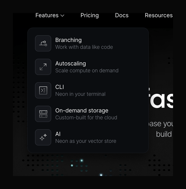

A dark-themed dropdown menu displaying a list of product features. Each item includes a line-art icon inside a rounded square, a title, and a short descriptive subtitle.
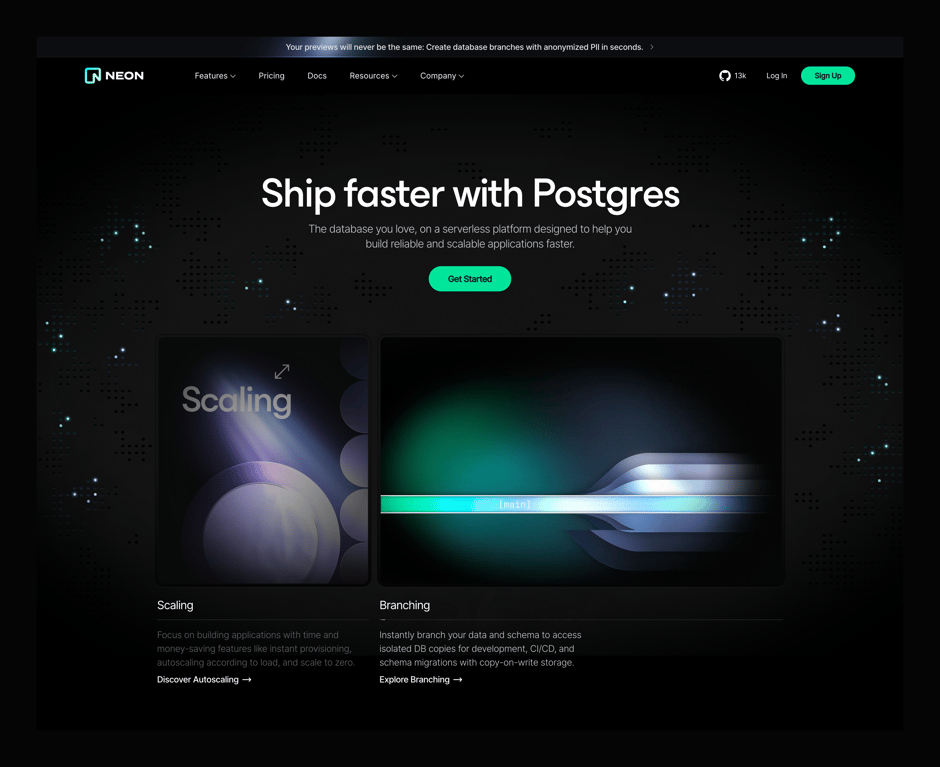
A dark-themed hero section featuring a prominent headline, subheadline, primary CTA button, and a two-column feature grid with abstract illustrations.
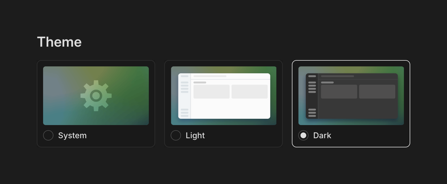
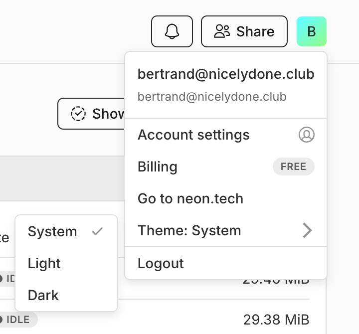
A radio group presenting three visual theme options: System, Light, and Dark. Each option includes a stylized thumbnail preview of the interface and a radio button.
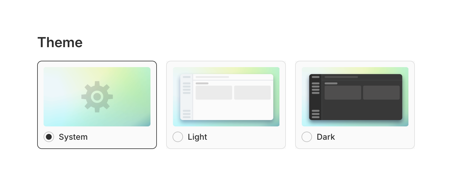
A radio group for selecting the UI theme, featuring visual previews for System, Light, and Dark modes.
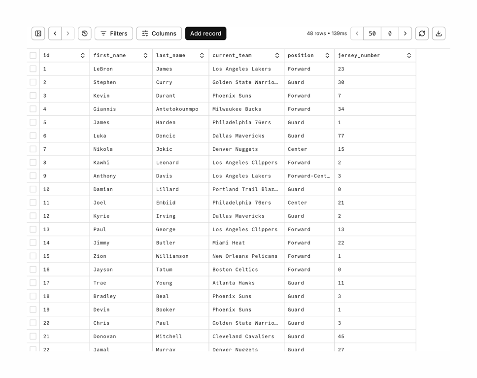
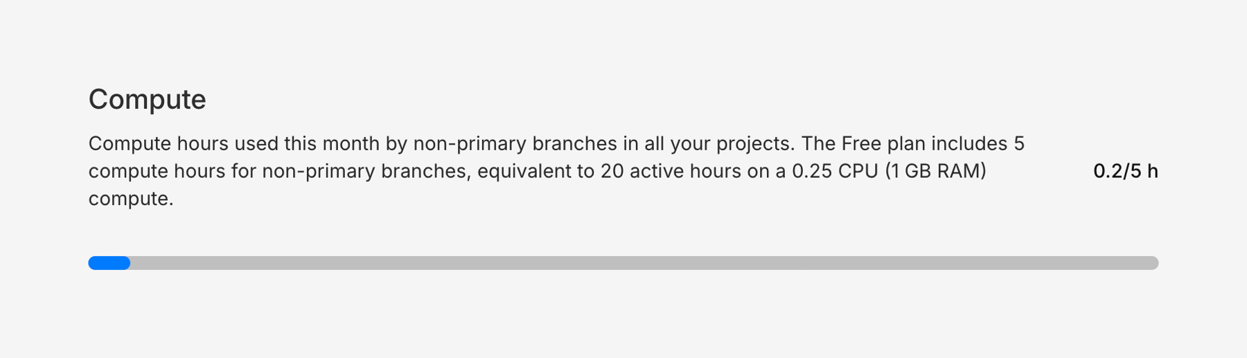
A progress bar showing compute usage against a monthly limit, accompanied by a title, detailed description, and a numeric usage ratio.
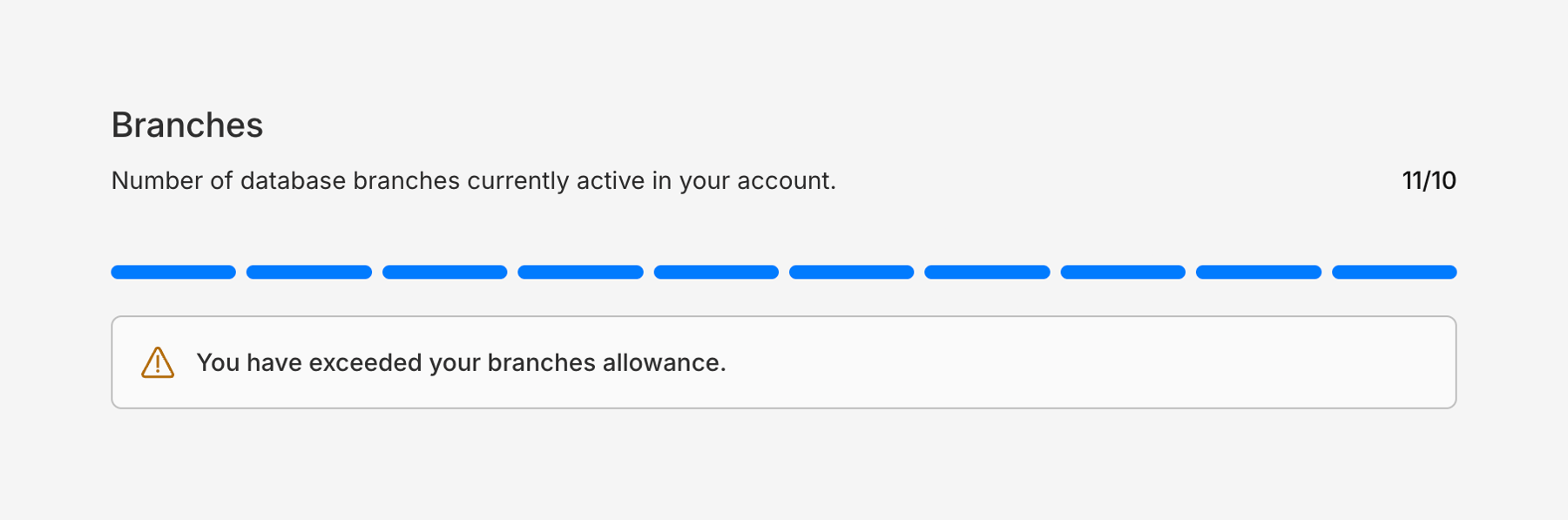
A progress indicator showing resource usage, specifically database branches, with an alert indicating the allowance has been exceeded.
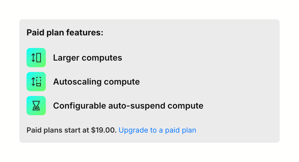
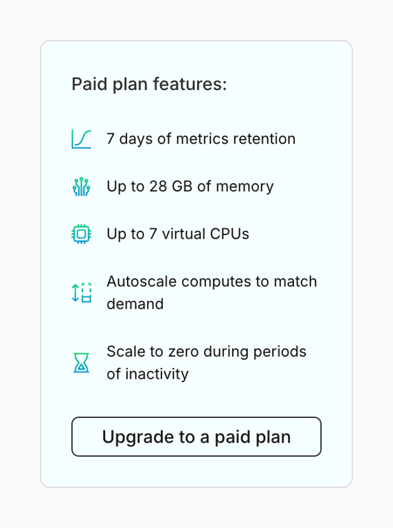
A card displaying a list of features available on a paid plan, with a link to upgrade.
Browse the full component library
Browse the full UI component library.
Trusted by the best teams







