Make UI components examples
Browse Make UI component design examples. Preview individual interface elements and explore related component categories. Connect apps & design workflows
Explore the examples
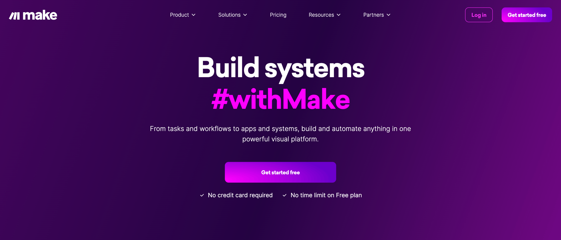

A hero section with a dark purple background, featuring a large headline, a subheadline, a prominent call-to-action button, and a top navigation bar.
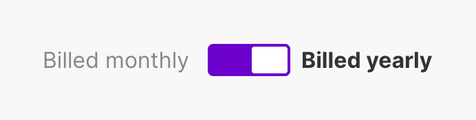
A horizontal toggle switch used to select between monthly and yearly billing cycles. The switch is currently set to the 'Billed yearly' option, which is highlighted in bold text.

A top header section displaying the organization name, a primary action button to create a new scenario, an organization settings dropdown, and a horizontal tab navigation menu.
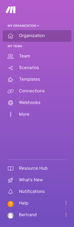
A vertical sidebar navigation menu with a purple background, featuring a logo, organization switcher, primary navigation links, utility links, and a user profile section.
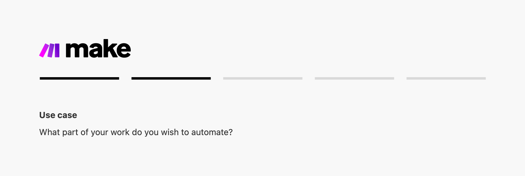
A header section showing the Make logo, a segmented progress bar indicating the current step, and a title with a subtitle asking the user about their use case.
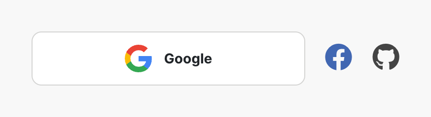
A row of social login options featuring a prominent Google button alongside smaller Facebook and GitHub icon buttons.
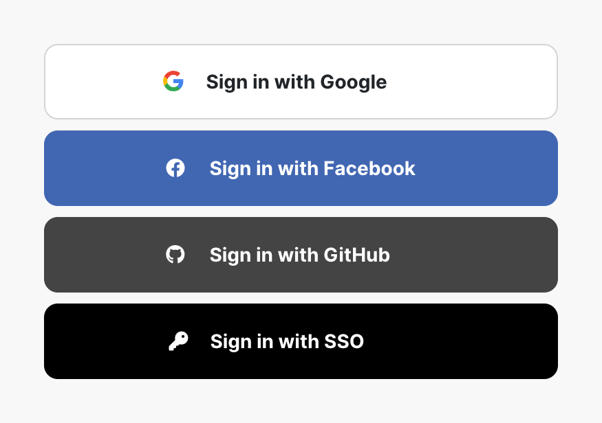
A vertical stack of four social login buttons for Google, Facebook, GitHub, and SSO.
Browse the full component library
Browse the full UI component library.
Trusted by the best teams







