Skip to content

Limitless UI components examples

Browse Limitless UI component design examples. Preview individual interface elements and explore related component categories. Go beyond your mind’s limitations

Explore the examples
Limitless — Hero section component
Limitless logo
Limitless

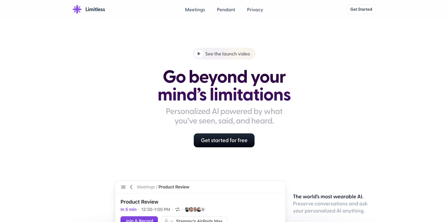
A hero section featuring a top navigation bar, a central headline with a subheadline, a primary call-to-action button, a video launch button, and a partial view of a product mockup below.
Limitless — Toggle/Switch component
Limitless logo
Limitless

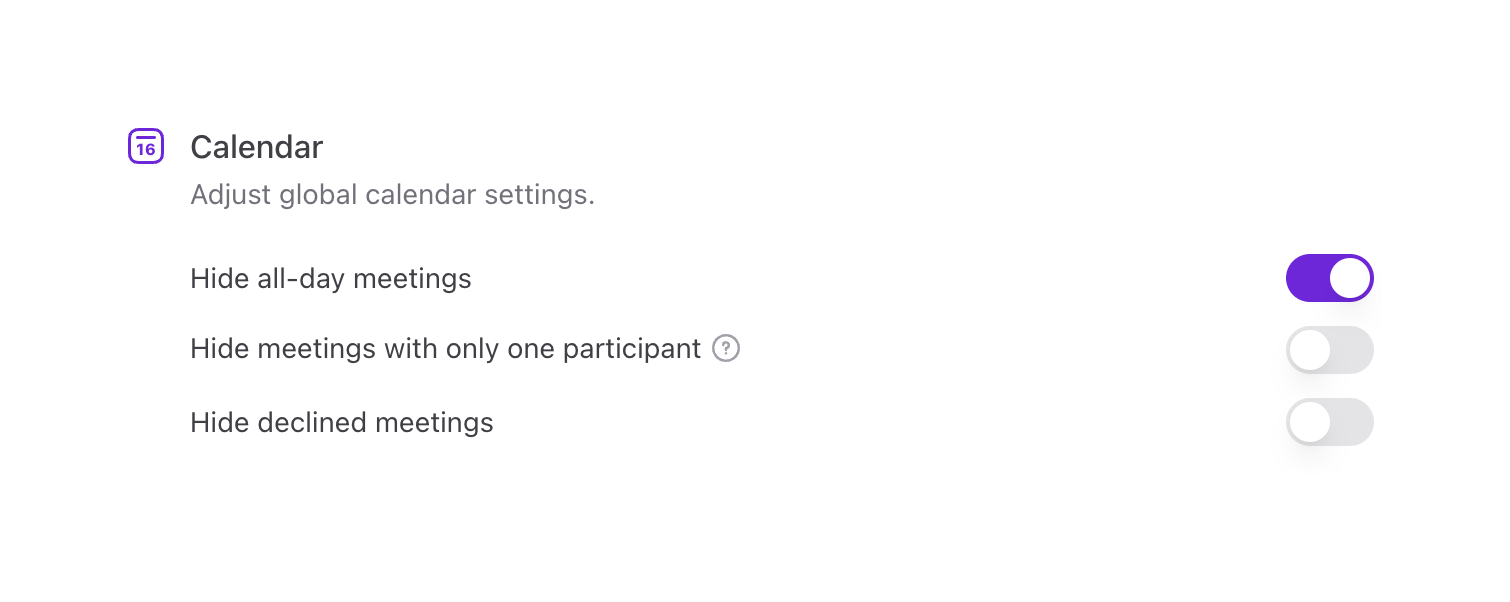
A settings section for calendar preferences, featuring a header with an icon and description, followed by three toggle switches for hiding specific types of meetings.
Limitless — Notification Toast component
Limitless logo
Limitless

A simple toast notification confirming receipt of user feedback.

Limitless — Feedback component
Limitless logo
Limitless

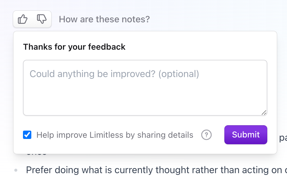
A feedback popover that appears below a thumbs up/down rating control, allowing the user to provide optional text feedback and opt-in to sharing details.

Limitless — Artificial intelligence component
Limitless logo
Limitless

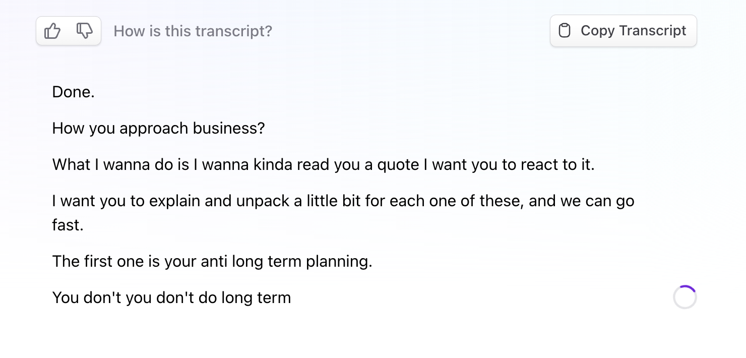
A live meeting transcript view showing spoken text appearing in real-time, with a loading spinner indicating ongoing transcription. A top toolbar includes a feedback prompt with thumbs up/down buttons and a 'Copy Transcript' button.
Limitless — Skeleton component
Limitless logo
Limitless

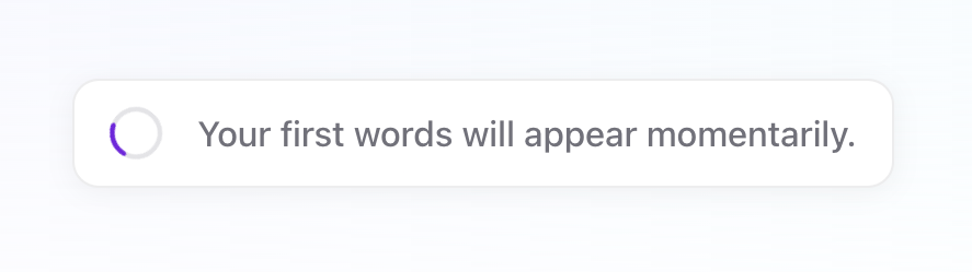
A simple card displaying a loading spinner and a message indicating that text will appear shortly.

Limitless — Empty state component
Limitless logo
Limitless

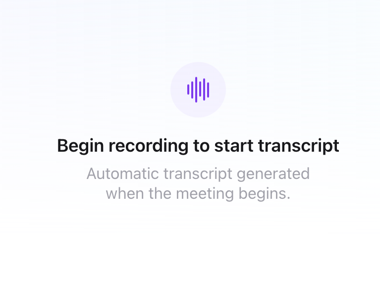
An empty state message indicating that a recording must begin to generate a transcript. It features a central purple audio wave icon inside a circular background, followed by a bold heading and a muted descriptive text.


Limitless — Tabs component
Limitless logo
Limitless

A horizontal tab navigation component with three options: Transcript, Notes, and Summary. The 'Transcript' tab is currently active, indicated by purple text and an underline.

Limitless — Breadcrumb component
Limitless logo
Limitless

A simple breadcrumb trail showing the path 'Meetings / Recording' with a back arrow icon.
Limitless — Vertical navigation component
Limitless logo
Limitless

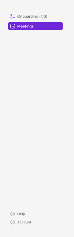
A vertical sidebar navigation menu featuring primary sections at the top and utility links at the bottom.

Limitless — Card component
Limitless logo
Limitless

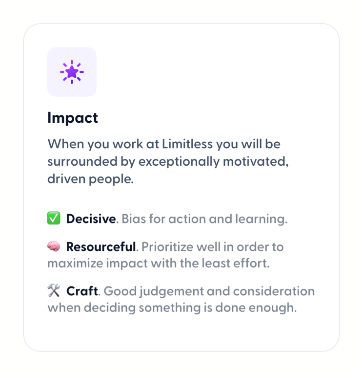
A card displaying a company value with an icon, title, description, and a list of related attributes.

Limitless — Footer component
Limitless logo
Limitless

A clean, minimalist footer featuring a logo and tagline on the left, and a horizontal navigation menu with secondary links and copyright information on the right.

Browse the full component library

Browse the full UI component library.

Trusted by the best teams