Skip to content

Hookdeck UI components examples

Browse Hookdeck UI component design examples. Preview individual interface elements and explore related component categories. A reliable event gateway for asynchronous applications

Explore the examples
Hookdeck — Toggle/Switch component
Hookdeck logo
Hookdeck

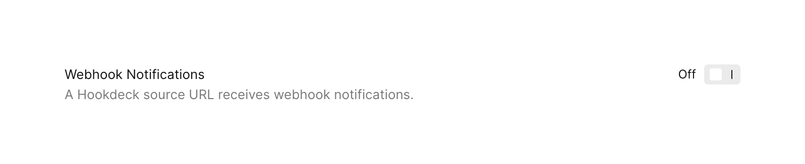
A settings row containing a title, a descriptive subtitle, and a toggle switch to turn a feature on or off.
Hookdeck — Toggle/Switch component
Hookdeck logo
Hookdeck

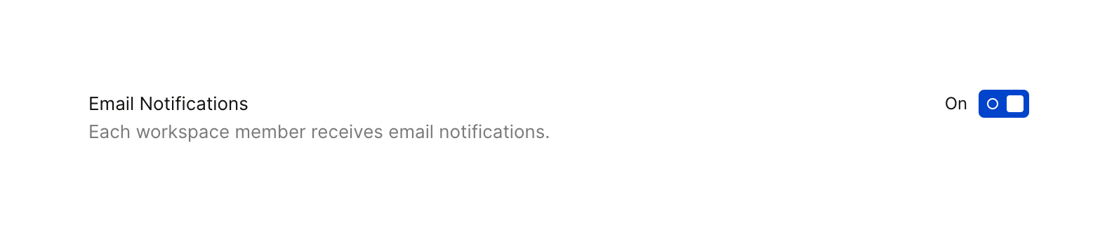
A horizontal settings row with a title, description, and a toggle switch to enable or disable a feature.
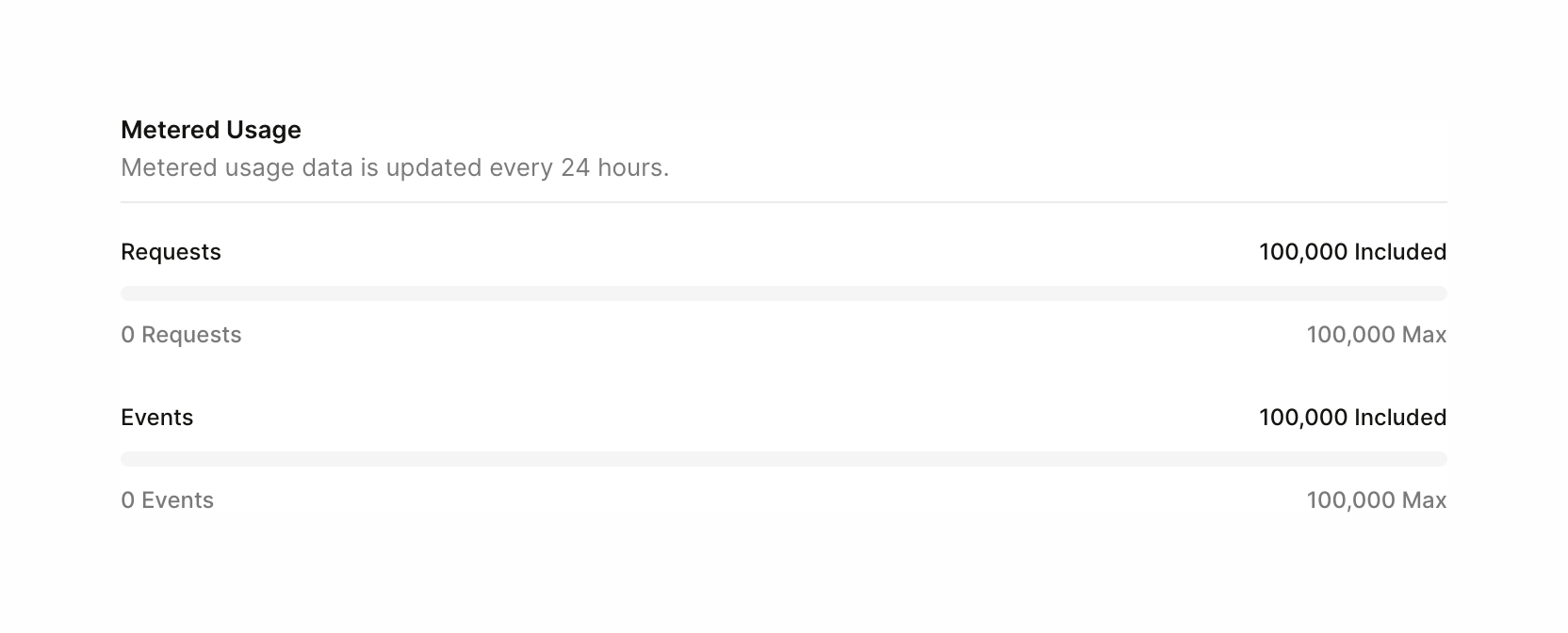
Hookdeck — Progress indicator component
Hookdeck logo
Hookdeck

A section displaying metered usage for requests and events, using progress bars to show current usage against a maximum limit.
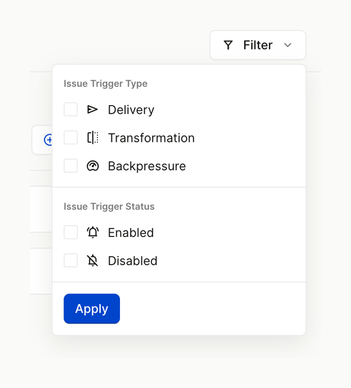
Hookdeck — Sorting & filtering component
Hookdeck logo
Hookdeck

A filter popover menu with checkbox options grouped by type and status, and an apply button.
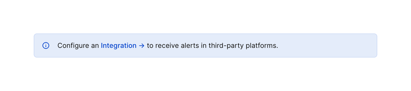
Hookdeck — Alert component
Hookdeck logo
Hookdeck

A light blue informational alert box containing an icon, text, and an inline link.

Hookdeck — Radio button component
Hookdeck logo
Hookdeck

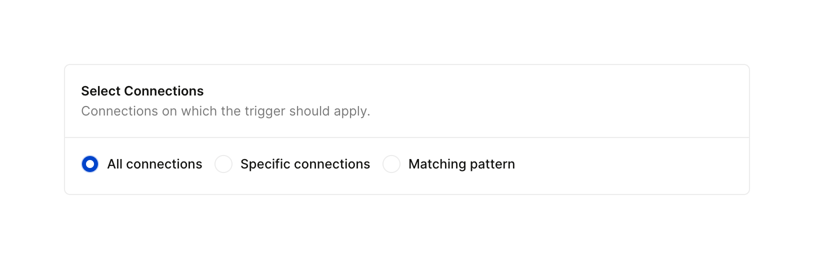
A card containing a title, description, and a horizontal radio group for selecting connection scope.
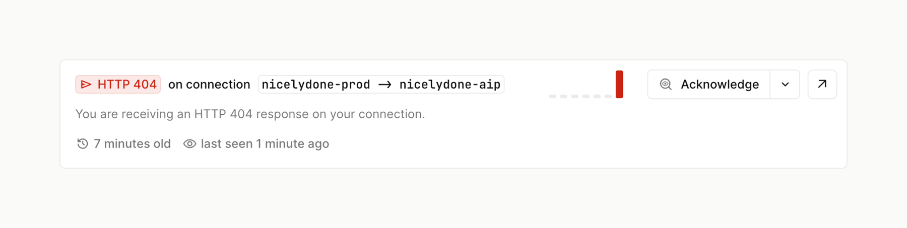

Hookdeck — Card component
Hookdeck logo
Hookdeck

A card displaying an HTTP 404 error issue, including the connection details, a description, timestamps, and an action to acknowledge the issue.

Hookdeck — Tabs component
Hookdeck logo
Hookdeck

A horizontal tab navigation bar for filtering issues by status. The active 'Open' tab includes an icon and a numeric badge indicating the count of open issues. Other tabs are 'Acknowledged', 'Resolved', and 'Ignored', each with a corresponding icon.

Hookdeck — Code block component
Hookdeck logo
Hookdeck

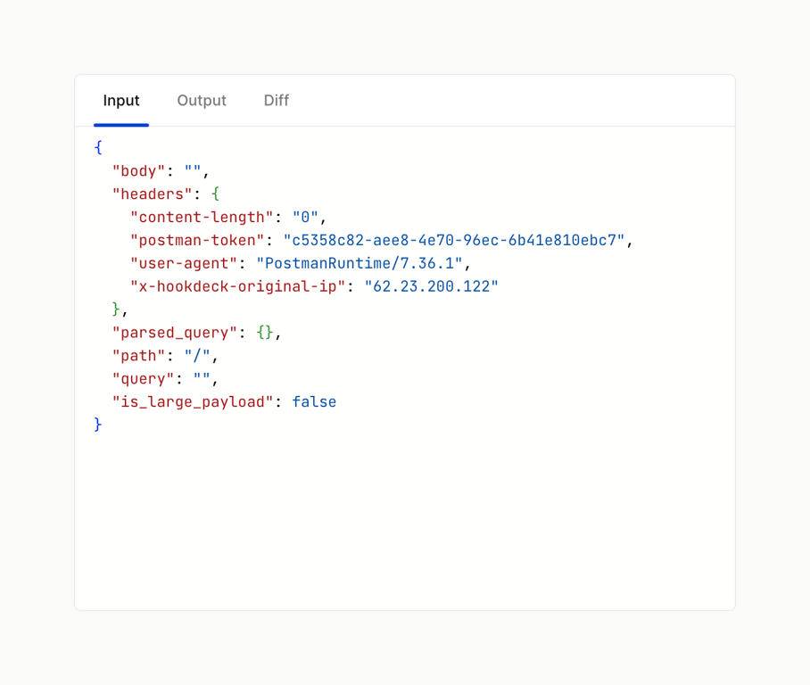
A tabbed code block displaying a formatted JSON payload. The active tab is 'Input', showing the raw JSON data with syntax highlighting.
Hookdeck — Code block component
Hookdeck logo
Hookdeck

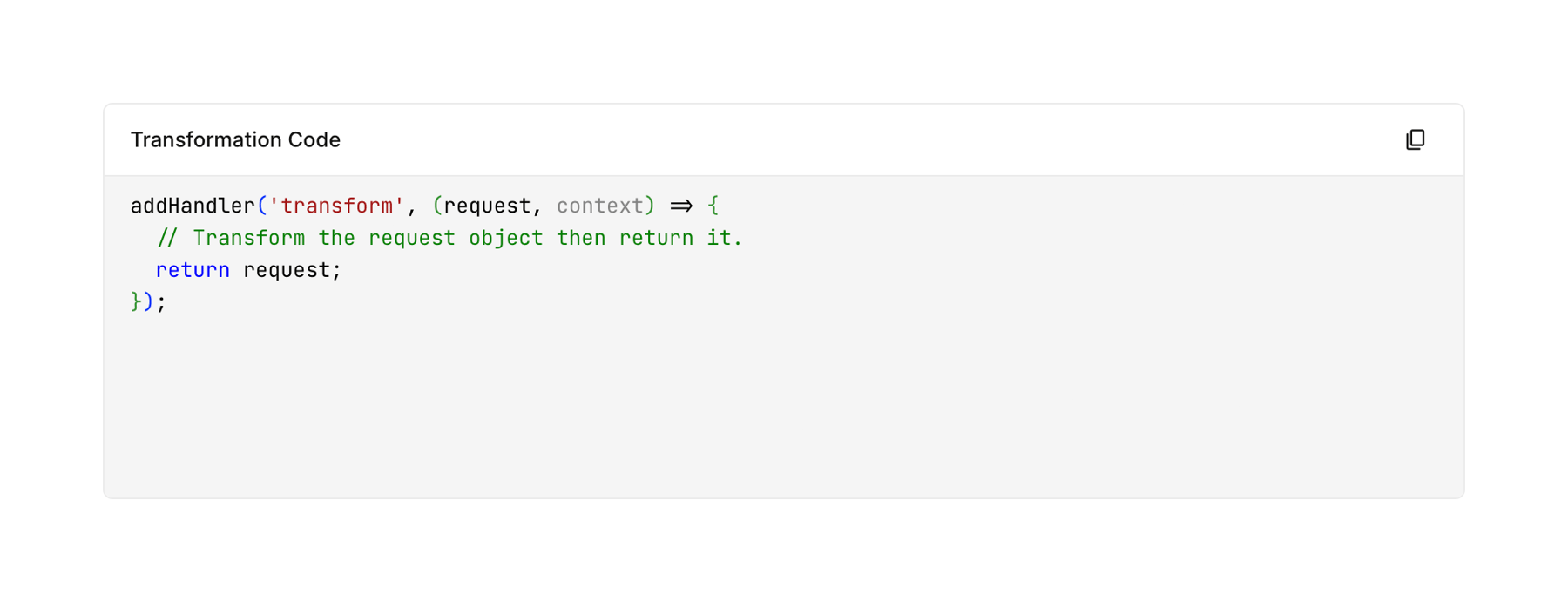
A card displaying a snippet of code with syntax highlighting and a copy-to-clipboard icon in the header.

Hookdeck — Charts component
Hookdeck logo
Hookdeck

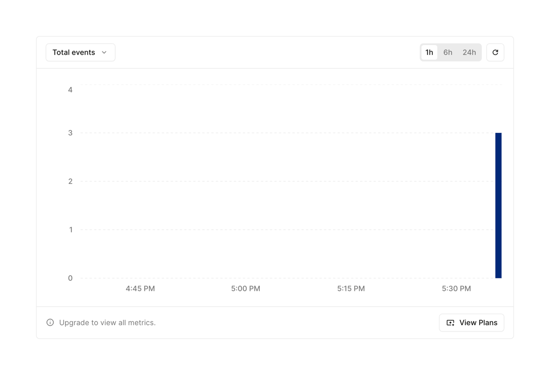
A bar chart displaying total events over time, with controls to change the metric and time range, and a footer prompting to upgrade for more metrics.

Hookdeck — Charts component
Hookdeck logo
Hookdeck

A data flow visualization interface

Browse the full component library

Browse the full UI component library.

Trusted by the best teams