Customer.io UI components examples
Browse Customer.io UI component design examples. Preview individual interface elements and explore related component categories. Platform: automation, data, content creation
Explore the examples
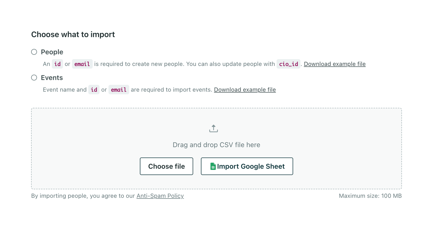

A form section allowing users to select the type of data to import (People or Events) via radio buttons, followed by a drag-and-drop file upload area with options to choose a local file or import from Google Sheets.
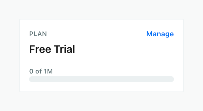
A card displaying the current plan type, a link to manage the plan, and a progress bar showing usage limits.
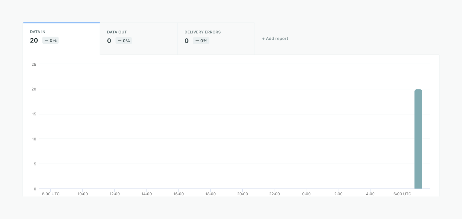
A bar chart displaying data over time, controlled by a set of KPI tabs acting as filters. The active tab shows 'DATA IN' with a value of 20.
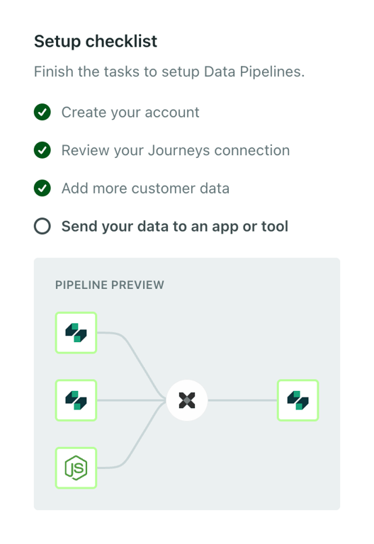
A vertical setup checklist displaying completed and pending tasks, with a visual pipeline preview for the current active step.

A full-width alert banner indicating that a data source has been disabled. It includes an error icon, a title, a brief explanation, and a button to re-enable the source.
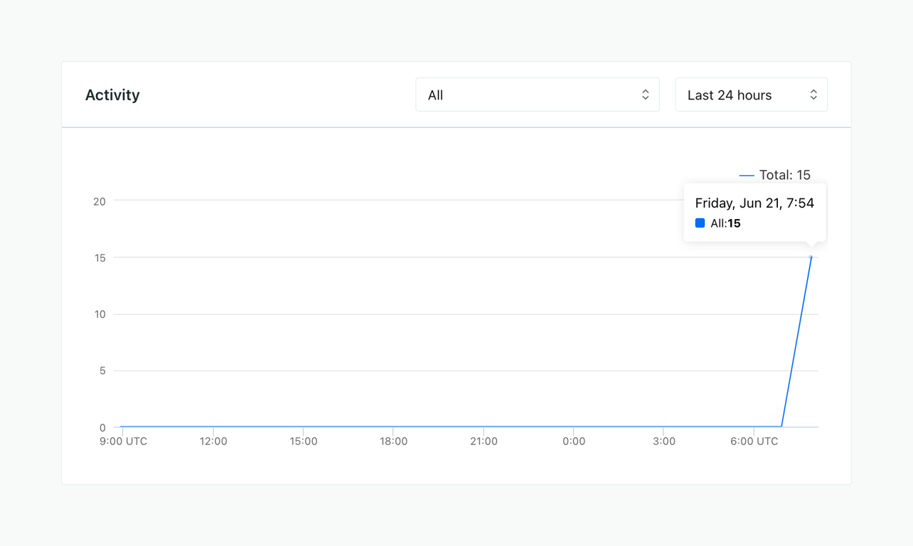
A line chart displaying activity over the last 24 hours. A tooltip shows specific data points on hover.
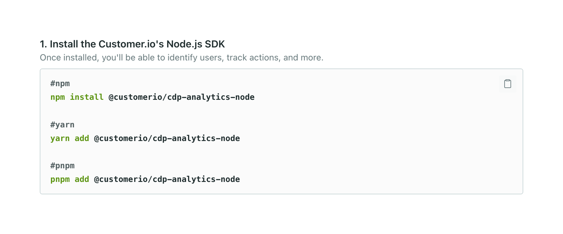
A code block displaying installation commands for different package managers (npm, yarn, pnpm) with a copy to clipboard button.
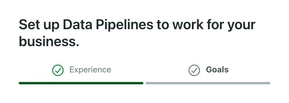
A two-step progress indicator with a title, showing the first step completed and the second step active.

A full-width success alert banner with a green background, a checkmark icon, a bold title, and a descriptive subtitle.

A horizontal stepper navigation bar for a campaign setup wizard, showing completed steps with checkmarks, the current active step, and an upcoming step. It includes a campaign title with an edit icon, an exit link, an autosave indicator, and a Next button.
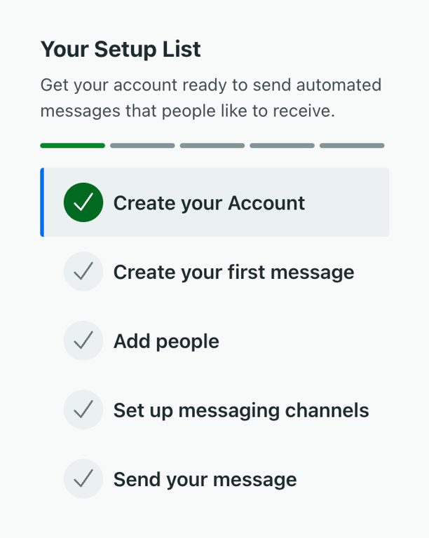
A vertical stepper showing the progress of an onboarding setup list. It includes a title, description, a horizontal progress bar, and a list of steps with checkmark icons indicating completion status.
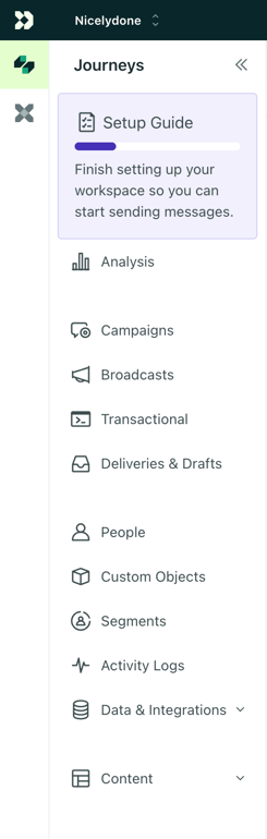
A vertical sidebar navigation menu featuring a workspace switcher, a highlighted setup guide card with a progress bar, and a list of navigation links with icons.
Browse the full component library
Browse the full UI component library.
Trusted by the best teams







