Copperx UI components examples
Browse Copperx UI component design examples. Preview individual interface elements and explore related component categories. Simplified payments for web3 companies
Explore the examples
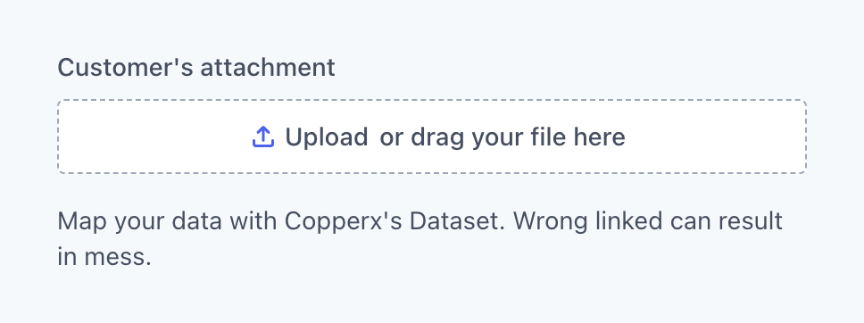

A file upload component with a dashed border dropzone, a label above, and helper text below.
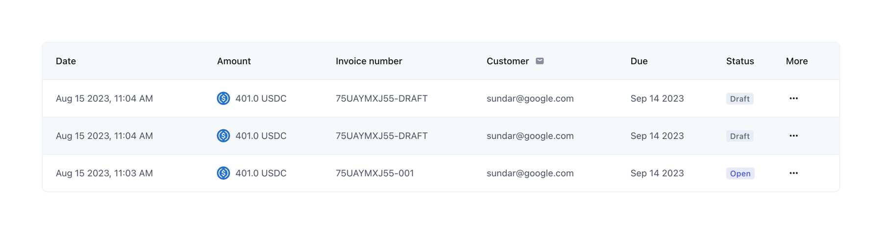
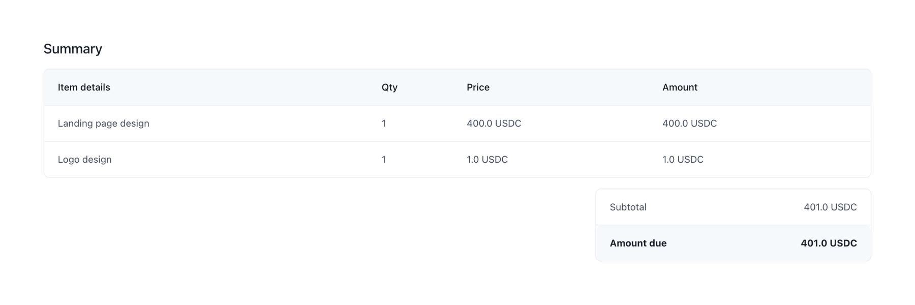
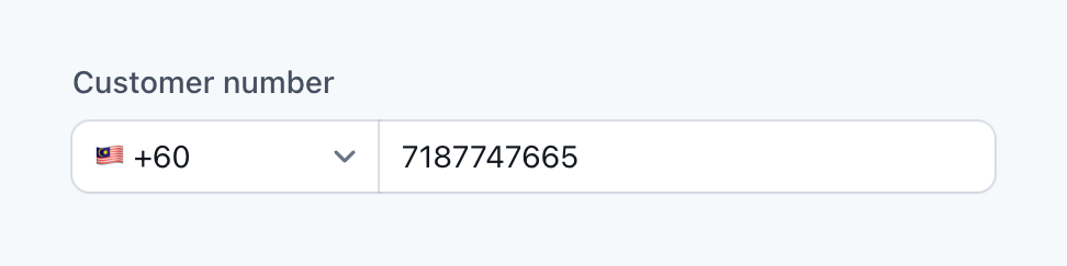
A form field for entering a phone number, featuring a country code selector with a flag icon and a text input for the number.
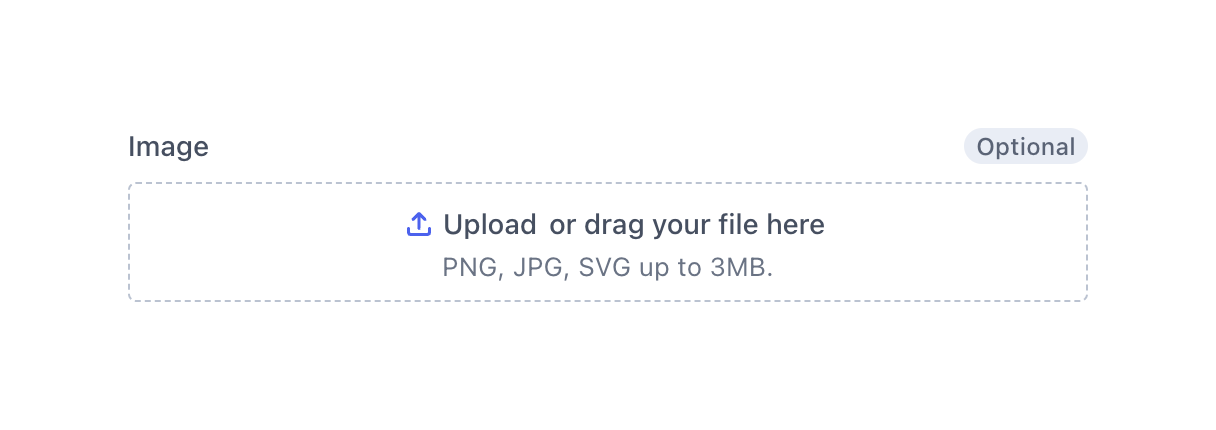
A drag-and-drop file upload area with a dashed border, an upload icon, and text indicating accepted file types and size limits.
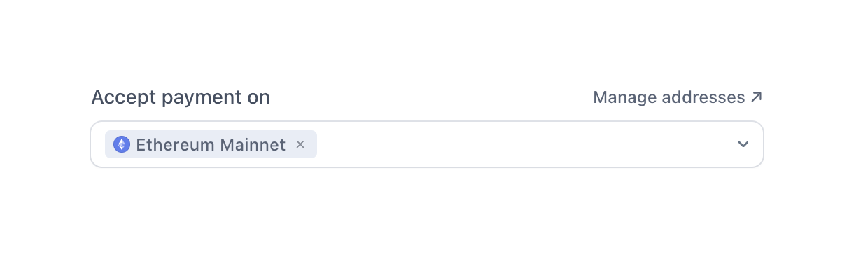
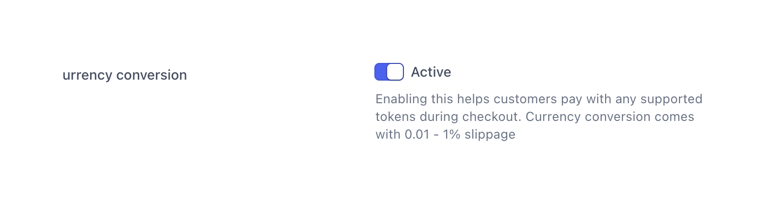
A settings row featuring a label on the left and an active toggle switch on the right, accompanied by a status label and a detailed helper text explaining the feature.
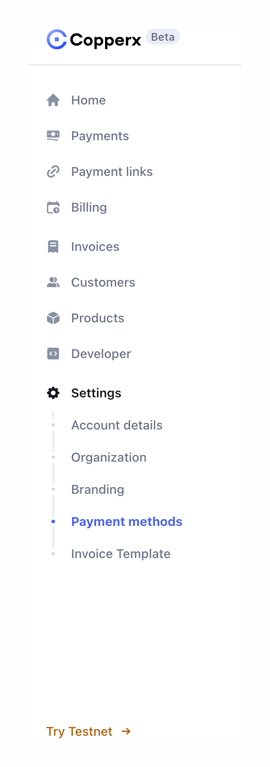
A vertical sidebar navigation menu featuring a logo, primary navigation links with icons, a nested submenu for settings, and a footer link.

A testimonial card featuring a company logo, a quote from a customer, and the customer's avatar, name, and title.
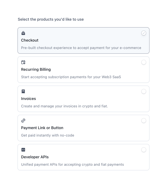
A vertical list of selectable product cards acting as a radio group. Each card includes an icon, title, description, and a radio button indicator. The first option is currently selected.
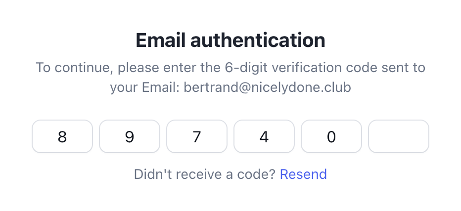
A form for entering a 6-digit email authentication code, with five digits currently entered and one empty slot. It includes a title, instructional text with the user's email, and a link to resend the code.

A section displaying customer testimonials with company logos, quotes, and author details.
Browse the full component library
Browse the full UI component library.
Trusted by the best teams







