Product Selection Radio Group
A vertical list of selectable product cards acting as a radio group. Each card includes an icon, title, description, and a radio button indicator. The first option is currently selected.
Explore the examples
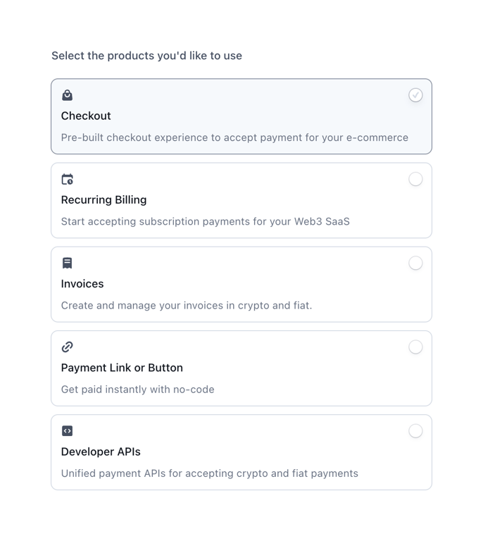

A vertical list of selectable product cards acting as a radio group. Each card includes an icon, title, description, and a radio button indicator. The first option is currently selected.
Browse the full component library
Browse the full UI component library.
Trusted by the best teams







