Button UI examples
Button UI design examples from SaaS apps. Explore how interfaces make actions visible and distinguish their importance. Look at button labels, icons, and visual states in the context of the task…
Explore the examples
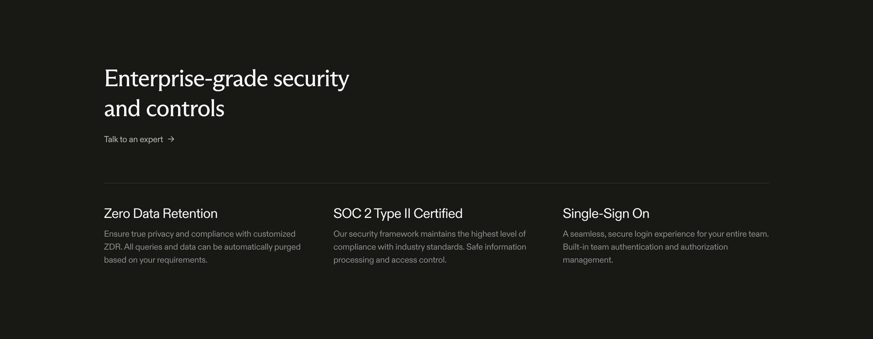

Highlights enterprise security features, compliance certifications, and SSO on a marketing landing page
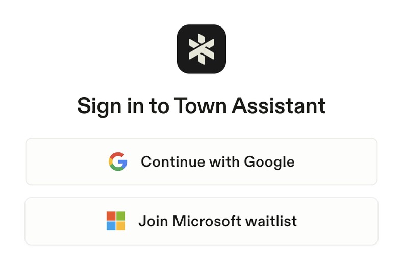

A sign-in screen for Town Assistant, offering options to continue with Google or join a Microsoft waitlist.
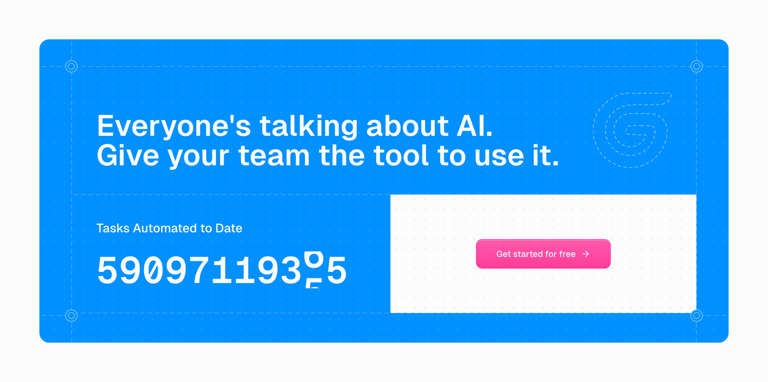

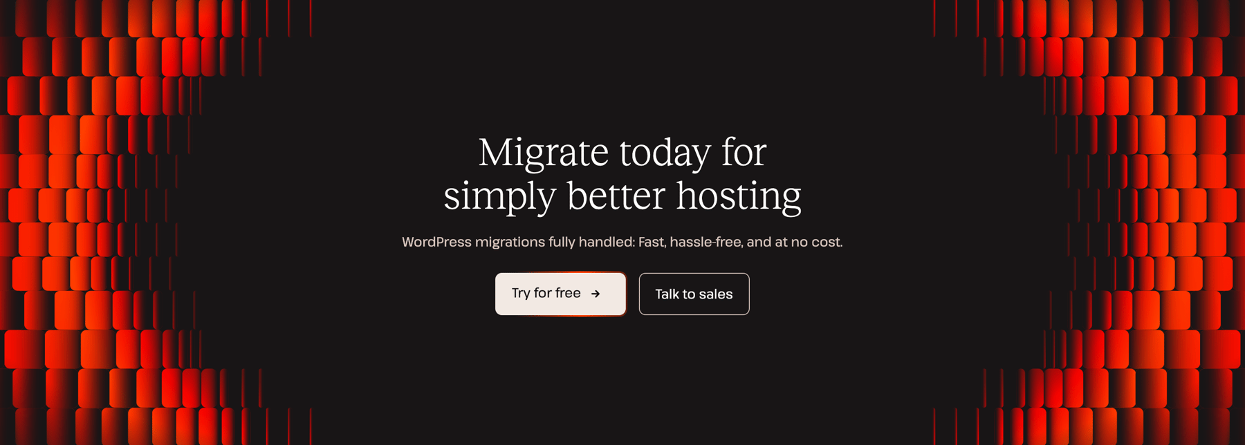

A call-to-action section with a dark background, a headline, a subheadline, and two buttons. The background features a decorative pattern of red, glowing, rounded rectangles on the left and right edges.
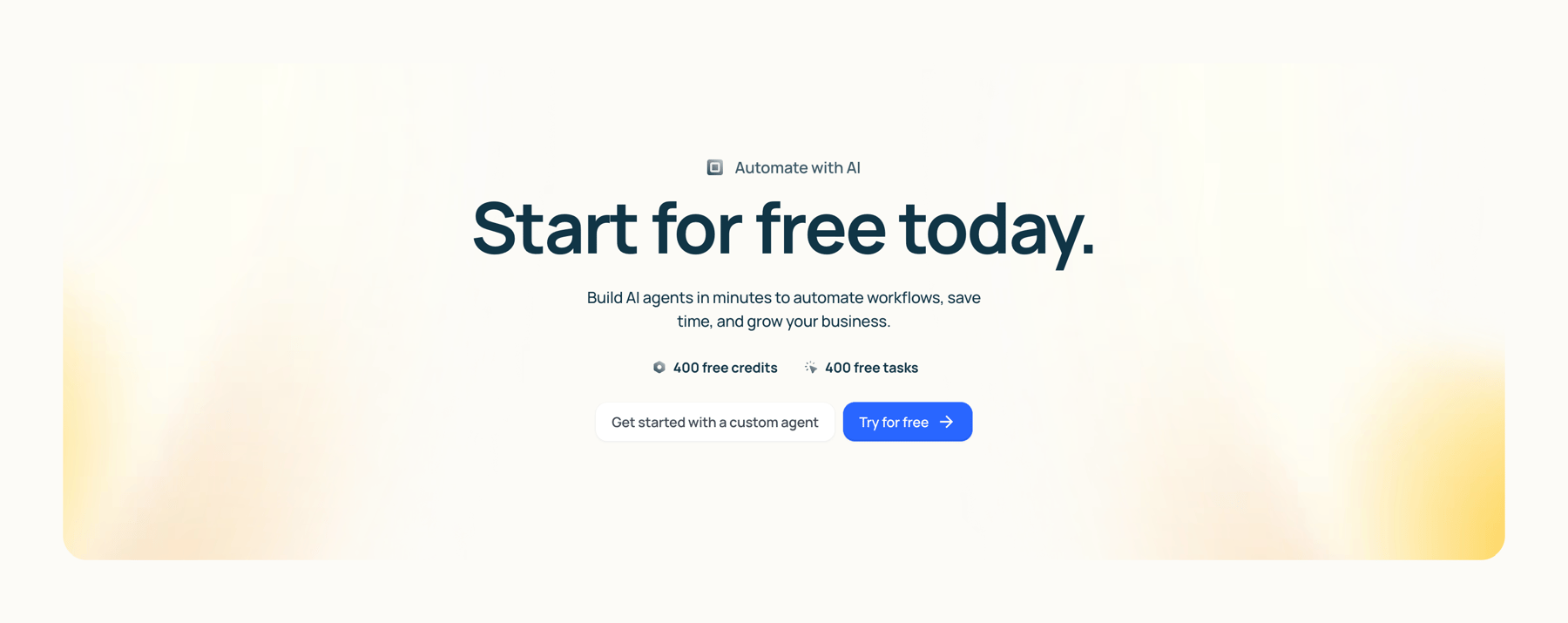

A call-to-action section with a headline, subheadline, feature badges, and two buttons on a soft gradient background.
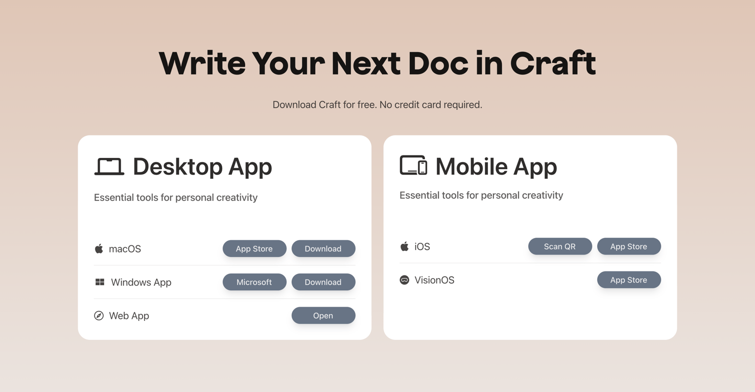

A section presenting download options for desktop and mobile apps. It features a prominent headline and two large cards detailing availability across various platforms like macOS, Windows, iOS, and VisionOS, with corresponding download or app store buttons.
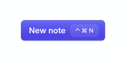

A primary action button labeled 'New note' with a visible keyboard shortcut.
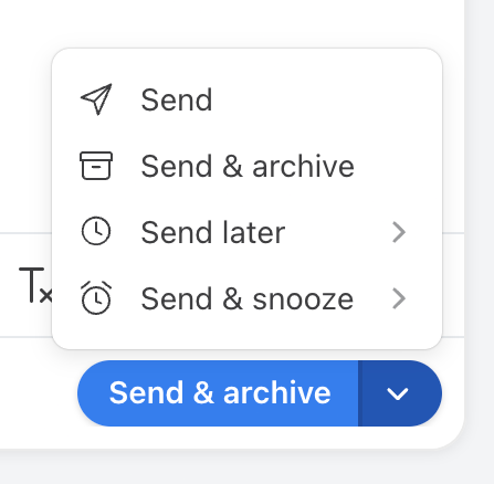

A split button showing 'Send & archive' as the primary action, with an open dropdown menu revealing additional sending options like 'Send', 'Send later', and 'Send & snooze'.
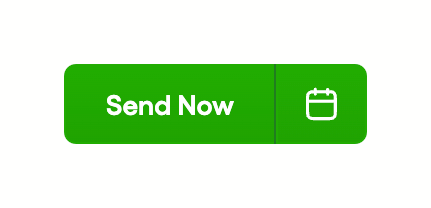

A green split button with a primary 'Send Now' action and a secondary calendar icon action.
A full-width outlined button labeled Login.
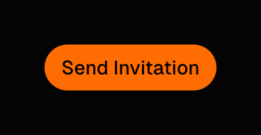
A pill-shaped, filled button labeled 'Send Invitation' with a bright orange background and black text.

A button with rounded corners and text
Browse the full component library
See 104 more Components.
Trusted by the best teams








About Button
Explore how interfaces make actions visible and distinguish their importance. Look at button labels, icons, and visual states in the context of the task they support.