
Front UI components examples
Browse Front UI component design examples. Preview individual interface elements and explore related component categories. Email redesigned for teams
Explore the examples
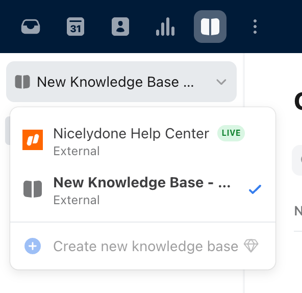
A dropdown menu used to switch between different knowledge bases. It shows the currently selected knowledge base, a list of available knowledge bases with their status, and an option to create a new one.
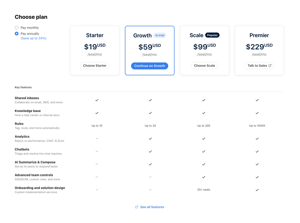
A comprehensive pricing section featuring a toggle for monthly/annual billing, four distinct plan cards (Starter, Growth, Scale, Premier), and a detailed feature comparison table below. The 'Growth' plan is highlighted as the current trial, and 'Scale' is marked as popular.
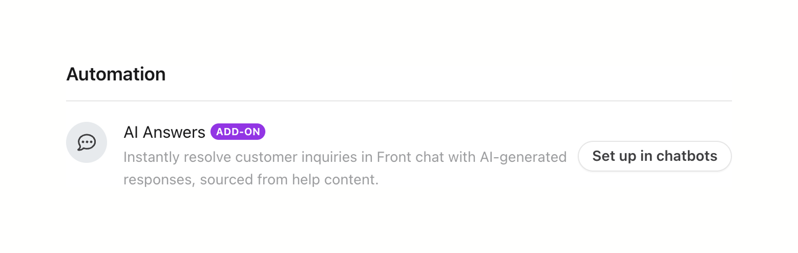
The screenshot displays an automation feature for resolving customer inquiries in front chat using AI-generated responses.
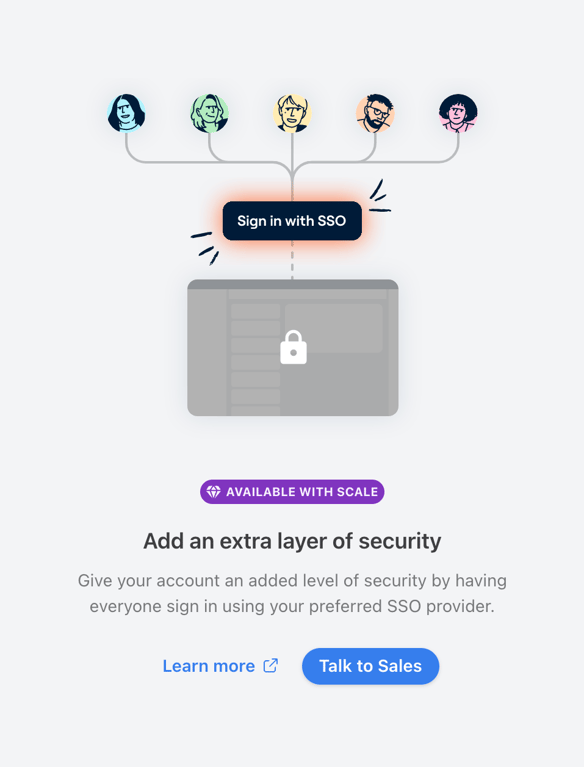
A feature gate empty state prompting the user to upgrade to the Scale plan to enable Single Sign-On (SSO). It features a custom illustration, a plan badge, a title, a descriptive paragraph, and two call-to-action buttons.
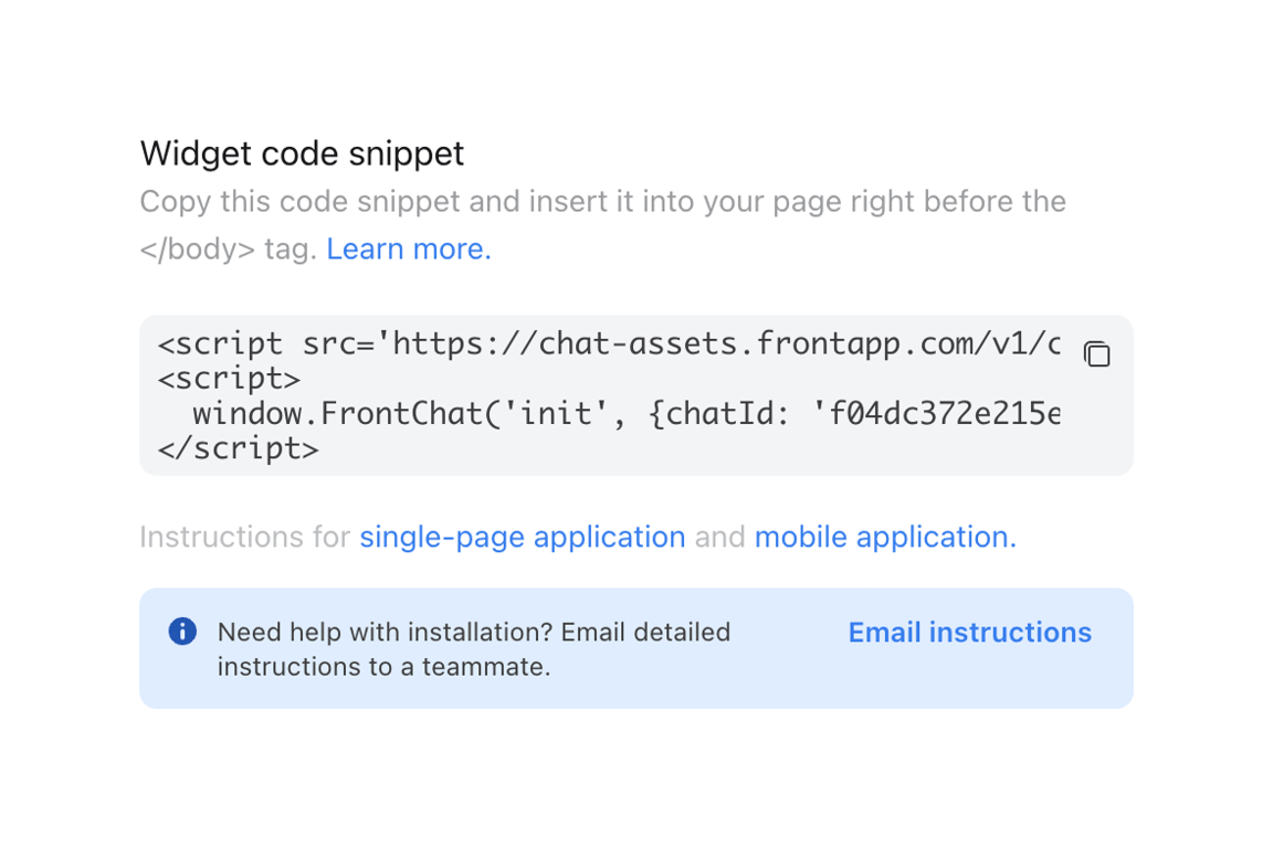
A section displaying a code snippet for a chat widget, complete with instructions, a copy button, and an alert box offering to email the instructions.

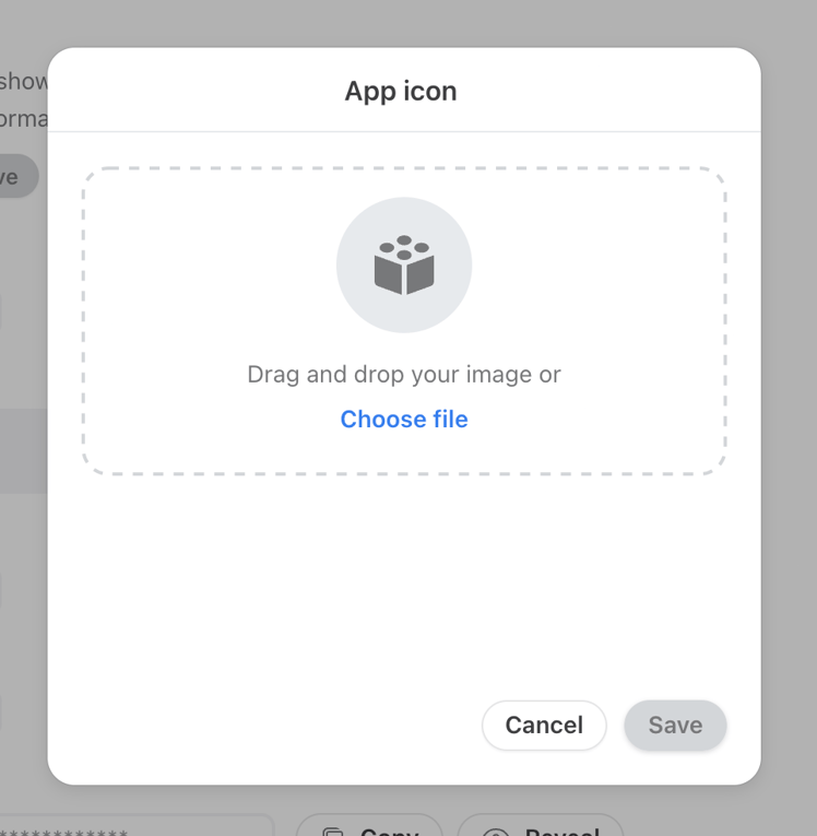
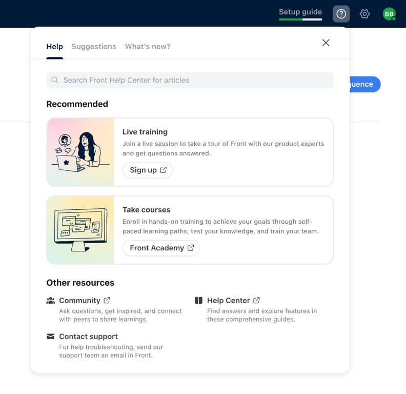
A help menu popover containing tabs for Help, Suggestions, and What's new. The active Help tab features a search bar, recommended training cards with illustrations, and links to other resources like the community and help center.
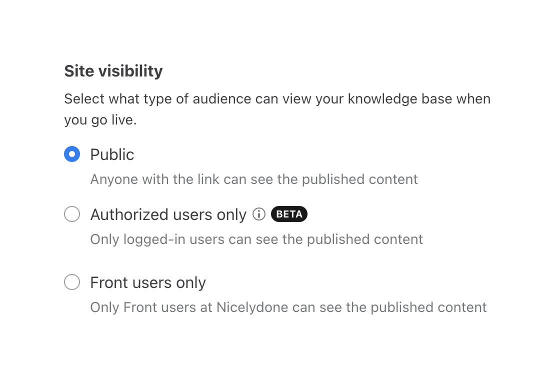
A radio group for selecting site visibility settings, with a title, description, and three options. Each option includes a label and helper text. The second option includes an info icon and a beta badge.
Similar components
Browse the full component library
Browse the full UI component library.
Trusted by the best teams







