Nicelydone | Polar
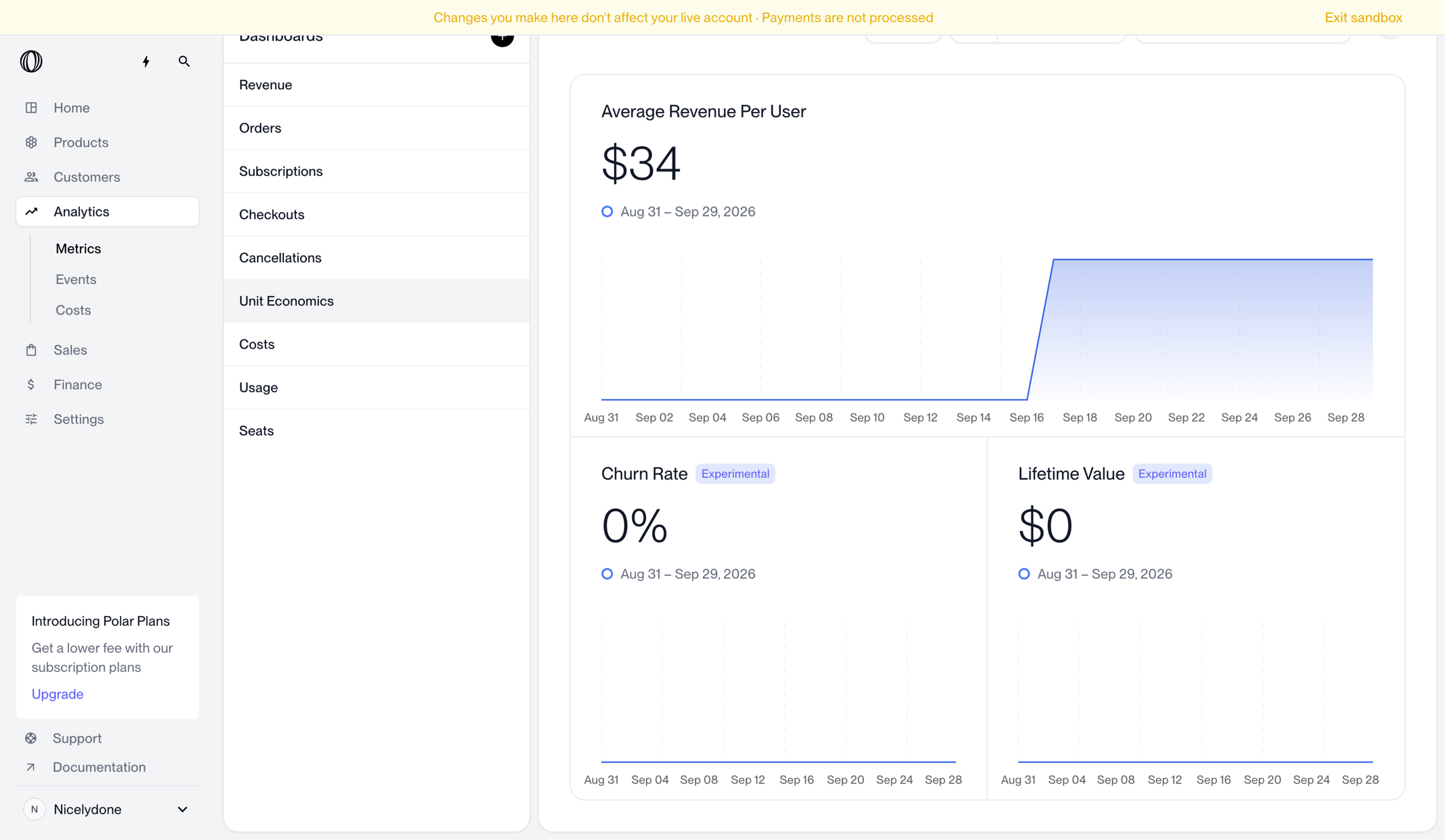
Screen UI design example from Polar. Dashboard where the user views unit economics metrics including average revenue per user, churn rate, and lifetime value over a selected date range.

Similar screens
Loading similar screens
Explore the full SaaS screen library
Upgrade to unlock the full library.
Trusted by the best teams