Theme selector toggle group
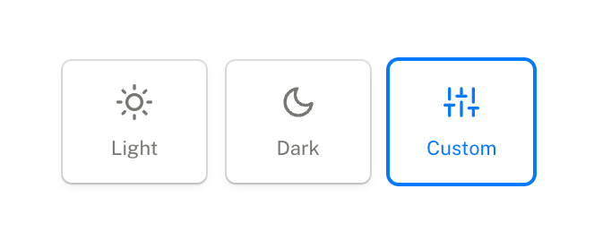
A horizontal row of three large, square toggle buttons for selecting a theme: Light, Dark, and Custom. The Custom option is currently selected, indicated by a blue border and blue text/icon.
Explore the examples

A horizontal row of three large, square toggle buttons for selecting a theme: Light, Dark, and Custom. The Custom option is currently selected, indicated by a blue border and blue text/icon.
Browse the full component library
Browse the full UI component library.
Trusted by the best teams







