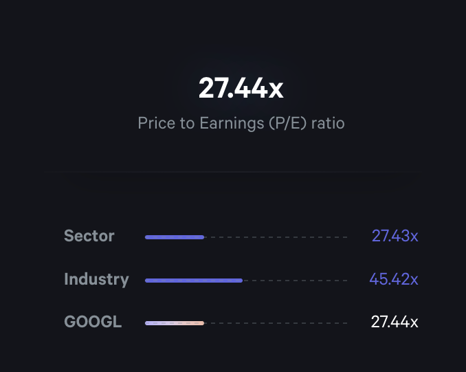
P/E Ratio Comparison Chart
A financial data visualization showing a primary metric (Price to Earnings ratio) at the top, followed by a horizontal bar chart comparing the stock's P/E ratio against its sector and industry averages.
Explore the examples

Browse the full component library
Browse the full UI component library.
Trusted by the best teams