Featured Articles Grid
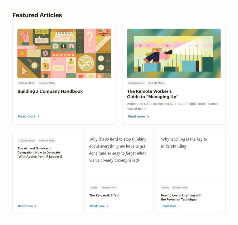
A grid layout displaying featured articles. The top row contains two large cards with cover images, tags, titles, and descriptions. The bottom row contains three smaller cards with text-only content, tags, and titles. All cards include a 'Read more' link.
Explore the examples

Browse the full component library
Browse the full UI component library.
Trusted by the best teams







