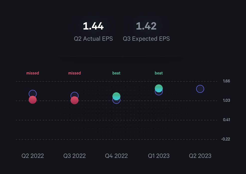
EPS Performance Chart
A scatter plot chart comparing actual vs expected Earnings Per Share (EPS) over several quarters. The chart uses colored dots to indicate whether the actual EPS 'missed' or 'beat' expectations, with a summary at the top showing the most recent actual and expected EPS figures.
Explore the examples

Browse the full component library
Browse the full UI component library.
Trusted by the best teams