Skip to content

Whop UI components examples

Browse Whop UI component design examples. Preview individual interface elements and explore related component categories. Where the internet does business

Explore the examples
Whop — Dropdown menu component
Whop logo
Whop

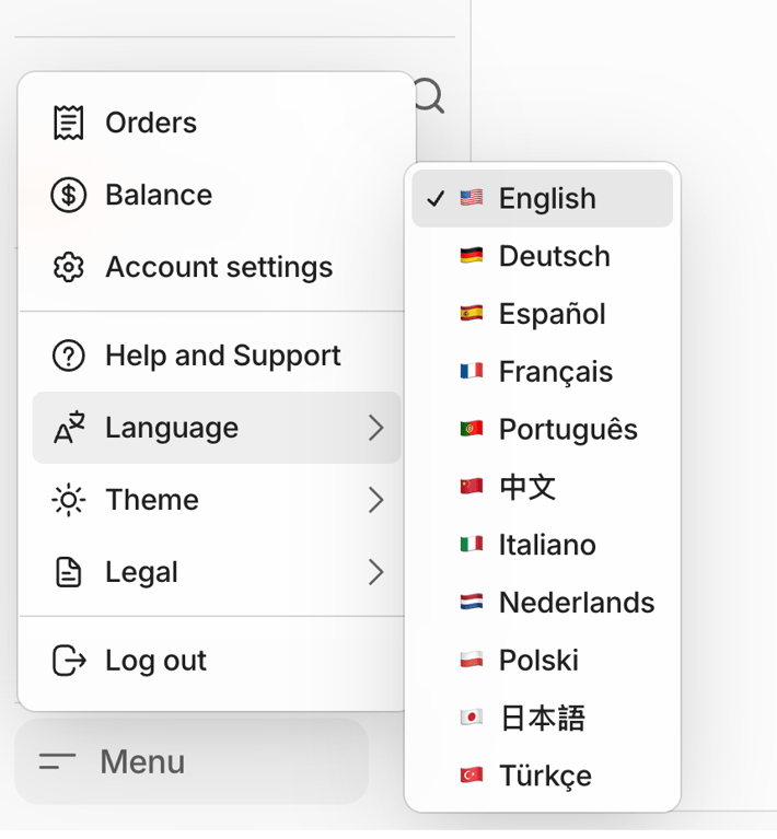
A user interface displaying a navigation menu with a nested language selection dropdown.
Whop — Dropdown menu component
Whop logo
Whop

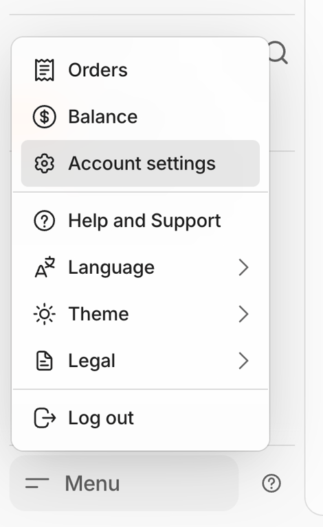
A popover menu displaying various account-related options and settings.

Whop — Progress indicator component
Whop logo
Whop

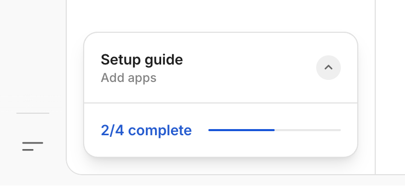
A card displaying a setup guide with a progress indicator for onboarding.

Whop — Message component
Whop logo
Whop

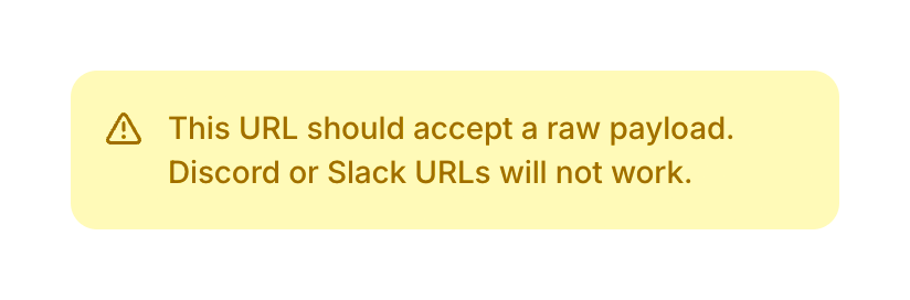
A warning message indicating that certain URLs (Discord or Slack) are not compatible with raw payloads.

Whop — Table component
Whop logo
Whop

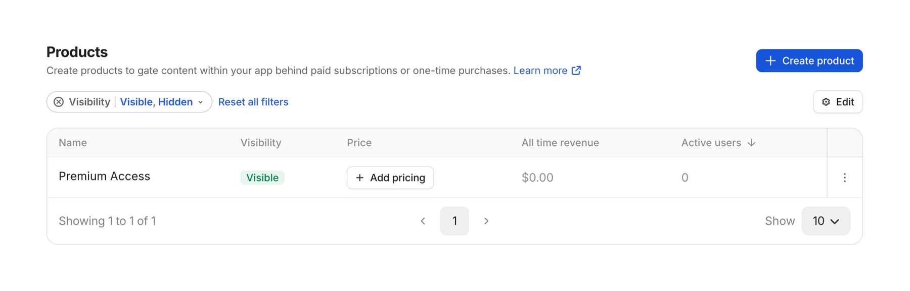
A dashboard interface displaying a list of products with their attributes, including visibility, pricing, revenue, and active users, alongside options for product creation, editing, and data filtering.

Whop — Click to copy component
Whop logo
Whop

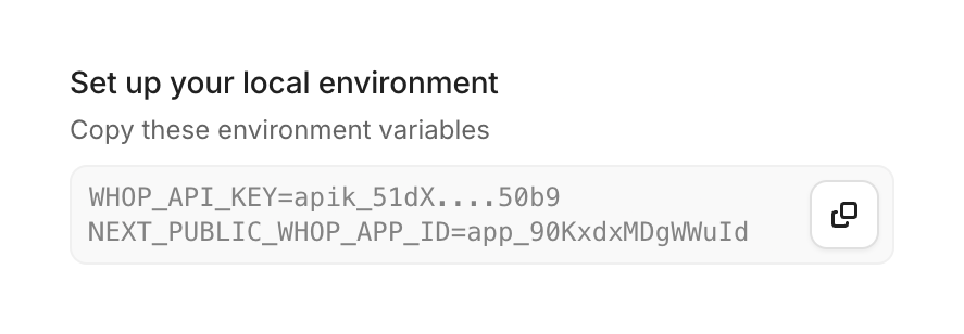
User interface for setting up a local environment by copying environment variables.
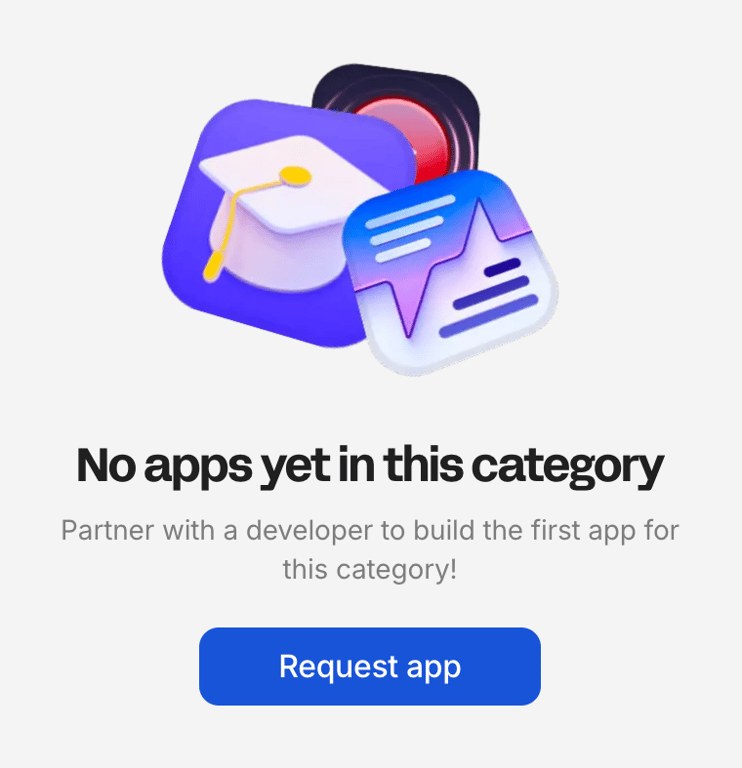
Whop — Empty state component
Whop logo
Whop

An empty state message for an app category, prompting the user to request an app.

Whop — Toggle/Switch component
Whop logo
Whop

A header with device preview toggles for a store page.

Whop — Sorting & filtering component
Whop logo
Whop

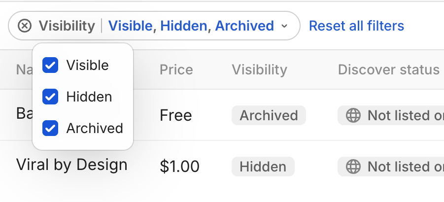
A user interface displaying a table with filter options, including an open dropdown menu for visibility status with multiple selected checkboxes.
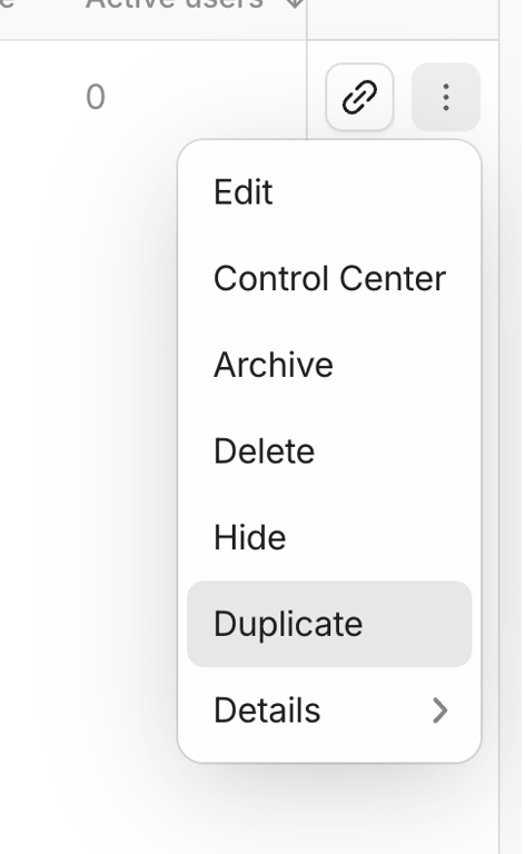
Whop — Dropdown menu component
Whop logo
Whop

A dropdown menu displaying a list of actions for an item, including edit, control center, archive, delete, hide, duplicate, and details, with a hover state on 'Duplicate'.
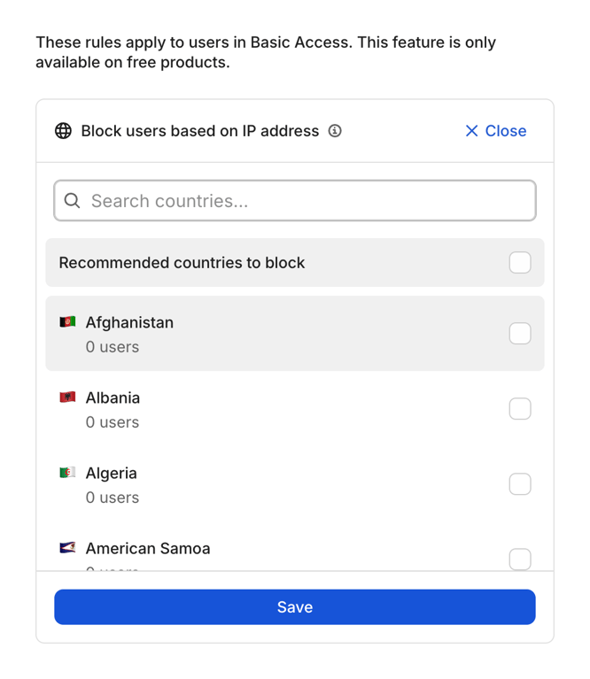
Browse the full component library

Browse the full UI component library.

Trusted by the best teams