Skip to content

Slack UI components examples

Browse Slack UI component design examples. Preview individual interface elements and explore related component categories. Be less busy

Explore the examples
Slack — Dropdown menu component
Slack logo
Slack

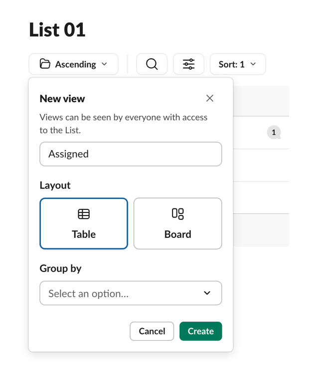
A popover form for creating a new view in a list. It includes a text input for the view name, a radio group styled as cards to select the layout (Table or Board), a dropdown to select a grouping option, and action buttons to cancel or create the view.
Slack — Table component
Slack logo
Slack

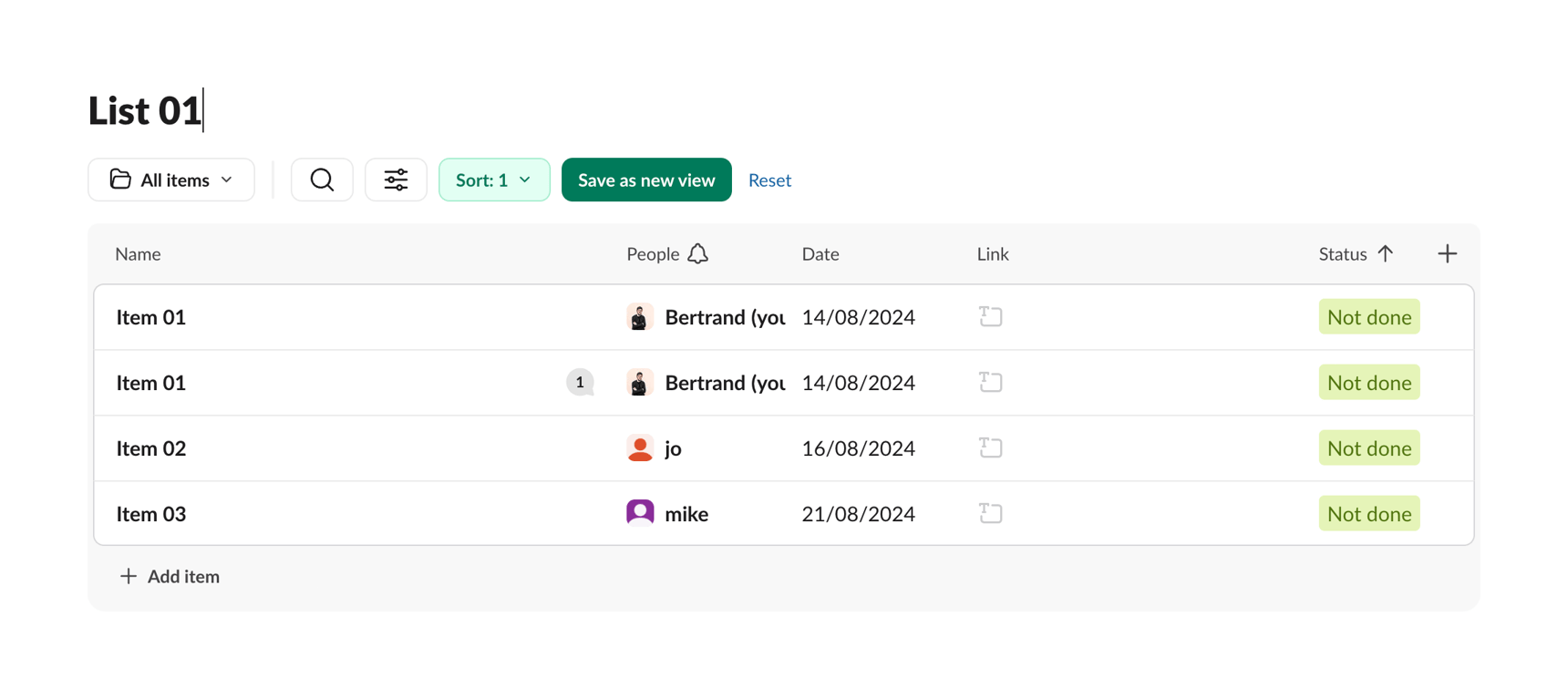
A list of items with people, date, link and status information.

Slack — Message component
Slack logo
Slack

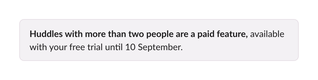
A simple alert box informing the user that the feature they are using is a paid feature, currently available during their free trial until a specific date.

Slack — Query builder component
Slack logo
Slack

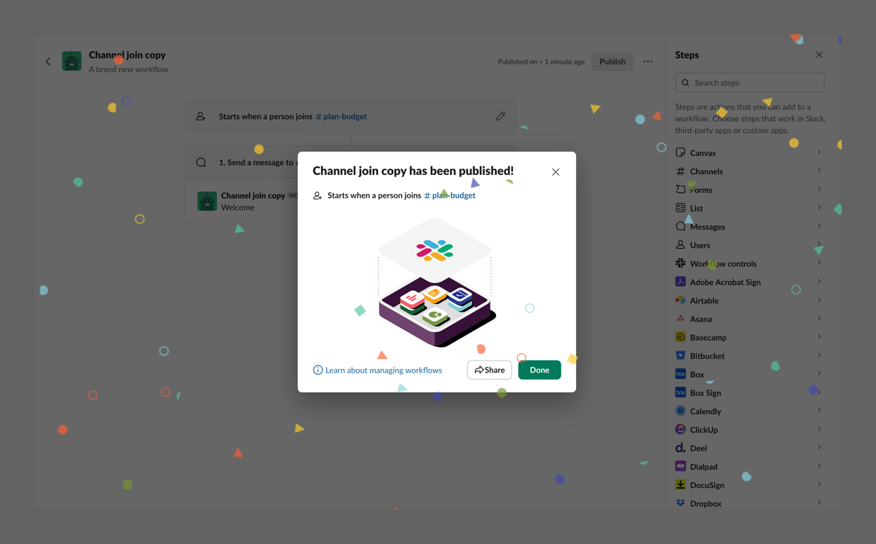
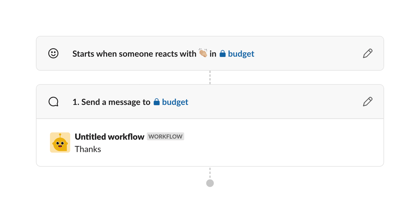
A workflow automation interface.

Slack — Progress indicator component
Slack logo
Slack

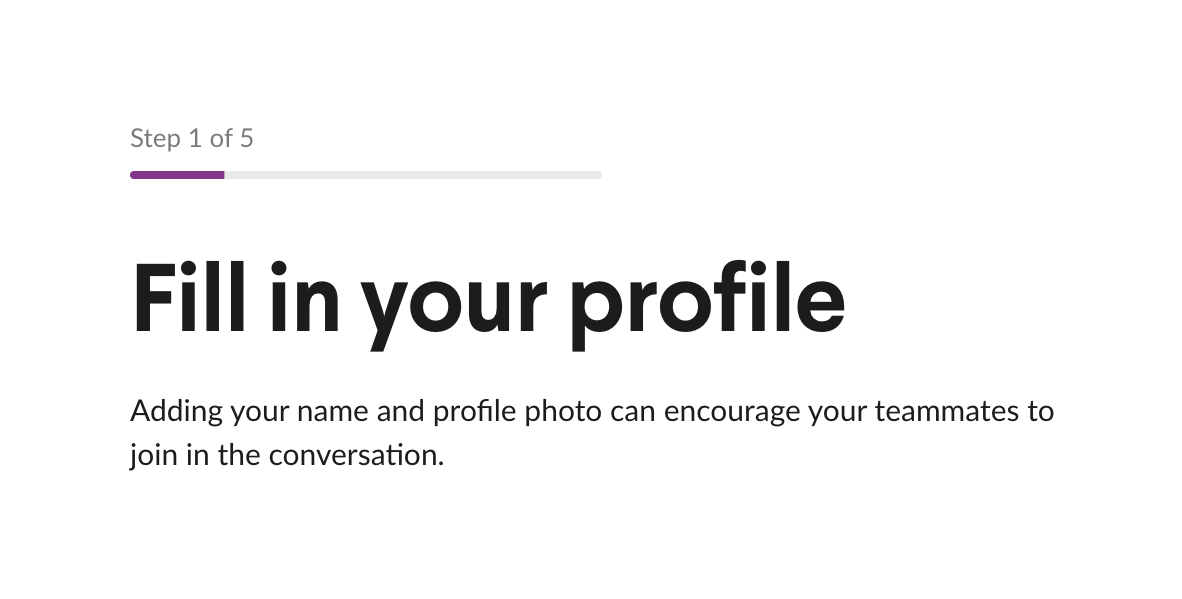
A header section for an onboarding flow, displaying the current step number, a progress bar, a main title, and a brief explanatory description.
Slack — Stepper component
Slack logo
Slack

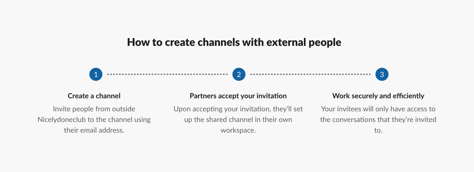
A three-step horizontal informational stepper explaining a process. Each step features a numbered blue circle, a bold title, and a descriptive paragraph, connected by a dashed line.

Slack — Table component
Slack logo
Slack

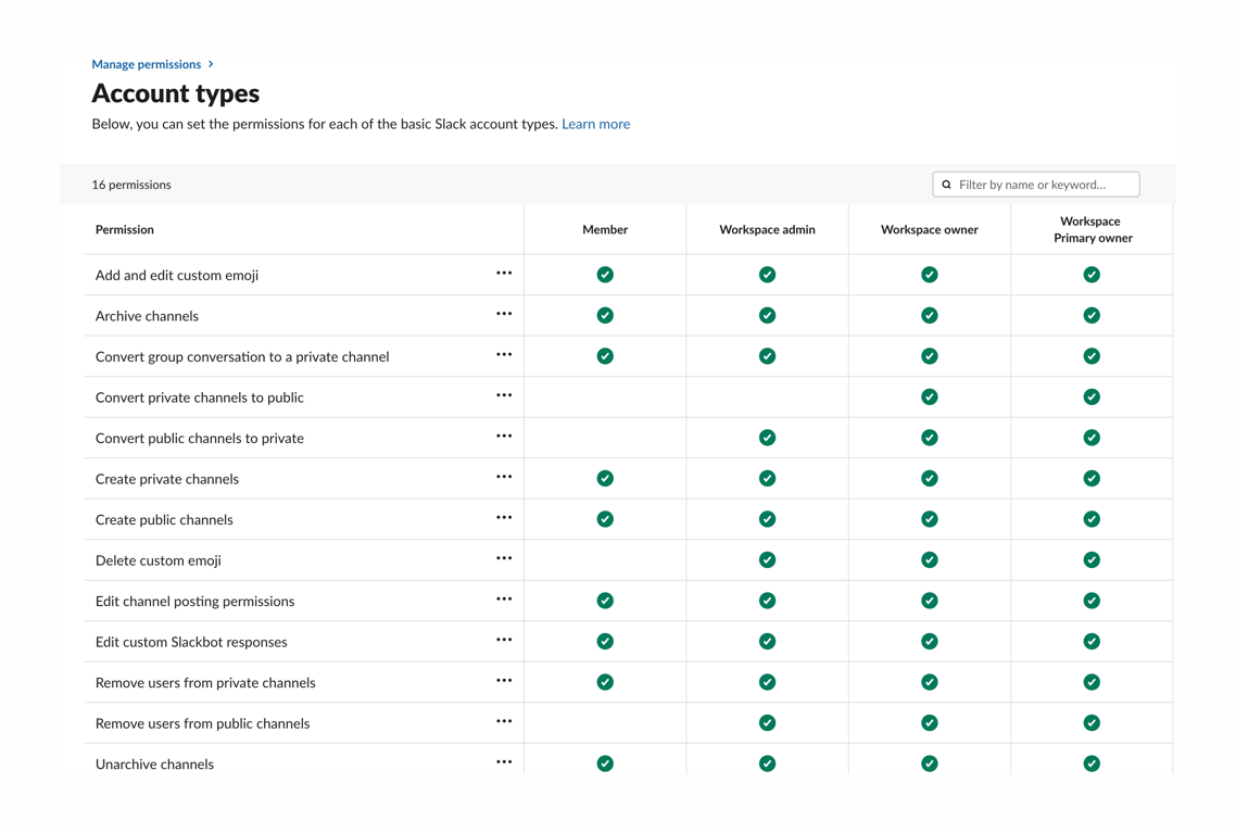
A table displaying account permissions for different user roles.

Slack — Charts component
Slack logo
Slack

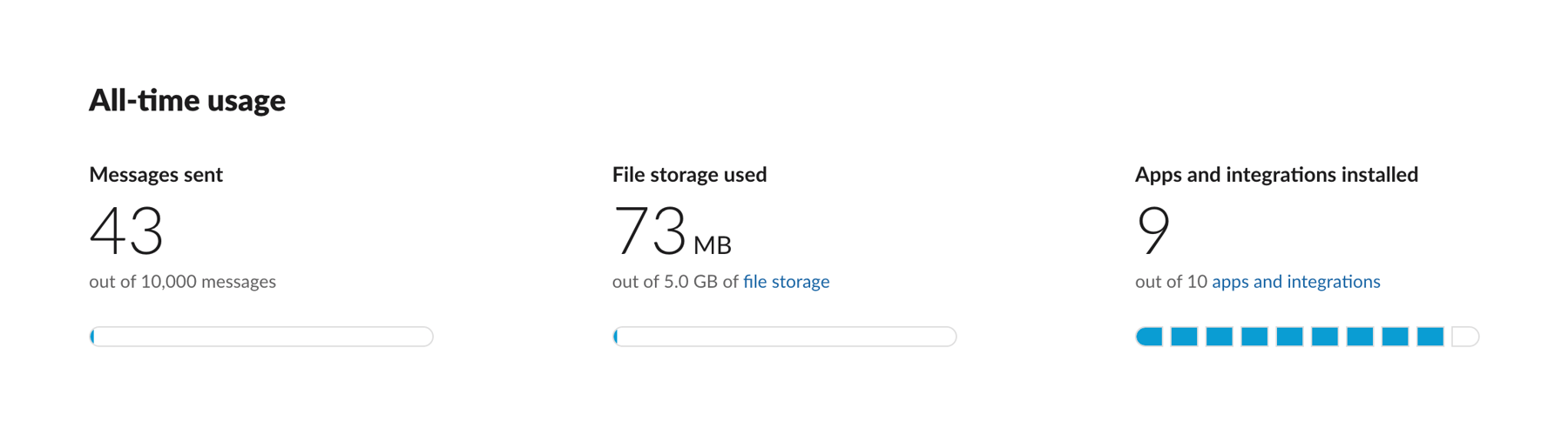
A row of three key performance indicators (KPIs) showing all-time usage metrics. Each KPI includes a title, a large numeric value, a descriptive subtext with a link, and a segmented progress bar indicating usage against a limit.

Slack — Tabs component
Slack logo
Slack

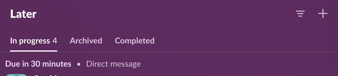
A header section featuring a title, action icons, and a tabbed navigation bar for filtering content by status.

Browse the full component library

Browse the full UI component library.

Trusted by the best teams