ServiceBell UI components examples
Browse ServiceBell UI component design examples. Preview individual interface elements and explore related component categories. Add live human connection to your website
Explore the examples
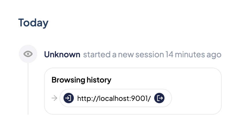

A timeline component showing a visitor's session activity, including the start time and a nested card displaying their browsing history with a specific URL.

A segmented control with two options: Overview and Live Session. The Live Session option is currently selected and features a green cursor icon.
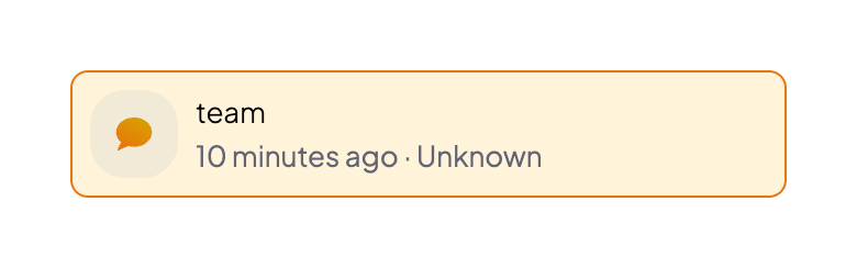
A small notification toast displaying a message from a team, along with a timestamp and sender information.
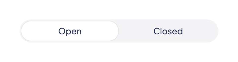
A segmented control with two options: Open and Closed. The 'Open' option is currently selected.

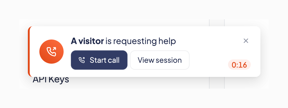
A notification toast alerting the user that a visitor is requesting help, with options to start a call or view the session.
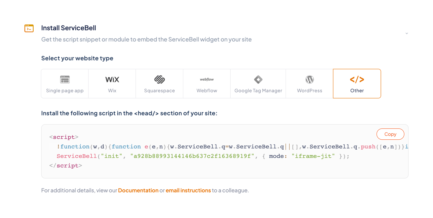
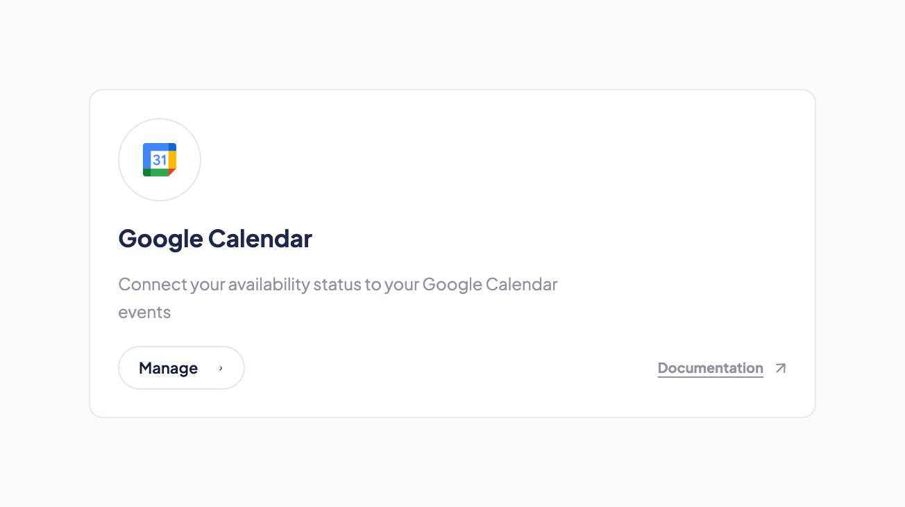
A card component displaying an integration option for Google Calendar. It includes the service logo, title, description, a 'Manage' button, and a link to documentation.
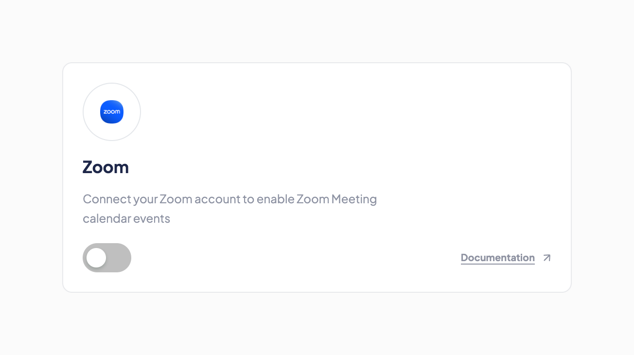
A card component for managing a third-party integration, featuring a logo, title, description, a toggle switch to enable/disable, and a link to documentation.
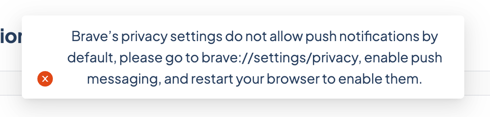
A toast notification displaying an error message about browser privacy settings blocking push notifications.
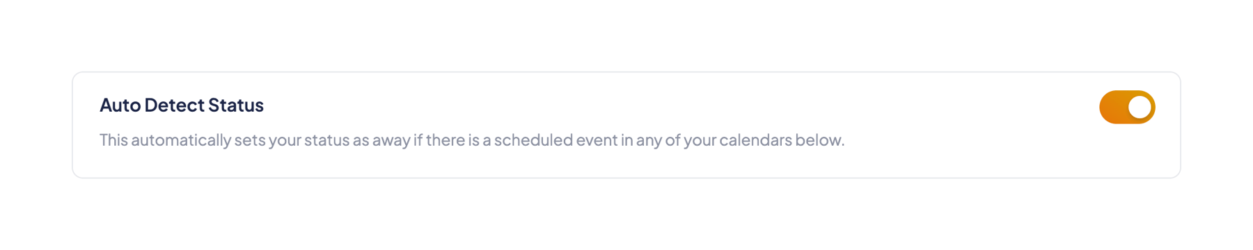
A card containing a setting title, a descriptive subtitle, and a toggle switch to enable or disable the feature.
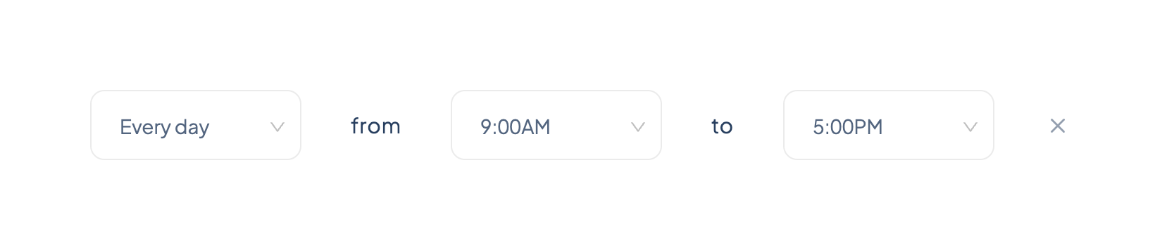
A horizontal row of dropdowns used to select a recurring day and a time range, separated by text labels.
Browse the full component library
Browse the full UI component library.
Trusted by the best teams







