Qatalog UI components examples
Browse Qatalog UI component design examples. Preview individual interface elements and explore related component categories. AI that works with your data
Explore the examples
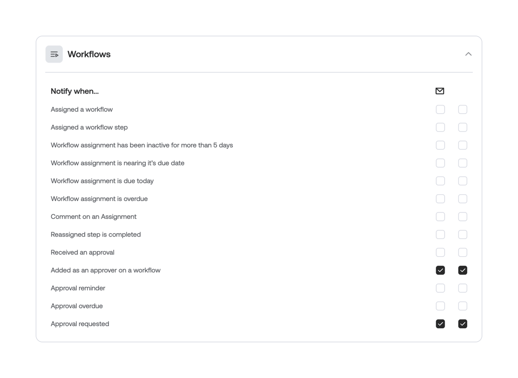

An expanded accordion section for configuring workflow notification preferences. It displays a list of events with two columns of checkboxes, likely representing different notification channels like email and in-app.
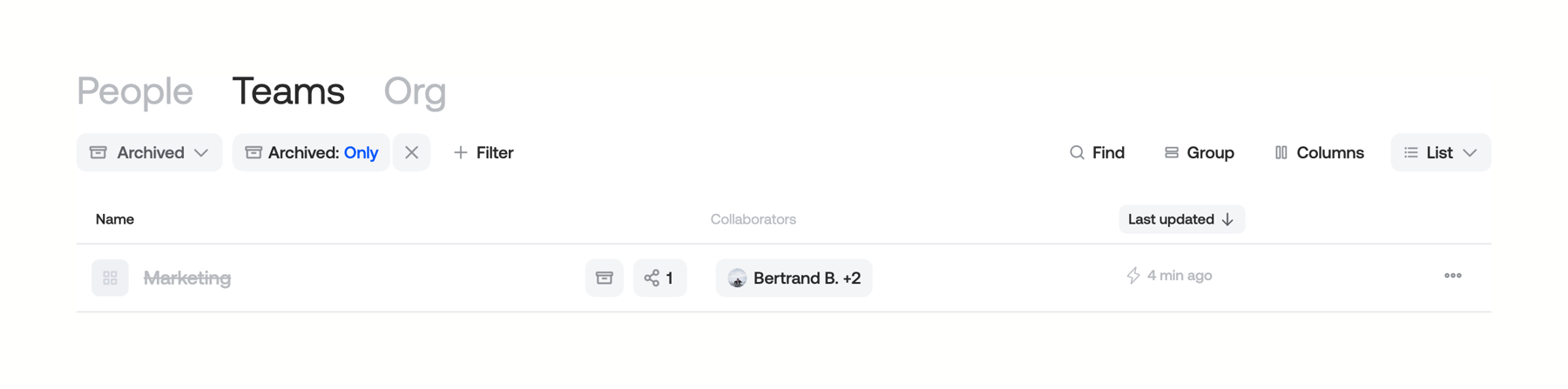
A directory list view showing teams, with active filters applied for archived items. Includes a toolbar for filtering, finding, grouping, and adjusting columns, followed by a table header and a single list item representing an archived team.

A horizontal settings row featuring a title, a descriptive subtitle, and a toggle switch on the right side. The toggle is currently in the active (on) state.

A settings row featuring a title, descriptive text, and a segmented control to select a time frequency.
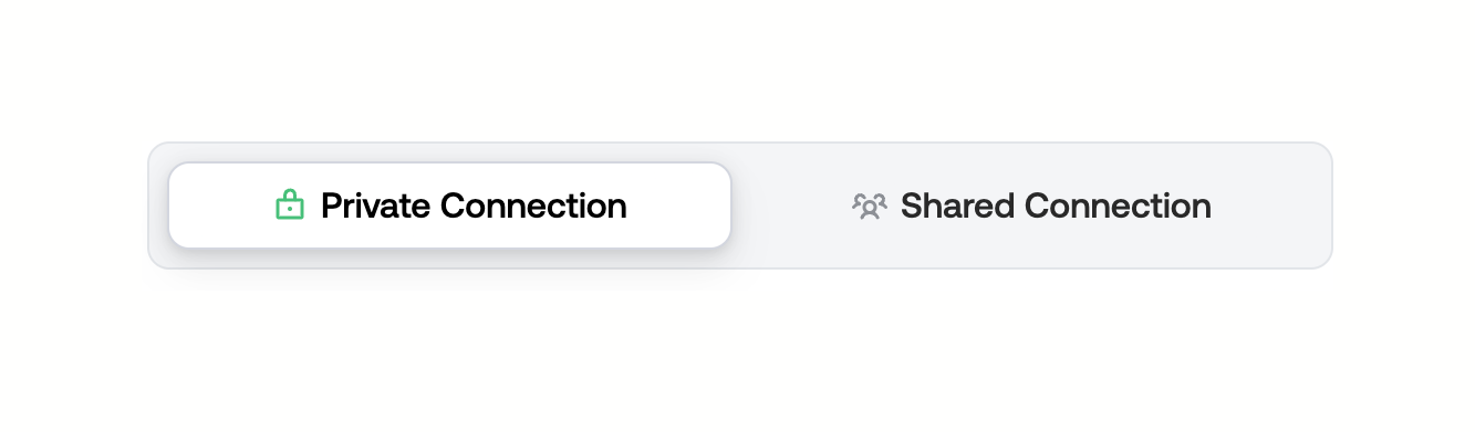
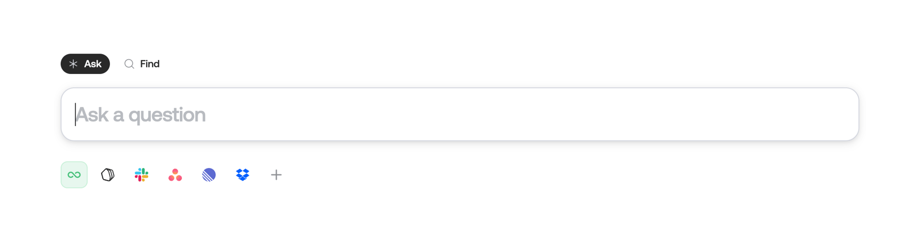
A large search input field with mode toggles for 'Ask' and 'Find' positioned above it, and a row of connected app icons below it indicating data sources.
Browse the full component library
Browse the full UI component library.
Trusted by the best teams







