Skip to content

Pipe UI components examples

Browse Pipe UI component design examples. Preview individual interface elements and explore related component categories. The modern capital platform

Explore the examples
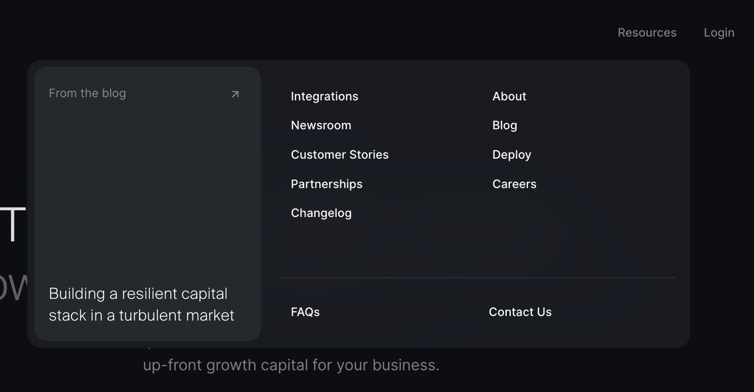
Pipe — Flyout menu component
Pipe logo
Pipe

A large dropdown menu showing resources, company links, and a featured blog post.

Pipe — Hero section component
Pipe logo
Pipe

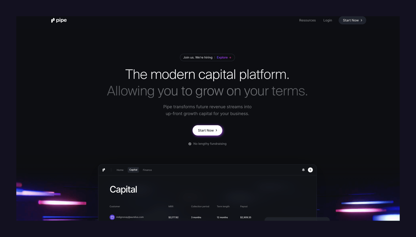
A dark-themed hero section featuring a centered headline, subheadline, and a primary call-to-action button. It includes a top navigation bar with a logo and links, and a mockup of a product interface at the bottom.
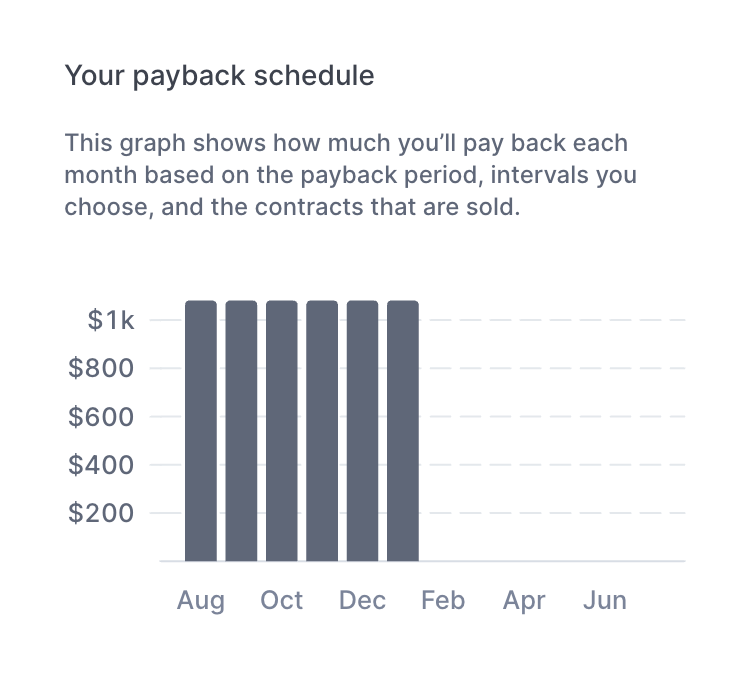
Pipe — Charts component
Pipe logo
Pipe

A bar chart showing a payback schedule over several months, with a title and explanatory text above it.

Pipe — Card component
Pipe logo
Pipe

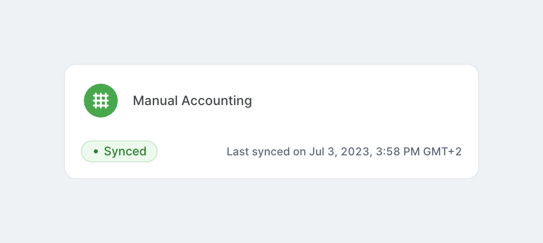
A card displaying the status of a connected data source, showing the source name, a status badge indicating it is synced, and a timestamp of the last sync.

Pipe — Toggle/Switch component
Pipe logo
Pipe

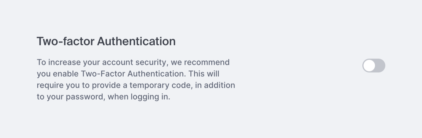
A settings row with a title, descriptive text, and a toggle switch to enable or disable two-factor authentication.
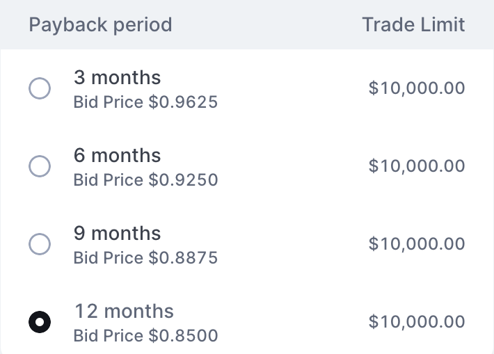
Pipe — Checkbox & radio component
Pipe logo
Pipe

A radio group presenting four payback period options (3, 6, 9, and 12 months) with associated bid prices and trade limits. The 12-month option is currently selected.

Pipe — Charts component
Pipe logo
Pipe

A widget displaying payment statistics with a title, two KPI columns for 'Total paid' and 'Total remaining', and a segmented progress bar showing zero activity.

Pipe — Charts component
Pipe logo
Pipe

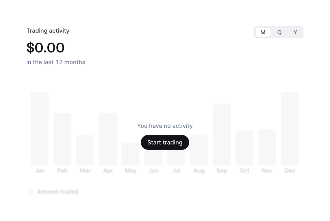
An empty state for a trading activity bar chart. It displays a zero balance, a time range toggle, and a faded background chart with a prompt and button to start trading.

Pipe — Slider component
Pipe logo
Pipe

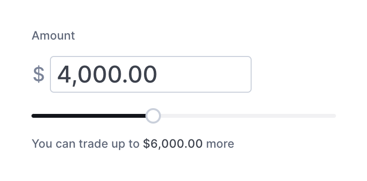
A composite control allowing users to set a monetary amount using either a text input field or a horizontal slider. It includes a label, a currency symbol prefix, and helper text indicating the remaining available amount.

Pipe — Accordion component
Pipe logo
Pipe

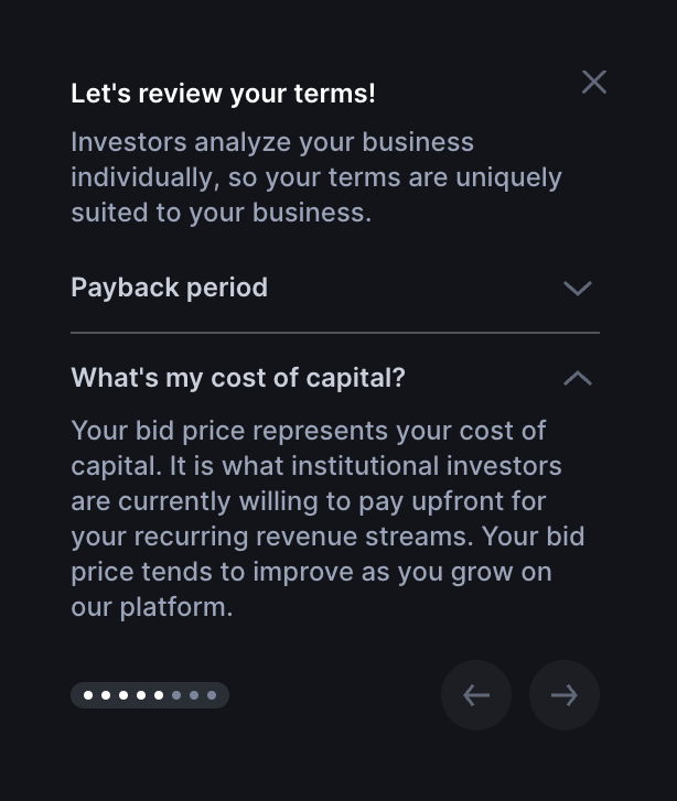
A dark-themed popover explaining terms, featuring a title, description, an accordion for FAQs, and pagination controls with previous/next buttons.

Pipe — Progress indicator component
Pipe logo
Pipe

A dark-themed popover explaining how capital access is determined, featuring a close icon, descriptive text, a dot pagination indicator showing progress through the tour, and a next arrow button.

Pipe — Avatar component
Pipe logo
Pipe

A user profile block displaying an avatar, user name, and company name.

Browse the full component library

Browse the full UI component library.

Trusted by the best teams