Perplexity UI components examples
Browse Perplexity UI component design examples. Preview individual interface elements and explore related component categories. World's first conversational answer engine and research companion
Explore the examples
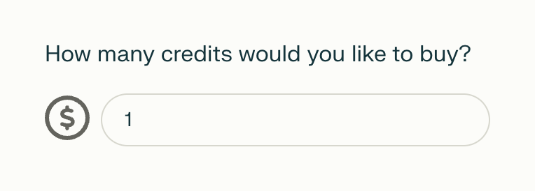

A numeric input field for purchasing API credits, featuring a dollar sign icon and a question prompt.

A page header for a Settings section, featuring a large title on the left and a horizontal tab navigation menu on the right. The 'Account' tab is currently active, indicated by a dark underline and darker text color.
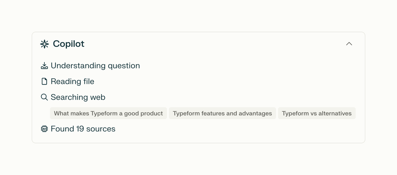
An expanded card displaying the sequential steps taken by an AI Copilot during a search query, including understanding the question, reading files, searching the web with specific queries, and finding sources.
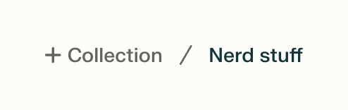
A simple breadcrumb navigation showing a 'Collection' link with a plus icon, followed by a slash separator and the current page title 'Nerd stuff'.
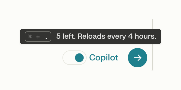
A toggle switch for Copilot mode, accompanied by a tooltip showing usage limits and a keyboard shortcut.
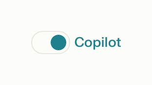
A toggle switch labeled 'Copilot' in an active state, indicated by the teal color of the switch handle and label text.
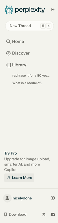
A vertical sidebar navigation menu containing a logo, a 'New Thread' button with a keyboard shortcut, main navigation links, a nested list of recent threads under 'Library', a promotional upgrade section, user profile settings, and footer links for download and social media.
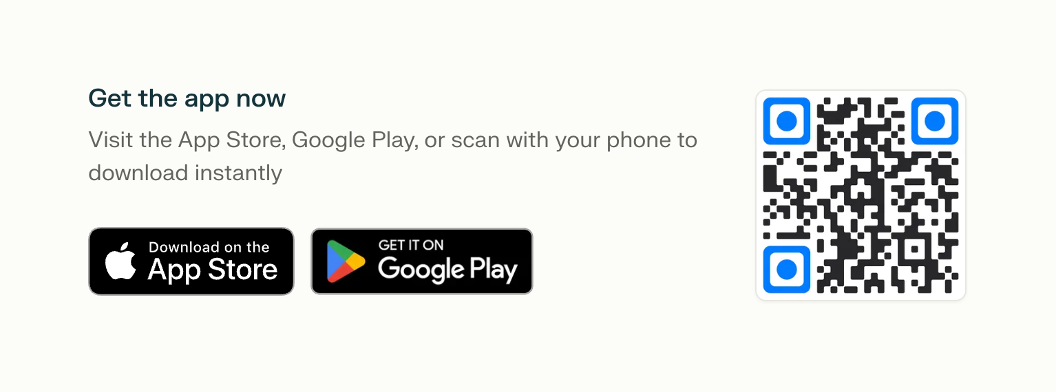
A section prompting users to download the mobile app, featuring a title, description, app store badges, and a QR code.

A header row for an onboarding flow containing a logo, title, step indicator, and a continue button.
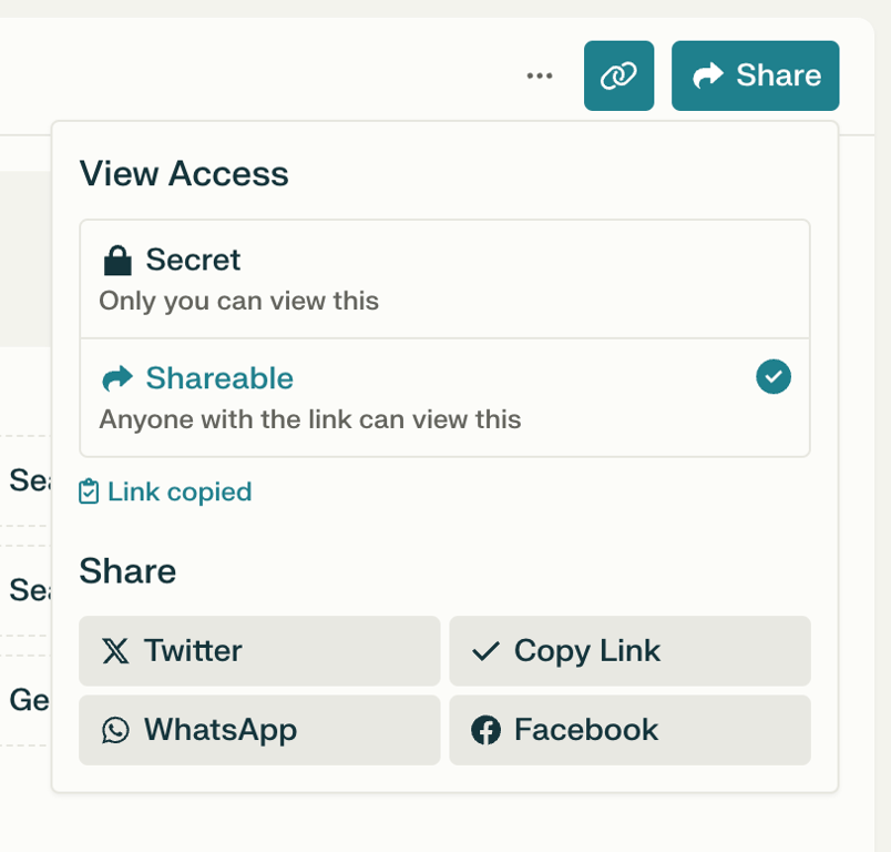
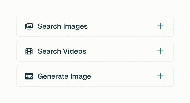
A vertical list of three dashed-border buttons for adding media to a query or response. Options include searching images, searching videos, and generating an image (marked as a Pro feature).
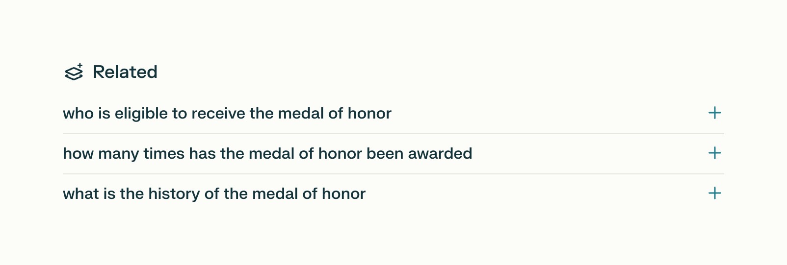
A list of related follow-up questions presented as an accordion. Each item has a plus icon indicating it can be expanded.
Browse the full component library
Browse the full UI component library.
Trusted by the best teams







