Skip to content

Mintlify UI components examples

Browse Mintlify UI component design examples. Preview individual interface elements and explore related component categories. The documentation you want, effortlessly

Explore the examples
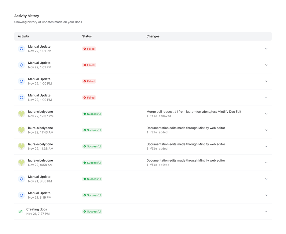
Mintlify — Table component
Mintlify logo
Mintlify

A table displaying a history of updates made to documentation. It includes columns for Activity, Status, and Changes, with rows showing individual updates, their success or failure status, and a chevron to expand for more details.

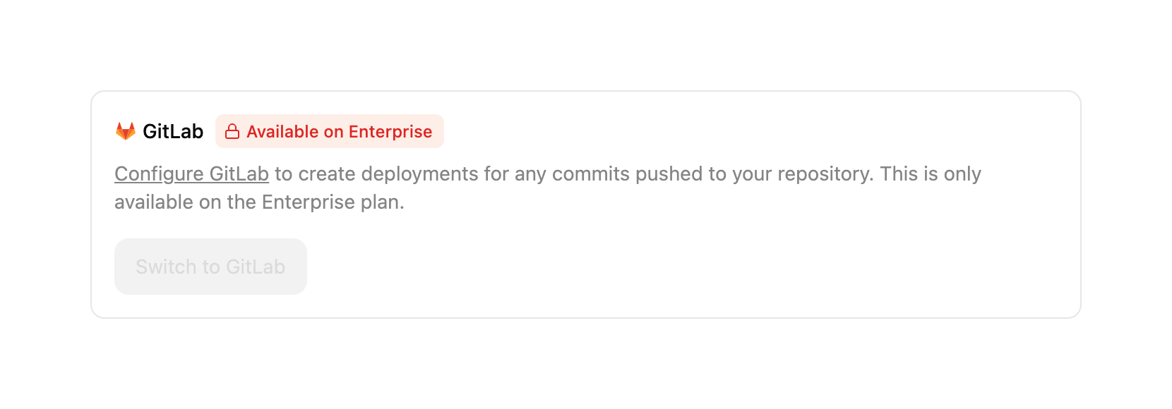
Mintlify — Upgrade your plan component
Mintlify logo
Mintlify

A card component displaying a gated integration option. It includes a title with an icon, a badge indicating it requires an Enterprise plan, descriptive text with a link, and a disabled action button.
Mintlify — Charts component
Mintlify logo
Mintlify

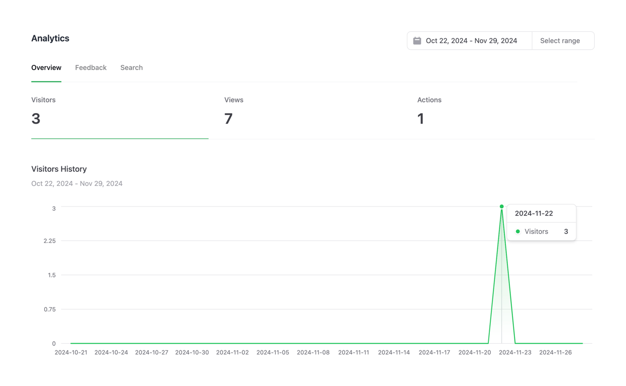
A dashboard view showing key performance indicators and a line chart for visitor history over a selected date range.

Mintlify — Datepicker component
Mintlify logo
Mintlify

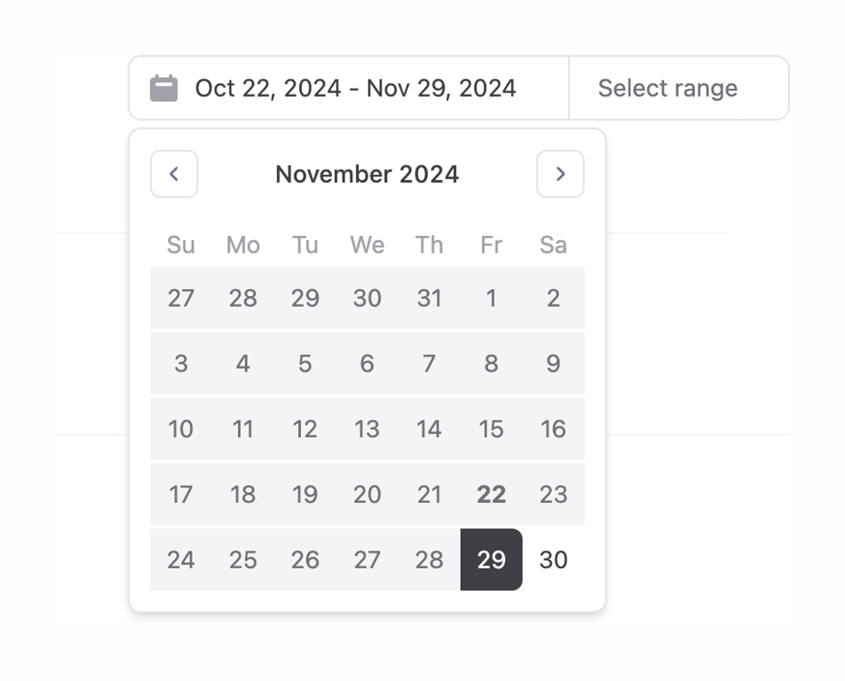
A date range picker component showing an open calendar popover. The trigger input displays the currently selected date range, and the calendar shows the month of November 2024 with a selected end date.
Mintlify — Notification Toast component
Mintlify logo
Mintlify

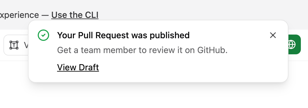
A toast notification indicating a successful pull request publication. It features a green success icon, a title, a brief description, a link to view the draft, and a close button.
Mintlify — Table component
Mintlify logo
Mintlify

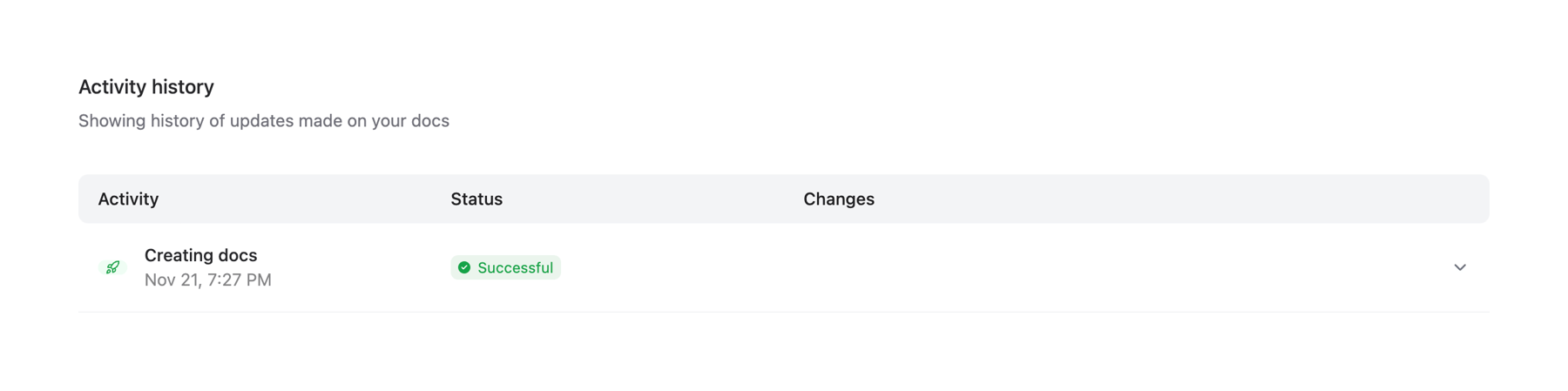
A table displaying a history of updates made to documentation. It includes columns for Activity, Status, and Changes, with a single row showing a successful 'Creating docs' event.

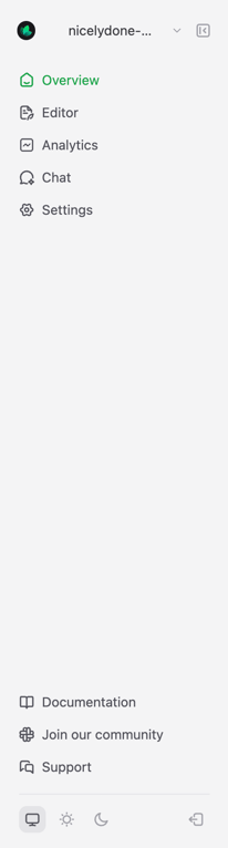
Mintlify — Vertical navigation component
Mintlify logo
Mintlify

A vertical sidebar navigation menu with a project selector at the top, primary navigation links in the middle, and secondary links with theme controls at the bottom.

Mintlify — Message component
Mintlify logo
Mintlify

A horizontal banner alerting the user that their team is on a free trial, providing details about the trial's end date and what happens after, along with a call to action to explore upgrades.

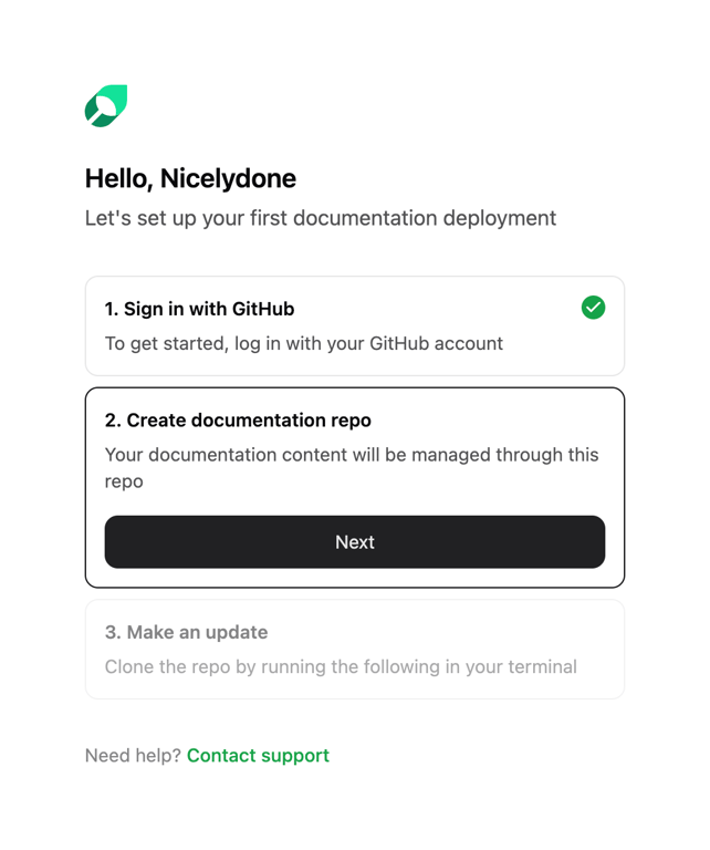
Mintlify — Stepper component
Mintlify logo
Mintlify

A vertical onboarding stepper showing three steps for setting up a documentation deployment. The first step is completed, the second is active with a 'Next' button, and the third is disabled.

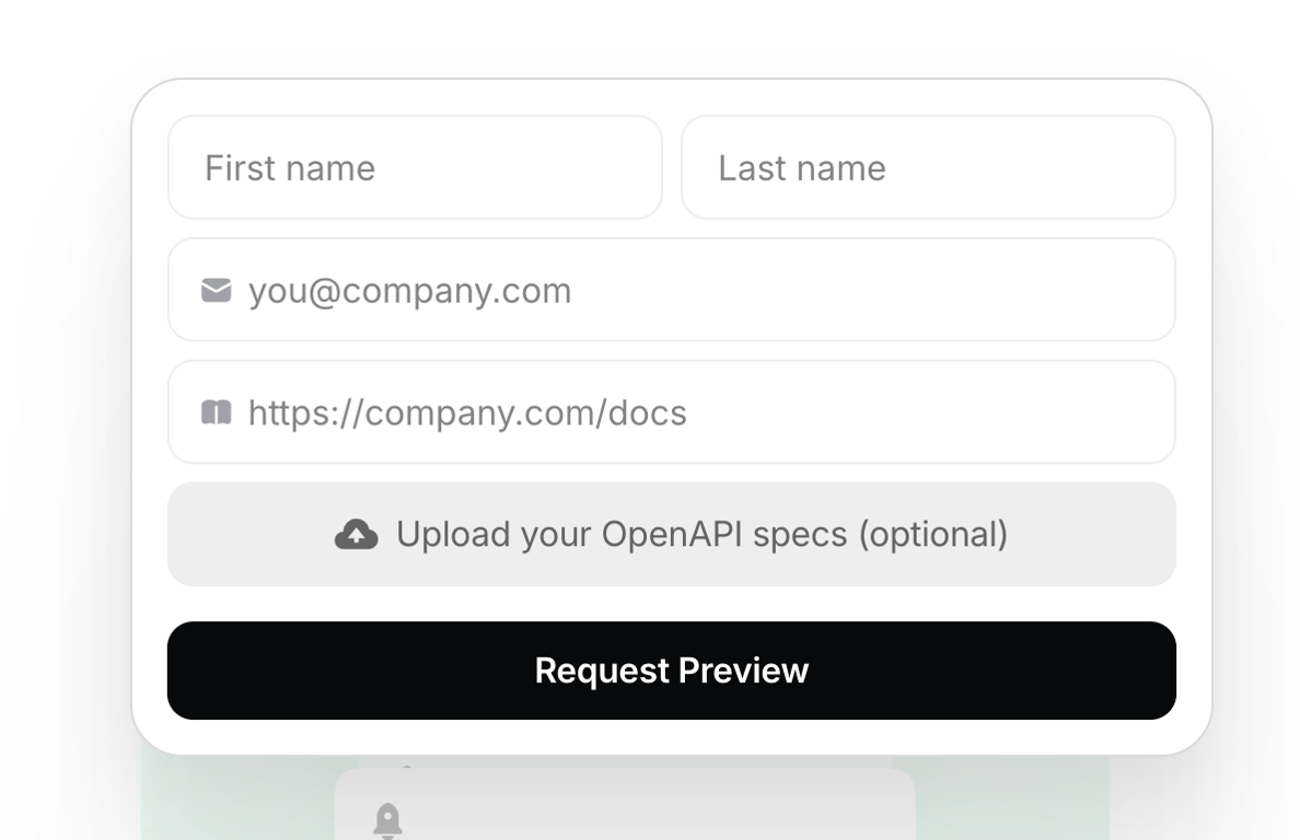
Mintlify — Form element component
Mintlify logo
Mintlify

A form card for requesting a documentation preview. It includes inputs for name, email, and documentation URL, an optional file upload button, and a primary submit button.
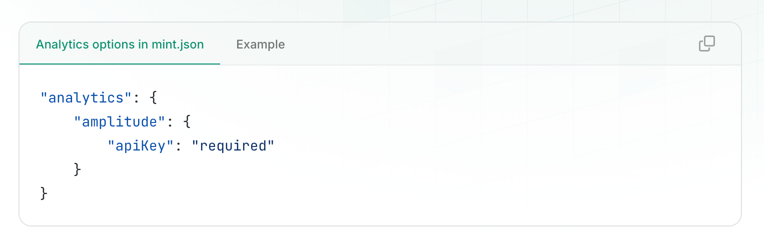
Mintlify — Code block component
Mintlify logo
Mintlify

A code block component with tabs for different code examples or configurations, featuring syntax highlighting and a copy-to-clipboard button.

Browse the full component library

Browse the full UI component library.

Trusted by the best teams