Skip to content

Mercury UI components examples

Browse Mercury UI component design examples. Preview individual interface elements and explore related component categories. Banking for startups

Explore the examples
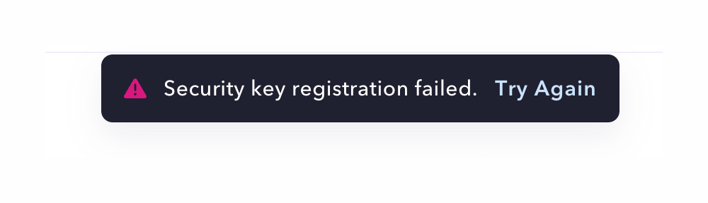
Mercury — Notification Toast component
Mercury logo
Mercury

A dark-themed toast notification displaying an error message with a retry action.
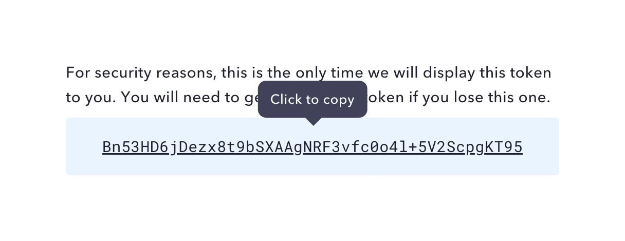
Mercury — Click to copy component
Mercury logo
Mercury

A read-only field displaying a generated API token with a tooltip indicating it can be clicked to copy. A warning message above explains that the token will only be shown once.

Mercury — Table component
Mercury logo
Mercury

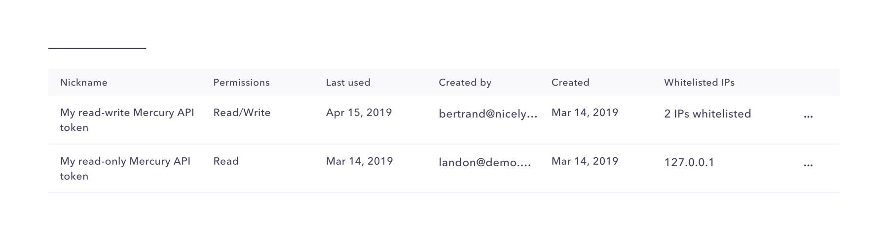
A data table displaying a list of API tokens with columns for Nickname, Permissions, Last used, Created by, Created, and Whitelisted IPs. Each row includes a more options menu icon.

Mercury — Button component
Mercury logo
Mercury

A button to create a new API token, featuring a circular plus icon with a dashed border next to the text label.

Mercury — Datepicker component
Mercury logo
Mercury

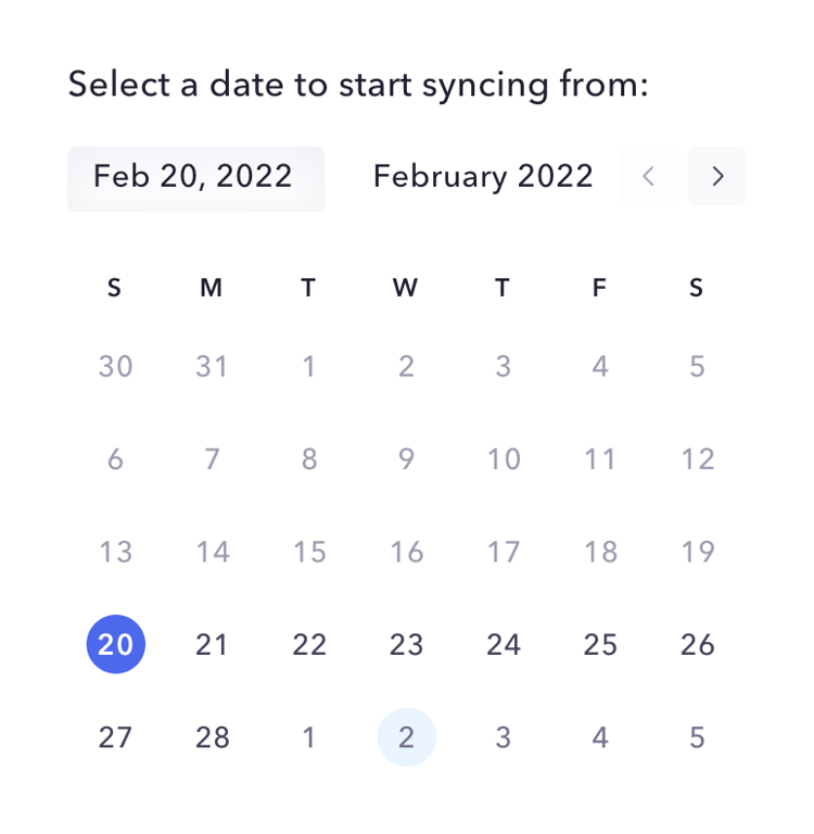
A calendar component for selecting a specific date. It includes a header with the selected date, current month and year, and navigation arrows. The calendar grid displays days of the week and dates, with the selected date highlighted.
Mercury — Input phone number component
Mercury logo
Mercury

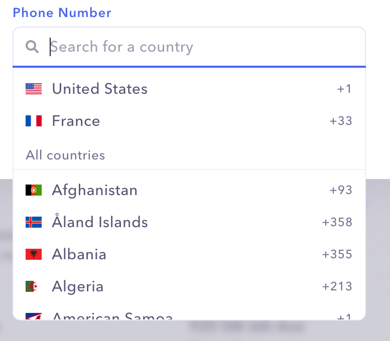
An expanded dropdown menu for selecting a country code, featuring a search input at the top and a scrollable list of countries with flags and calling codes.

Mercury — Input phone number component
Mercury logo
Mercury

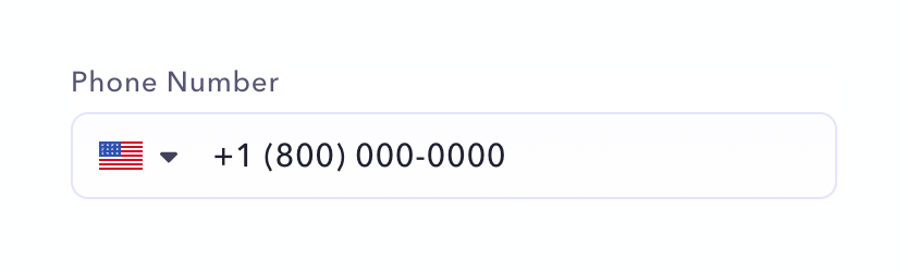
A phone number input field with a country code selector.

Mercury — Avatar component
Mercury logo
Mercury

A rounded square avatar containing a single initial, accompanied by a text label to its right.

Mercury — Input amount component
Mercury logo
Mercury

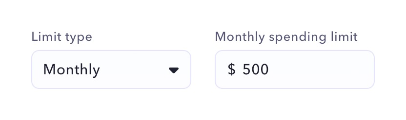
A row containing a dropdown to select the limit type and a number input for the monthly spending limit.
Mercury — Checkbox & radio component
Mercury logo
Mercury

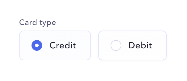
A radio group allowing the user to select between Credit and Debit card types, styled as large selectable cards.

Mercury — Avatar component
Mercury logo
Mercury

A horizontal row showing two overlapping circular avatars with initials, followed by descriptive text indicating the number of users.

Mercury — Input select component
Mercury logo
Mercury

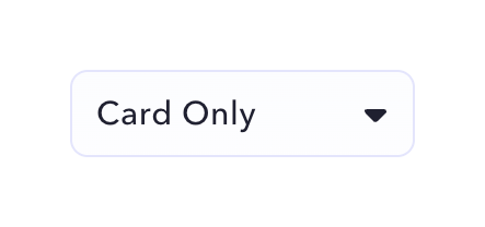
A standard select input field displaying a selected value with a dropdown arrow.

Browse the full component library

Browse the full UI component library.

Trusted by the best teams