Skip to content

Livekit UI components examples

Browse Livekit UI component design examples. Preview individual interface elements and explore related component categories. Build voice, video, and physical AI

Explore the examples
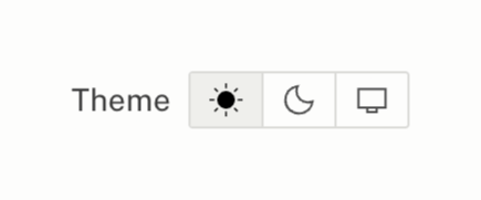
Livekit — Theme settings component
Livekit logo
Livekit

A user interface element for selecting the display theme, offering light, dark, and system options.
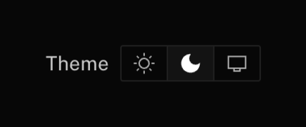
Livekit — Theme settings component
Livekit logo
Livekit

User interface element for theme selection with options for light, dark, and system modes.
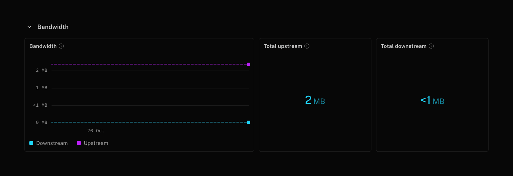
Livekit — Charts component
Livekit logo
Livekit

A dashboard displaying network bandwidth data with a line graph and summary cards for total upstream and downstream usage.

Livekit — Charts component
Livekit logo
Livekit

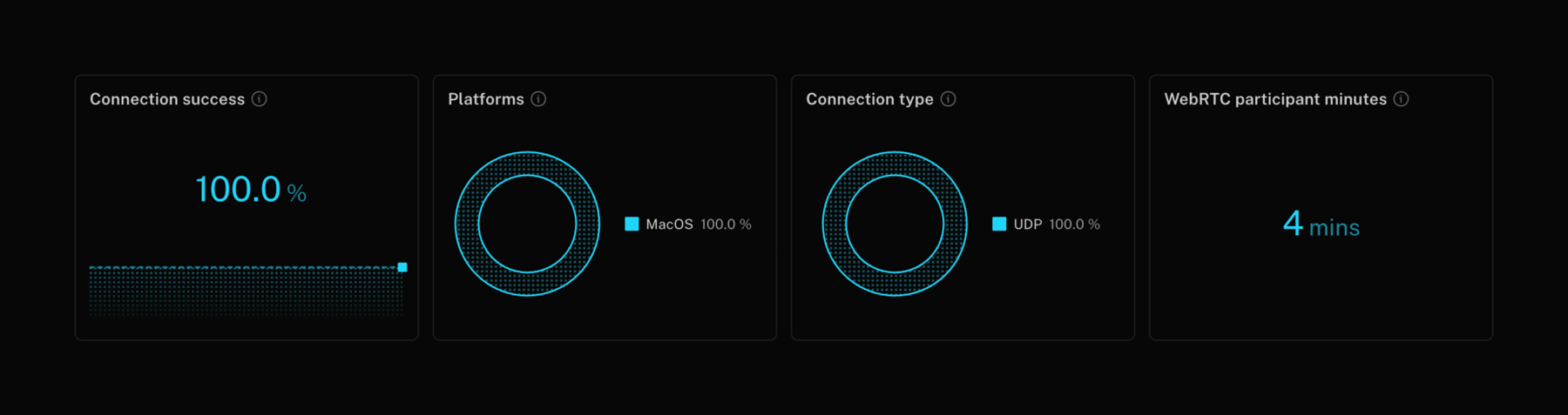
A dashboard displaying connection success, platform usage, connection type, and participant minutes with data visualizations.

Livekit — Checkbox & radio component
Livekit logo
Livekit

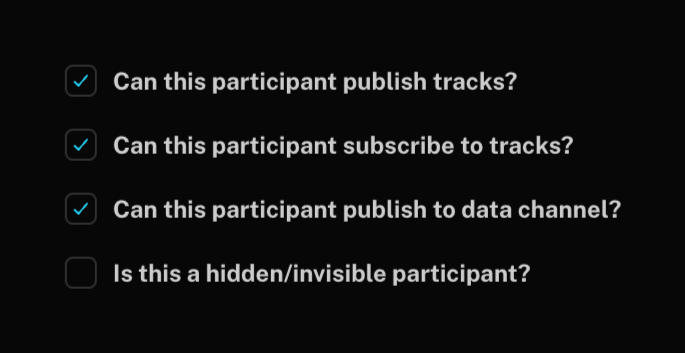
A list of checkboxes for managing participant permissions.

Livekit — Artificial intelligence component
Livekit logo
Livekit

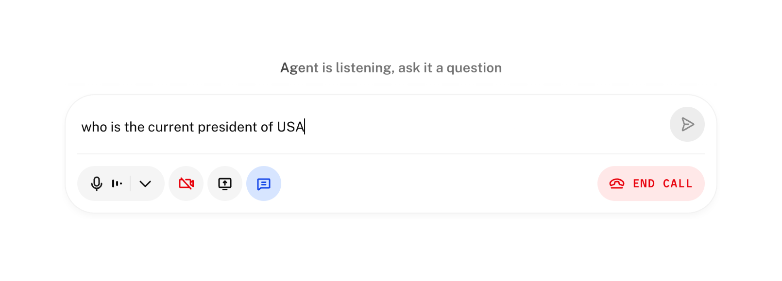
A user interface for an AI agent interaction, featuring a text input field, action buttons for call controls, and a prompt for user input.
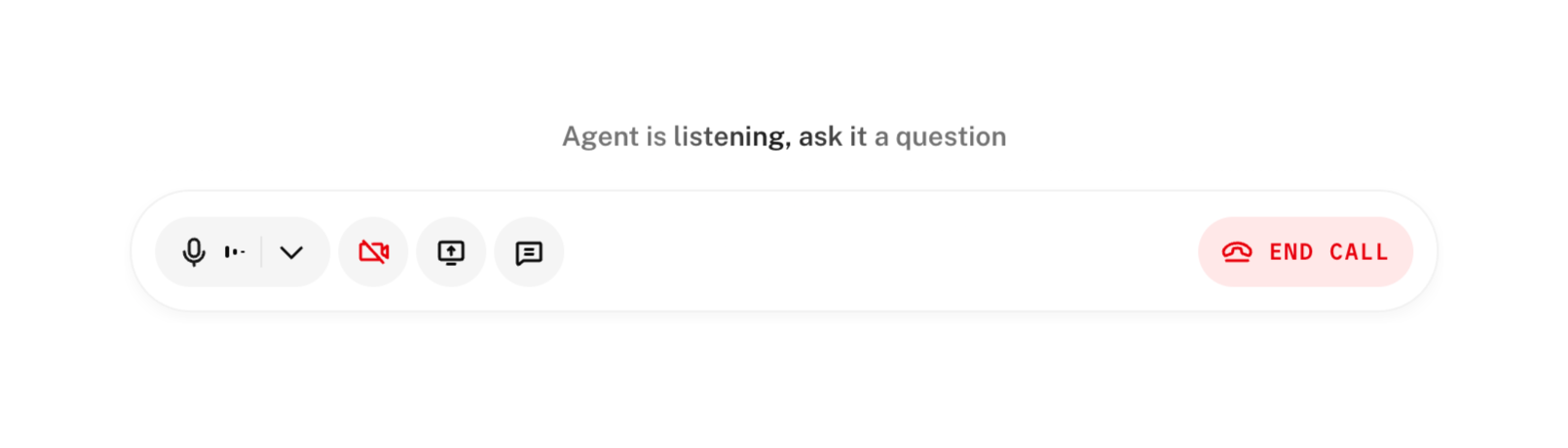
Livekit — Audio player component
Livekit logo
Livekit

A call interface with controls for audio, video, screen sharing, chat, and ending the call, along with a status message.
Livekit — Checkbox & radio component
Livekit logo
Livekit

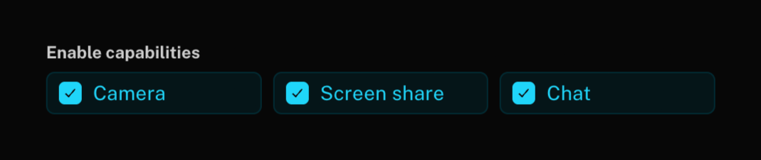
A dark mode interface displaying options to enable capabilities such as camera, screen share, and chat, each with a checkbox.
Livekit — Sorting & filtering component
Livekit logo
Livekit

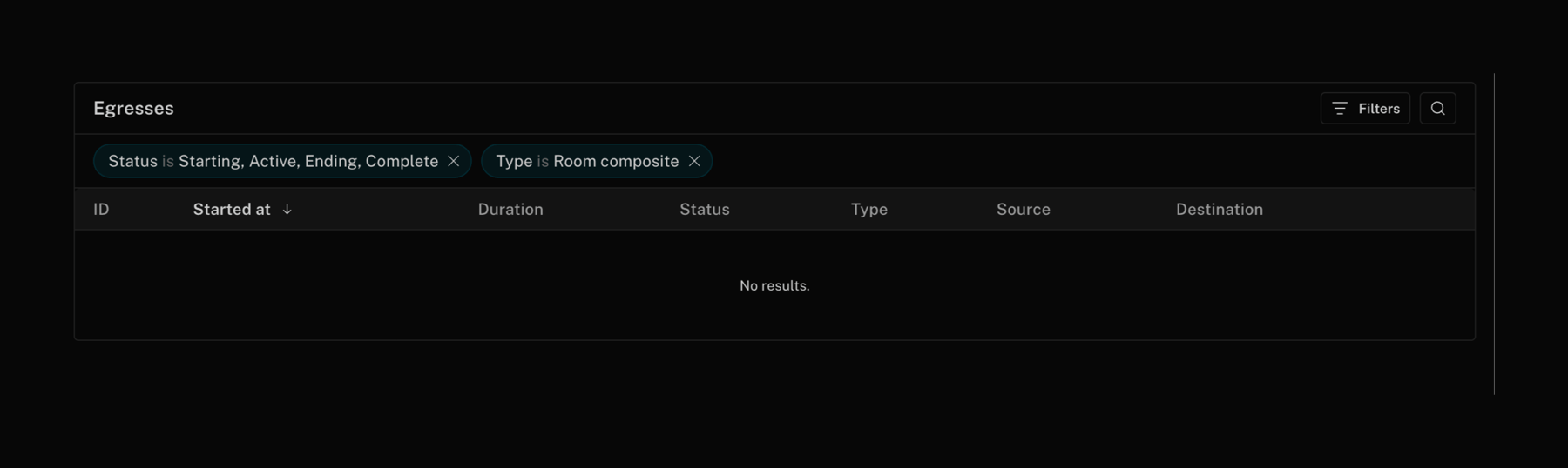
A dark mode dashboard displaying a table of egresses with applied filters and an empty state message.
Livekit — Sorting & filtering component
Livekit logo
Livekit

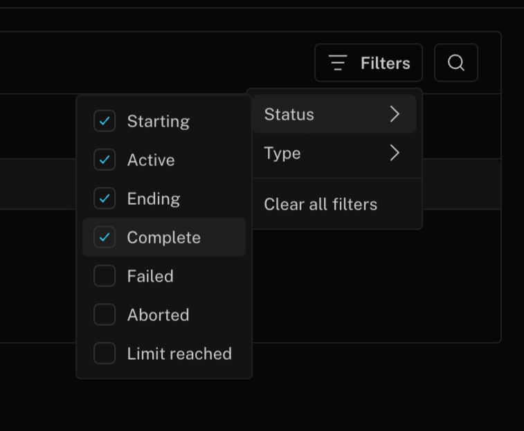
A nested dropdown menu for filtering data by status and other criteria.

Livekit — Code block component
Livekit logo
Livekit

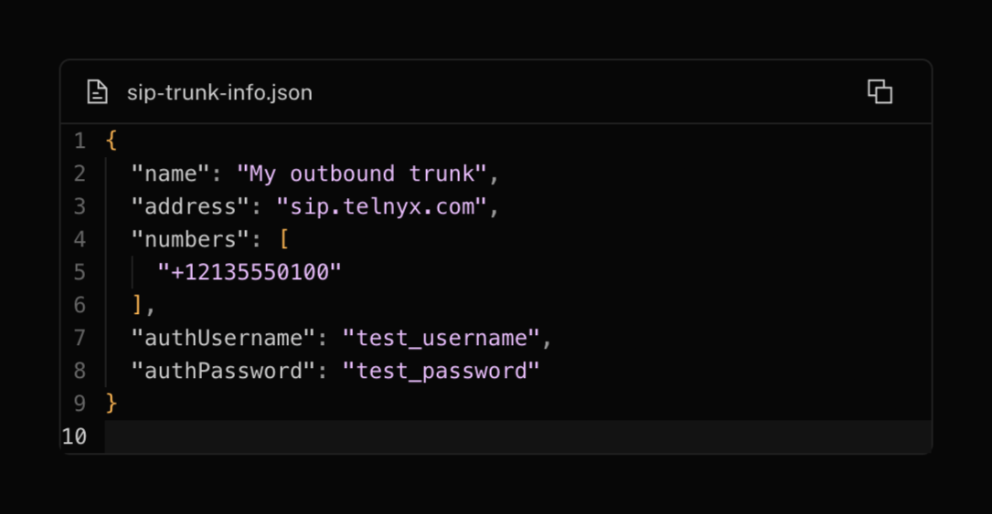
A code editor displaying a JSON file for SIP trunk configuration.

Livekit — Checkbox & radio component
Livekit logo
Livekit

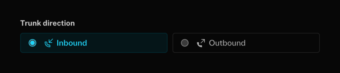
A user interface element for selecting trunk direction, offering 'Inbound' and 'Outbound' options.

Browse the full component library

Browse the full UI component library.

Trusted by the best teams