Linkedin UI components examples
Browse Linkedin UI component design examples. Preview individual interface elements and explore related component categories. Connect to Opportunity
Explore the examples
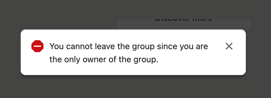

A toast notification displaying an error message preventing the user from leaving a group.
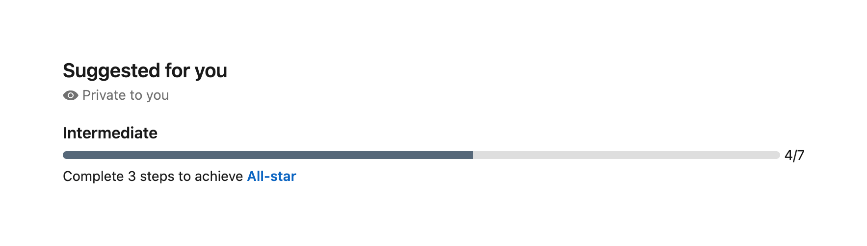
A progress bar showing profile completion status, labeled 'Intermediate' with a step count of 4/7. It includes a prompt to complete remaining steps to achieve 'All-star' status.
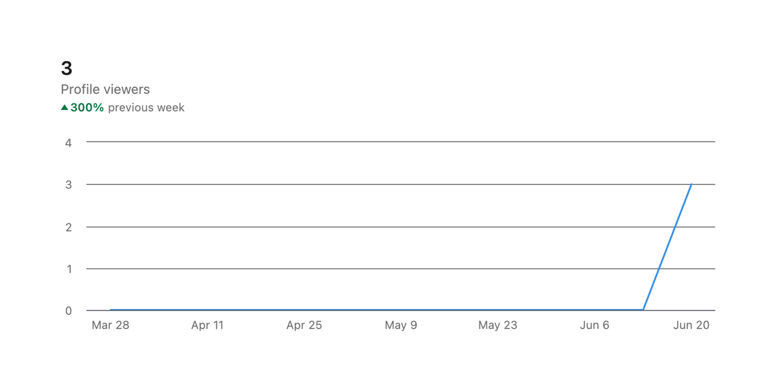
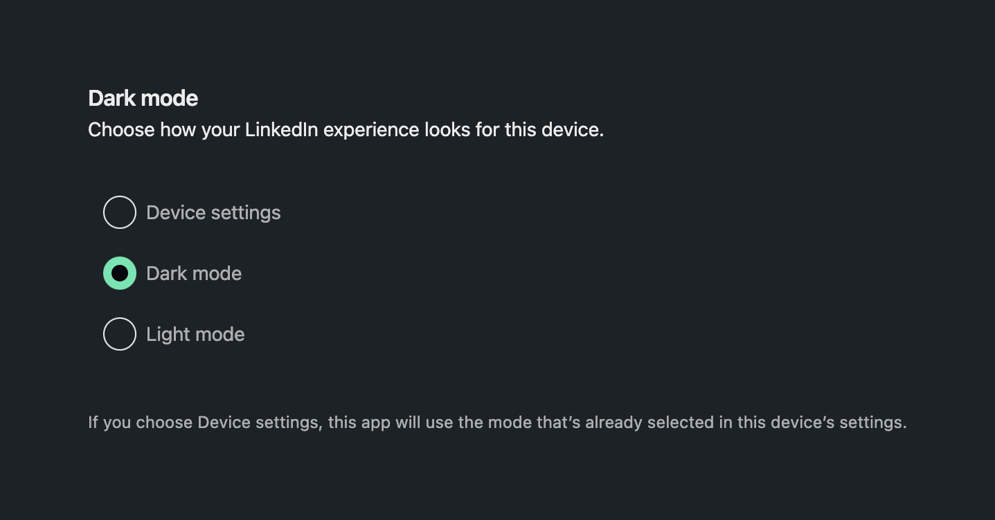
A settings section allowing users to select their preferred appearance mode (Device settings, Dark mode, or Light mode) using radio buttons.
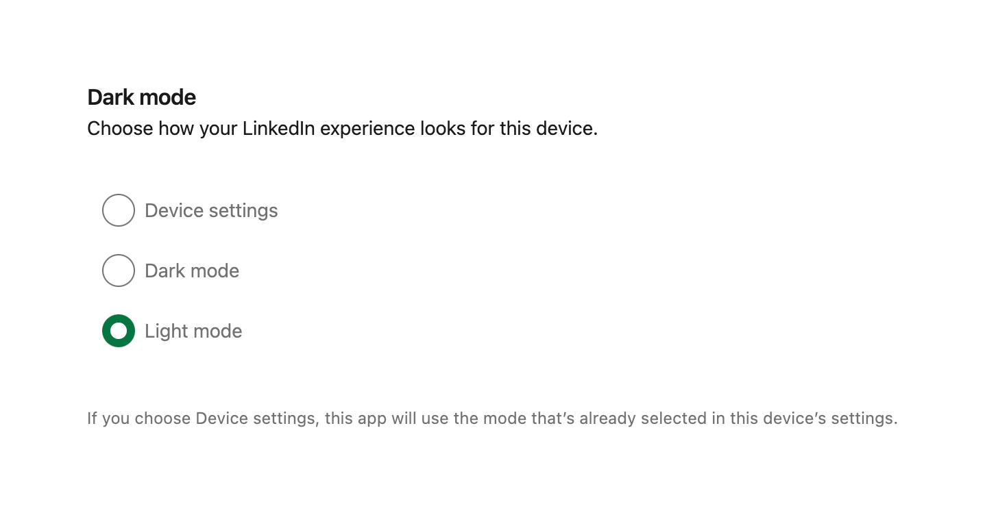
A settings section allowing the user to select their preferred theme mode (Device settings, Dark mode, or Light mode) using a radio group.
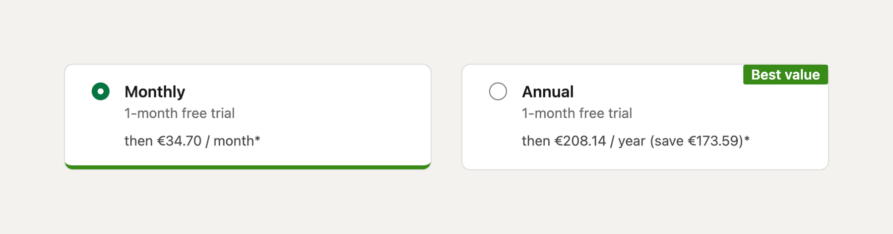
A radio group presented as two side-by-side cards, allowing the user to select between monthly and annual billing cycles. The monthly option is currently selected. The annual option includes a 'Best value' badge.
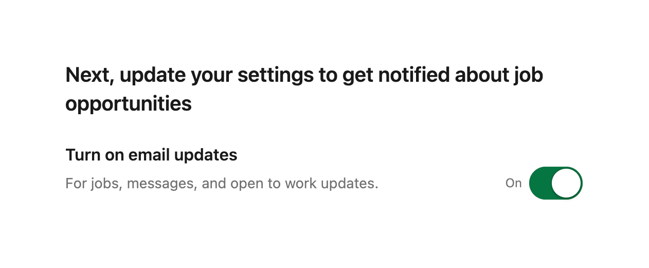
A section prompting the user to update settings, featuring a toggle switch to turn on email updates.
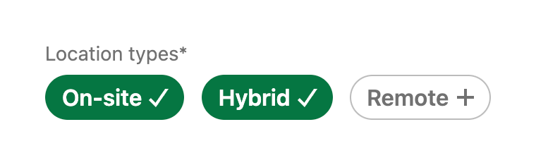
A group of pill-shaped toggle buttons for selecting job location types, with an overarching label.
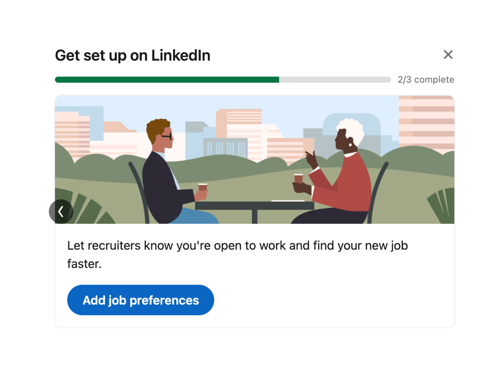
A card component displaying onboarding progress with a progress bar, an illustration, descriptive text, and a primary call-to-action button.
Browse the full component library
Browse the full UI component library.
Trusted by the best teams







