Skip to content

Lemni UI components examples

Browse Lemni UI component design examples. Preview individual interface elements and explore related component categories. Ai agents for all your customer interactions

Explore the examples
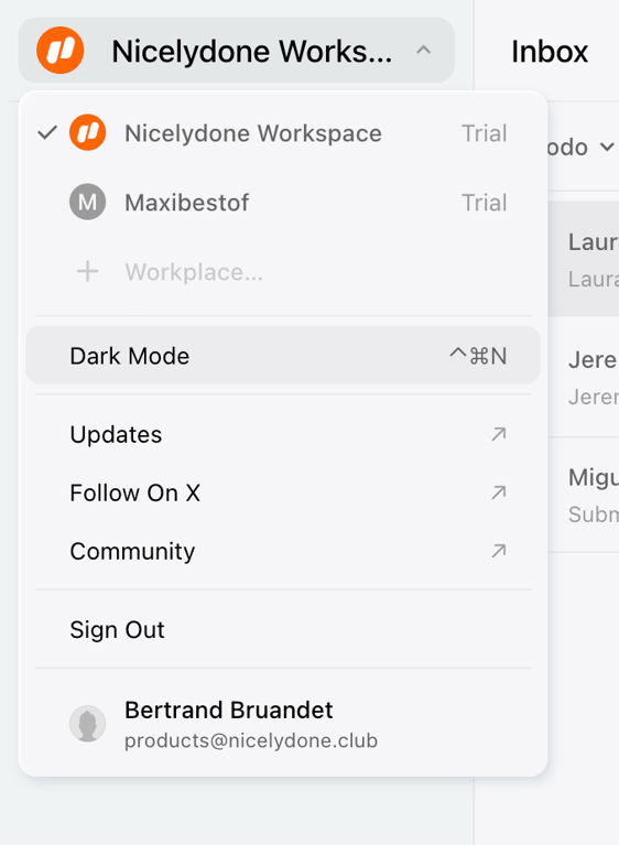
Lemni — Theme settings component
Lemni logo
Lemni

The screenshot displays a dropdown menu with options such as 'Dark Mode', 'Updates', 'Follow On X', 'Community', and 'Sign Out'.
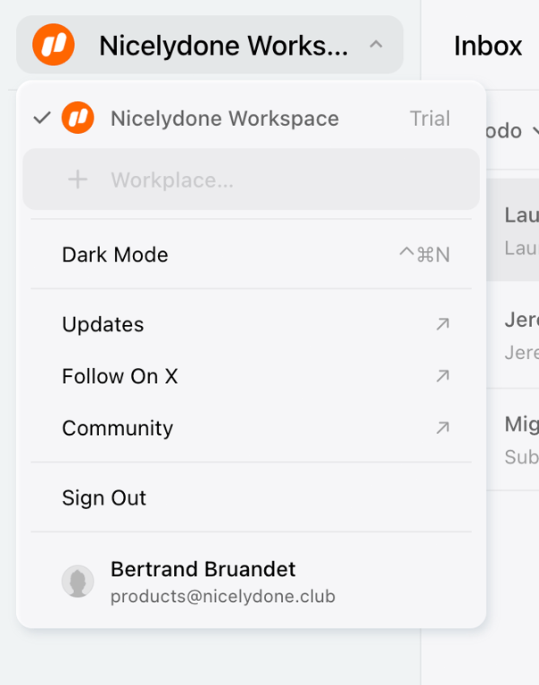
Lemni — Dropdown menu component
Lemni logo
Lemni

The screenshot displays a dropdown menu with options such as dark mode, updates, and sign out.
Lemni — Charts component
Lemni logo
Lemni

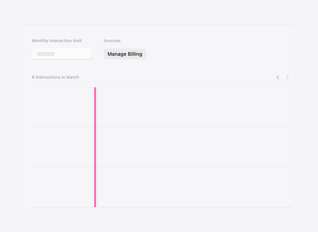
A simple chart showing monthly interaction limit and invoices.

Lemni — Table component
Lemni logo
Lemni

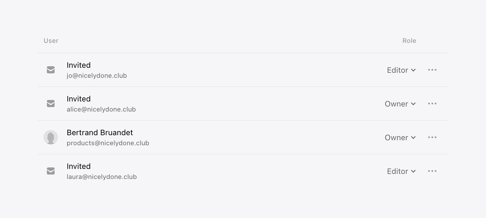
A list of users with their roles.

Lemni — Input select component
Lemni logo
Lemni

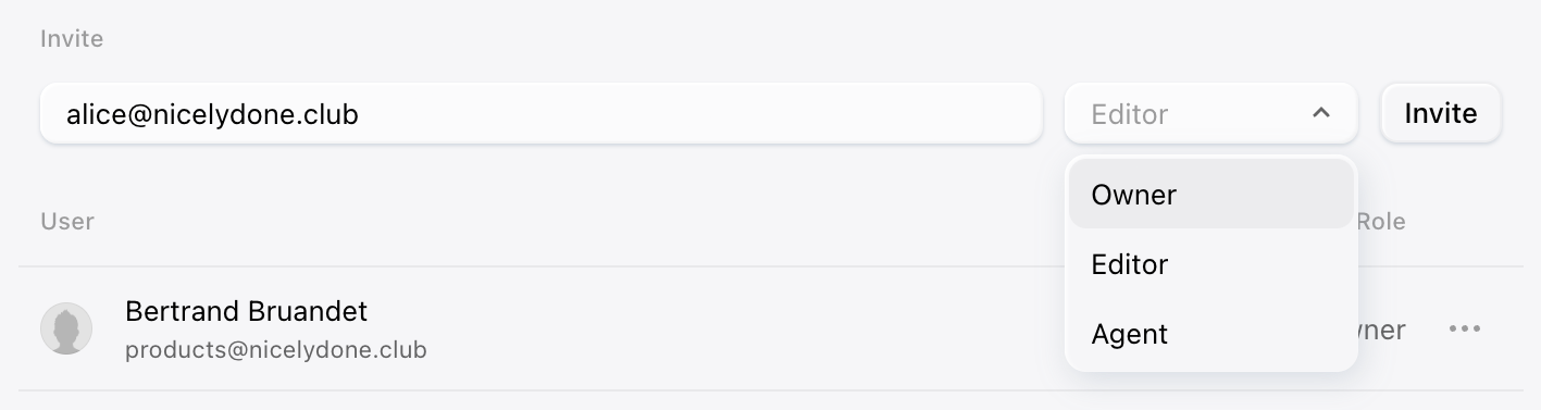
The screenshot displays a user interface for inviting a user with a dropdown menu to select the user's role.
Lemni — Input date component
Lemni logo
Lemni

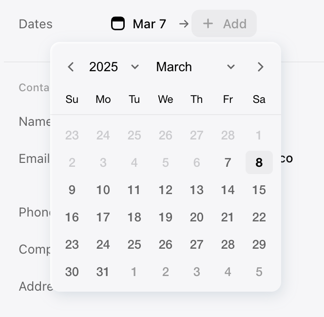
A date picker modal.

Lemni — Dropdown menu component
Lemni logo
Lemni

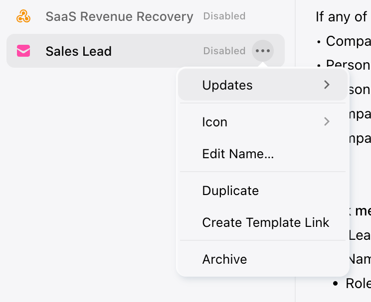
A dropdown menu with options to manage a sales lead.

Lemni — Dropdown menu component
Lemni logo
Lemni

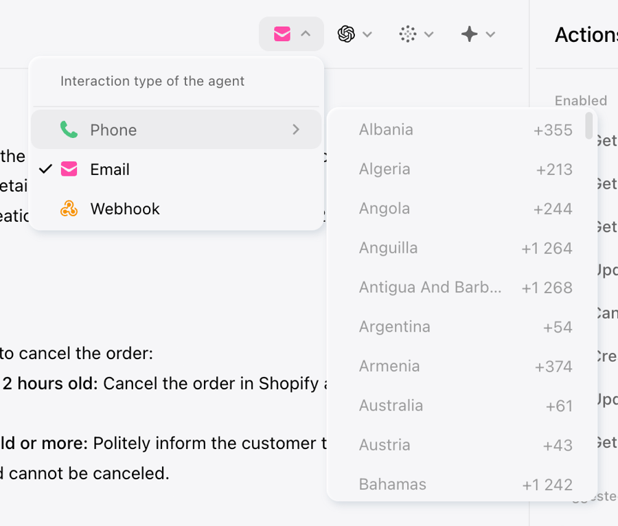
The screenshot shows a user interface with a modal and a dropdown menu.

Lemni — Notification Toast component
Lemni logo
Lemni

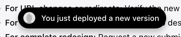
The screenshot shows a notification modal.

Lemni — Stepper component
Lemni logo
Lemni

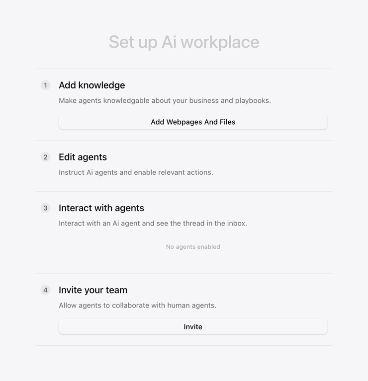
A setup screen for an AI workplace.

Lemni — Vertical navigation component
Lemni logo
Lemni

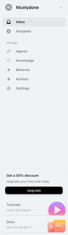
A screenshot of a side navigation with a promotion banner and links to tutorials and documentation.
Lemni — Toggle/Switch component
Lemni logo
Lemni

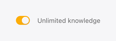
A toggle switch is in the on position.

Browse the full component library

Browse the full UI component library.

Trusted by the best teams