Hireproof UI components examples
Browse Hireproof UI component design examples. Preview individual interface elements and explore related component categories. Your new interviewing superpower
Explore the examples
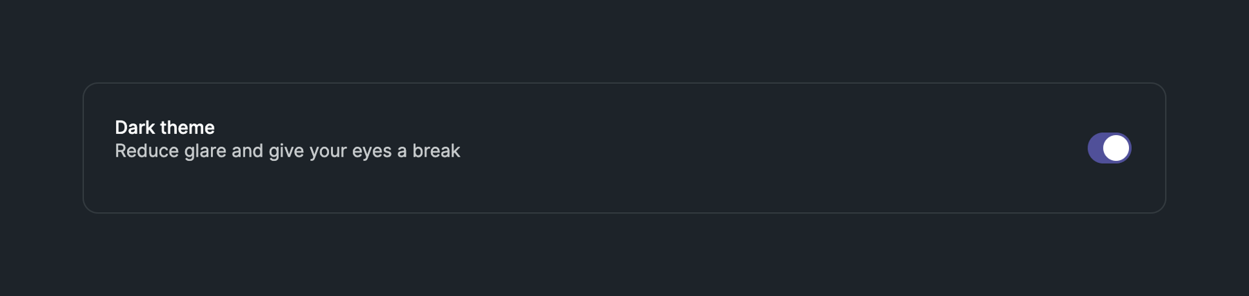

A settings row with a title, description, and a toggle switch to enable or disable the dark theme.

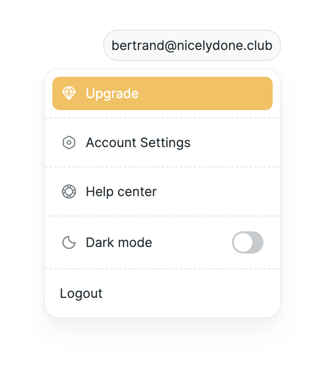
A dropdown menu triggered by an email address pill, containing options for upgrading, account settings, help, dark mode toggle, and logout.
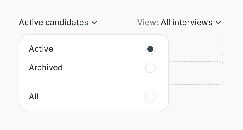
A dropdown menu for filtering candidates by status, showing options for Active, Archived, and All with radio button selection.
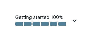
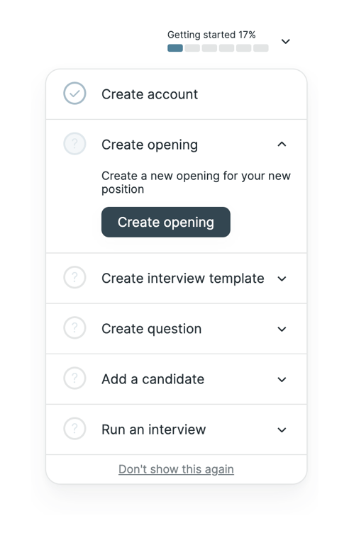
A segmented progress bar showing 100% completion with a label and a dropdown chevron.

A horizontal progress indicator split into three equal segments. The middle segment is highlighted with a darker color, indicating the current step or progress.
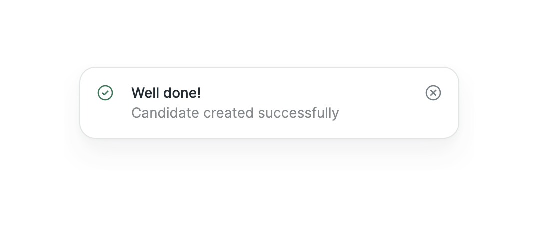
A toast notification confirming a successful action, featuring a success icon, a title, a descriptive message, and a close button.
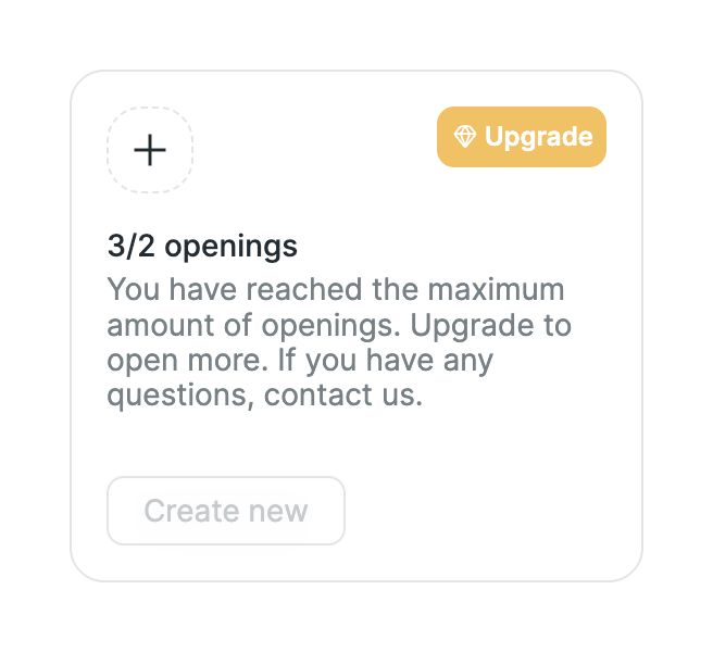
A card component displaying a quota limit message and an upgrade call-to-action. It includes a disabled 'Create new' button, indicating the user cannot perform the primary action until they upgrade.
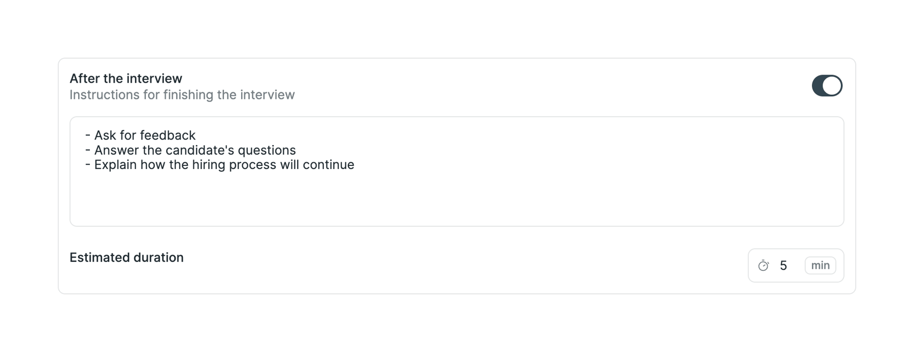
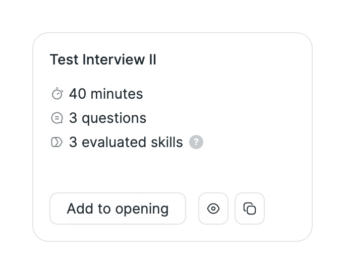
A card component used to configure a specific step in an interview process. It includes a title, description, a toggle switch to enable/disable the step, a text area for instructions, and an input field for estimated duration.
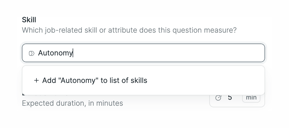
A combobox input field for selecting a skill, showing an active dropdown menu with an option to add a new skill based on the typed text.
Browse the full component library
Browse the full UI component library.
Trusted by the best teams







