Skip to content

Grok UI components examples

Browse Grok UI component design examples. Preview individual interface elements and explore related component categories.

Explore the examples
Grok — Input code component
Grok logo
Grok

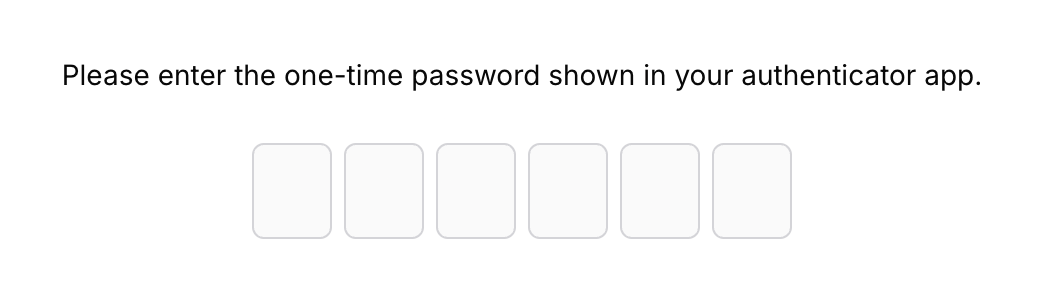
A one-time password entry interface.

Grok — Checkbox & radio component
Grok logo
Grok

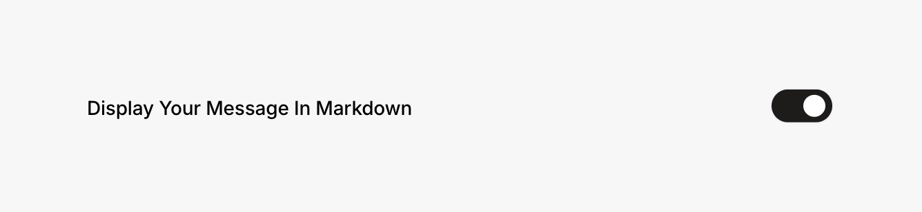
A toggle switch with a label.

Grok — Theme settings component
Grok logo
Grok

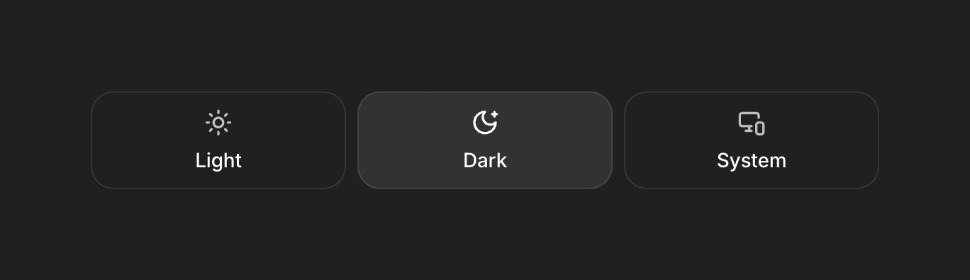
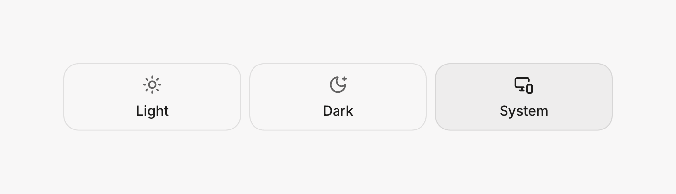
A UI showing options for light, dark, and system theme preferences.

Grok — Feedback component
Grok logo
Grok

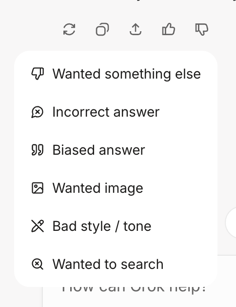
The screenshot displays a feedback modal with a list of options.

Grok — Feedback component
Grok logo
Grok

A set of icons with a label.

Grok — Artificial intelligence component
Grok logo
Grok

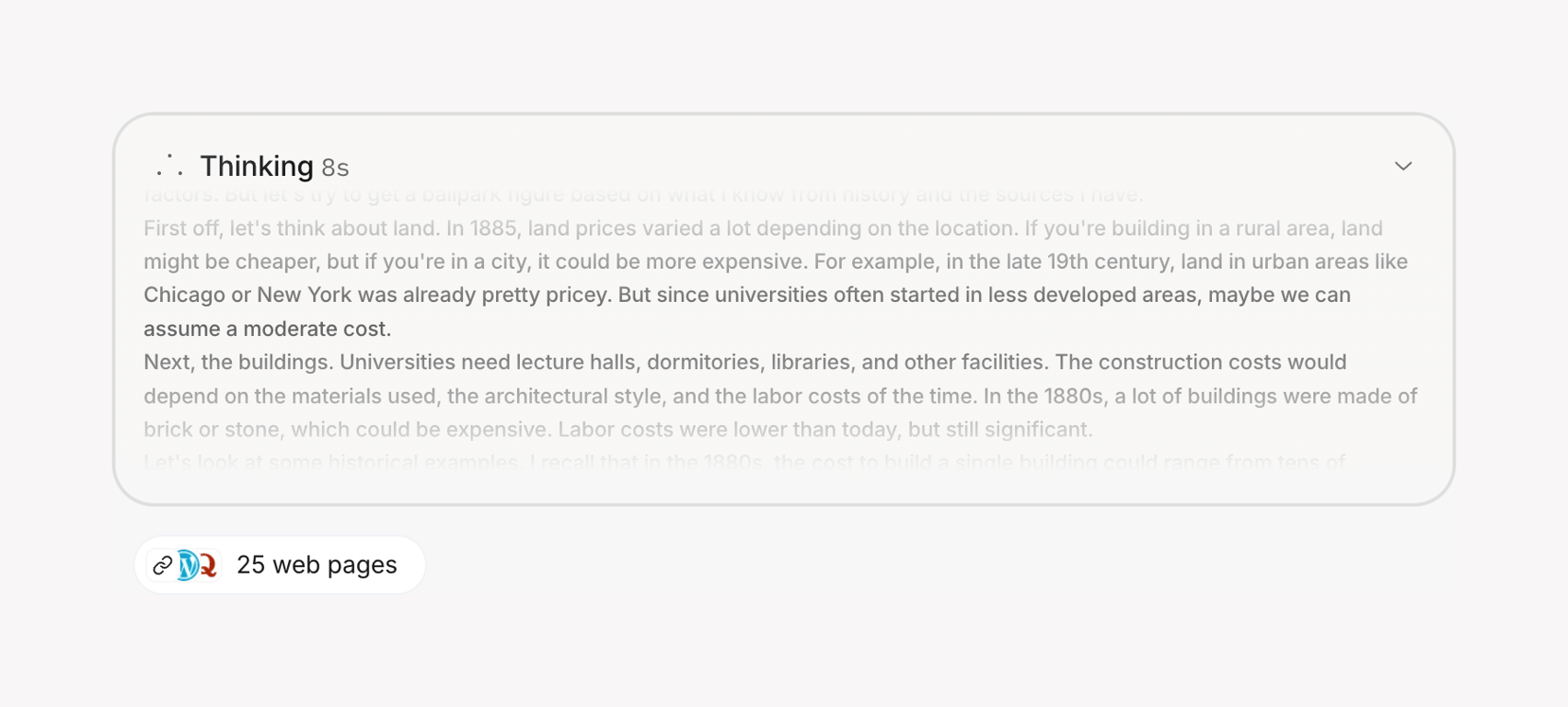
The screenshot displays a modal with a text-heavy interface.

Grok — Artificial intelligence component
Grok logo
Grok

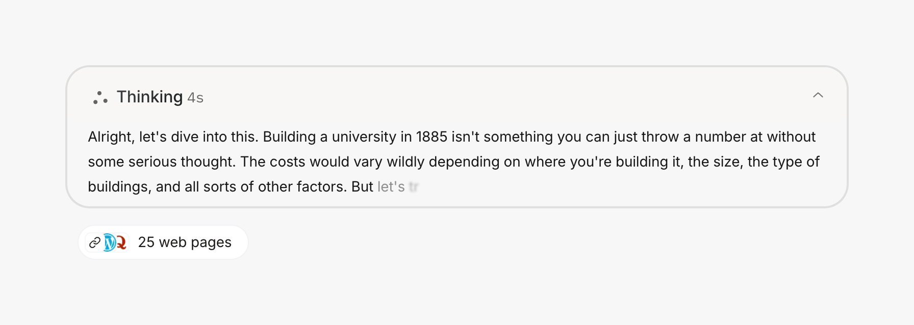
A message bubble with text content.

Grok — Artificial intelligence component
Grok logo
Grok

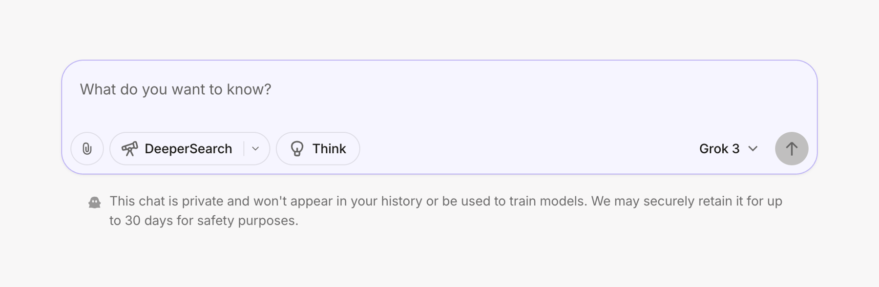
A chat interface with input options.

Grok — Artificial intelligence component
Grok logo
Grok

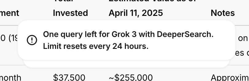
The screenshot shows a modal with a message about query limits for Grok 3 with DeeperSearch.
Grok — Artificial intelligence component
Grok logo
Grok

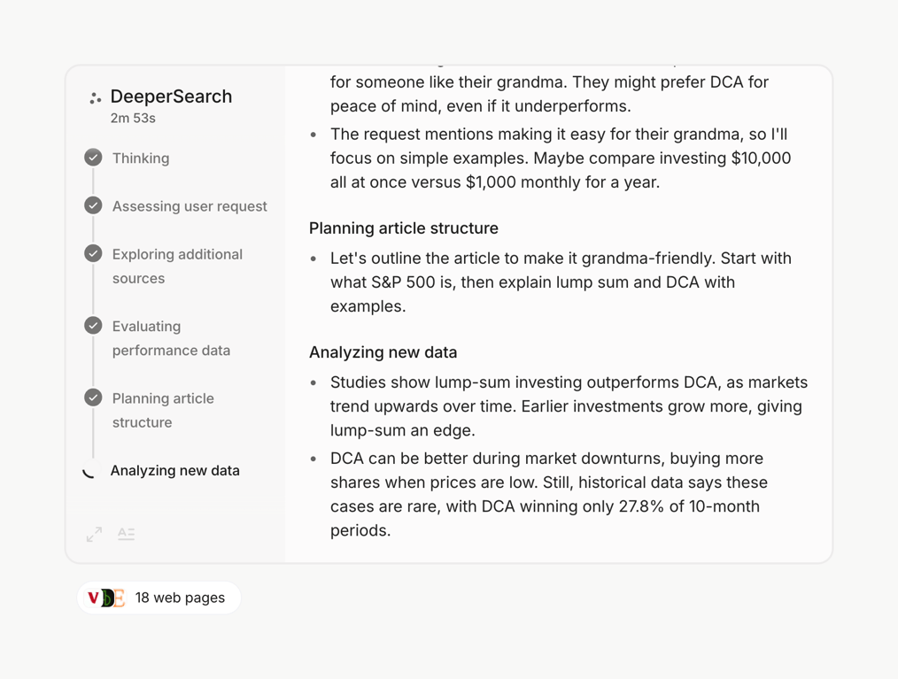
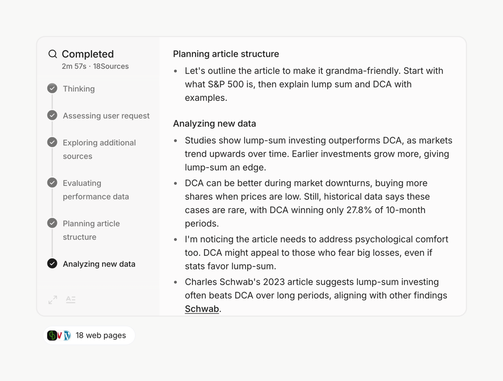
A task list with completed tasks and article structure planning.

Grok — Artificial intelligence component
Grok logo
Grok

The screenshot displays a modal with a list of tasks being performed by 'DeeperSearch', including 'Thinking', 'Assessing user request', 'Exploring additional sources', 'Evaluating performance data', 'Planning article structure', and 'Analyzing new data'.

Browse the full component library

Browse the full UI component library.

Trusted by the best teams