
Fiberplane UI components examples
Browse Fiberplane UI component design examples. Preview individual interface elements and explore related component categories. Collaborative Notebooks for debugging your infrastructure
Explore the examples

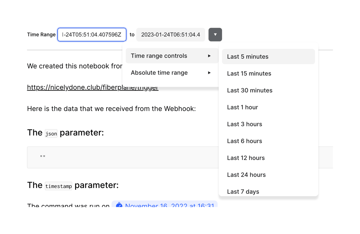
A time range selector showing a start and end time input, with an open dropdown menu offering relative time presets like 'Last 5 minutes' and 'Last 15 minutes'.
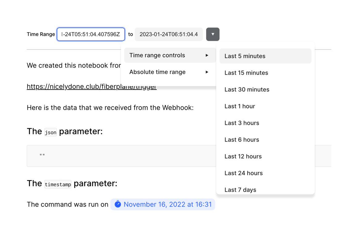
A time range selection component featuring two input fields for start and end times, and a dropdown menu with cascading options for quick relative time selections.
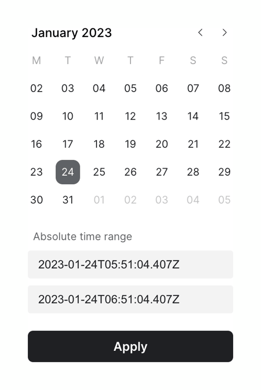
A calendar view for selecting a date, combined with inputs for setting an absolute time range and an Apply button.

A top navigation bar showing the current workspace, a breadcrumb trail to the active notebook, and action buttons for sharing and more options.
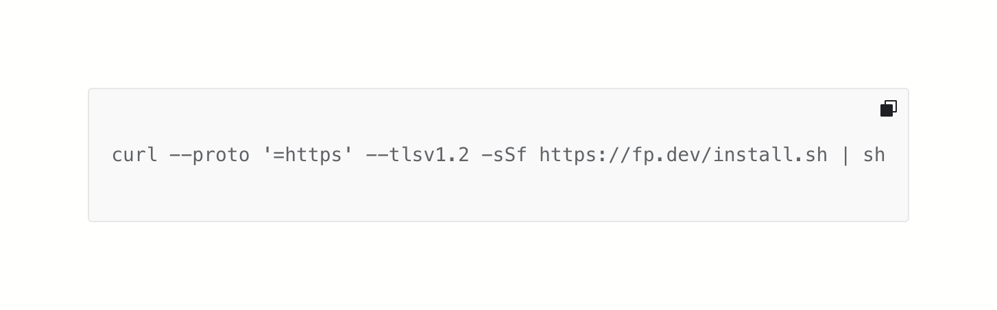
A single-line code block displaying a shell command with a copy-to-clipboard icon in the top right corner.
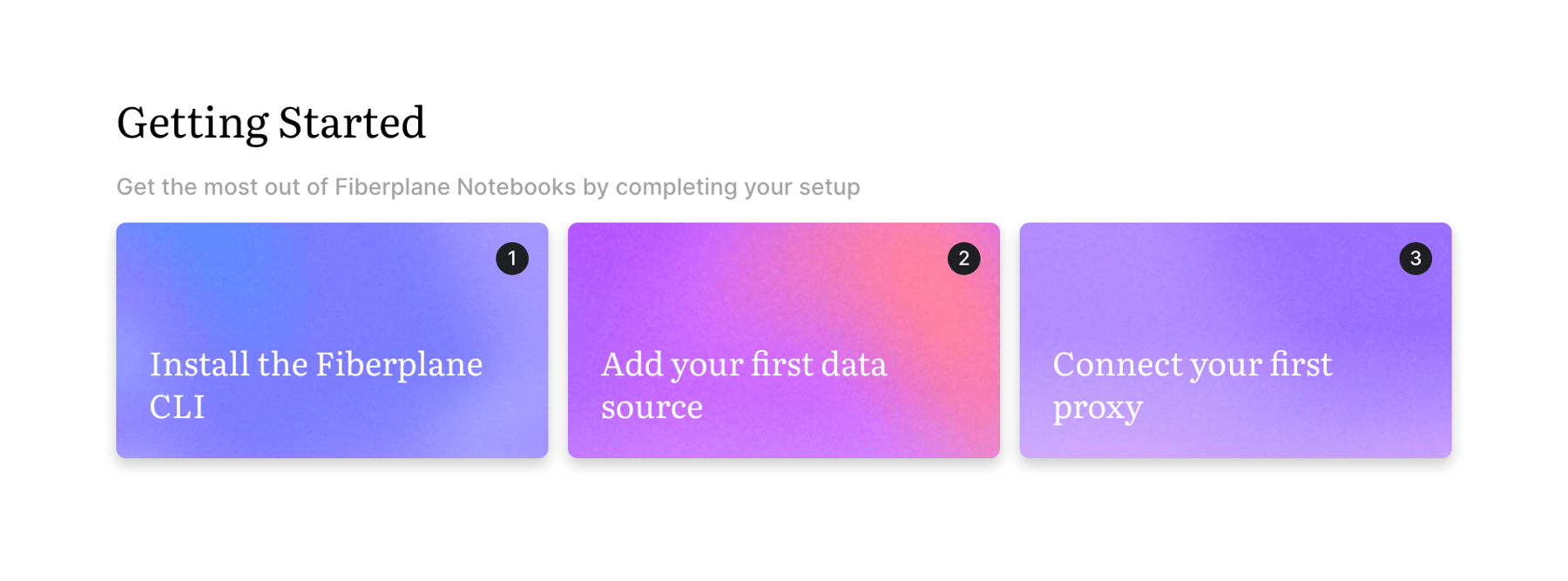
A horizontal row of three colorful cards acting as a getting started stepper. Each card has a number badge and a title for a setup step.
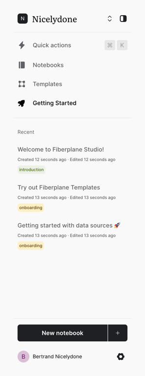
A vertical sidebar navigation menu featuring workspace switching, primary navigation links, a recent items list, and a prominent 'New notebook' action.
A horizontal row of four circular dots indicating pagination or progress, with the first dot filled to show the active state.
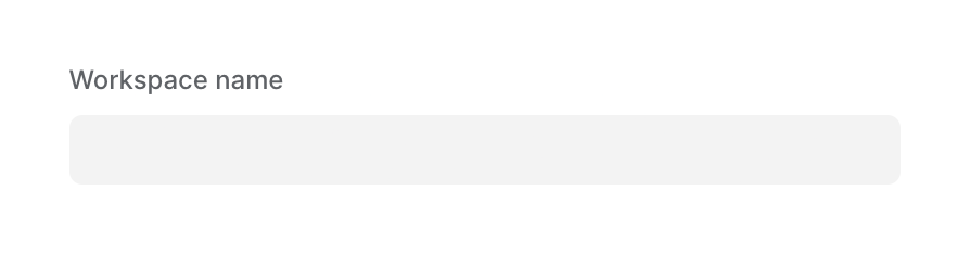
A standard text input field labeled 'Workspace name' with a light gray background.
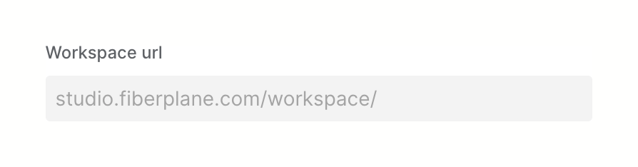
A text input field for specifying a workspace URL, featuring a label and placeholder text showing the base URL path.
Browse the full component library
Browse the full UI component library.
Trusted by the best teams







