Skip to content

Dopt UI components examples

Browse Dopt UI component design examples. Preview individual interface elements and explore related component categories. Ship self-serve product onboarding and education, your way

Explore the examples
Dopt — Footer component
Dopt logo
Dopt

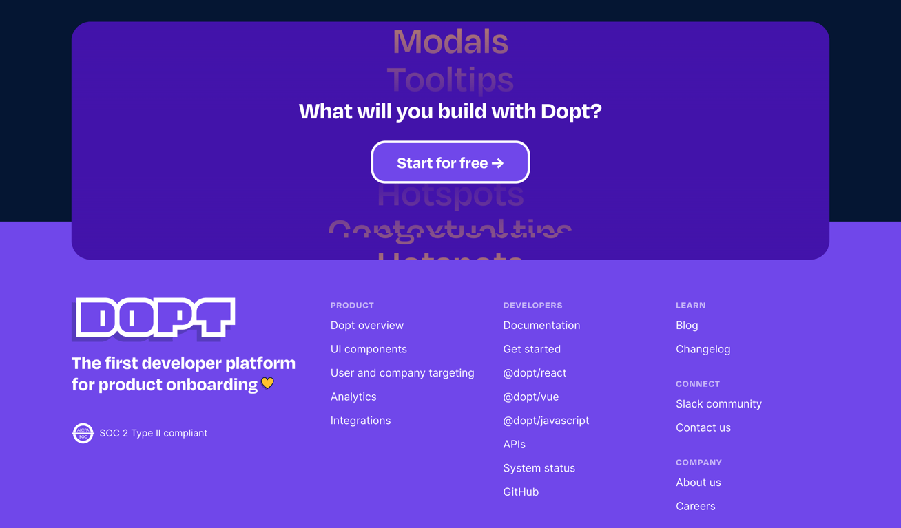
A dark-themed footer section featuring a prominent call-to-action block overlapping the top edge, followed by a multi-column link directory and company branding.

Dopt — Testimonial component
Dopt logo
Dopt

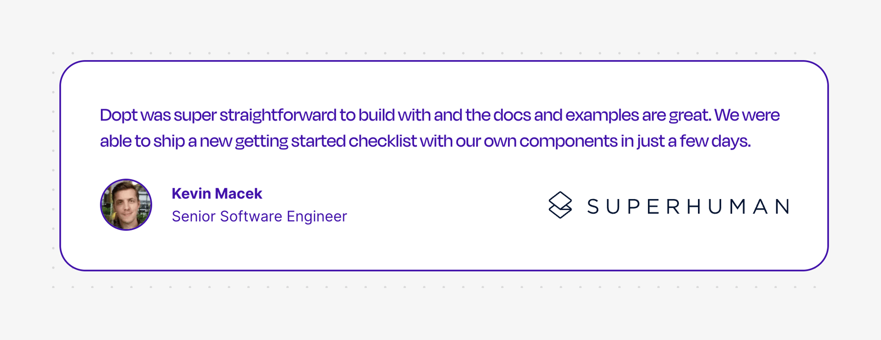
A testimonial card featuring a quote, the author's avatar, name, title, and their company logo. The card has a distinct purple border and sits on a dotted background.
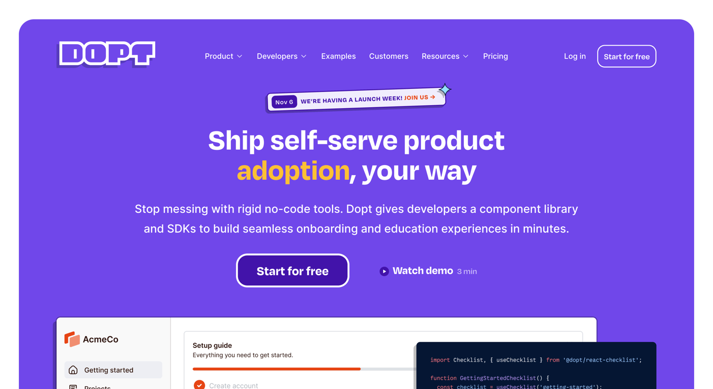
Dopt — Hero section component
Dopt logo
Dopt

A hero section with a top navigation bar, a prominent headline, a subheadline, a primary call-to-action button, a secondary demo link, and a preview image of the product interface.
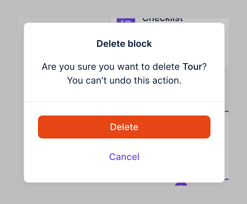

Dopt — Modal component
Dopt logo
Dopt

A delete confirmation modal.

Dopt — Progress indicator component
Dopt logo
Dopt

A progress bar showing the current step out of total steps.

Dopt — Modal component
Dopt logo
Dopt

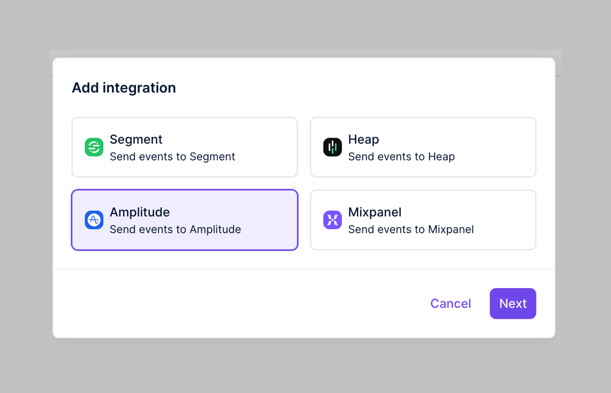
A modal for adding integrations.

Dopt — Modal component
Dopt logo
Dopt

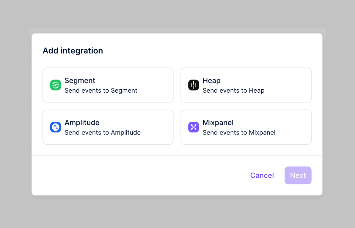
A modal for adding integrations.

Dopt — Vertical list component
Dopt logo
Dopt

A table displaying names and identifiers.

Dopt — Input text component
Dopt logo
Dopt

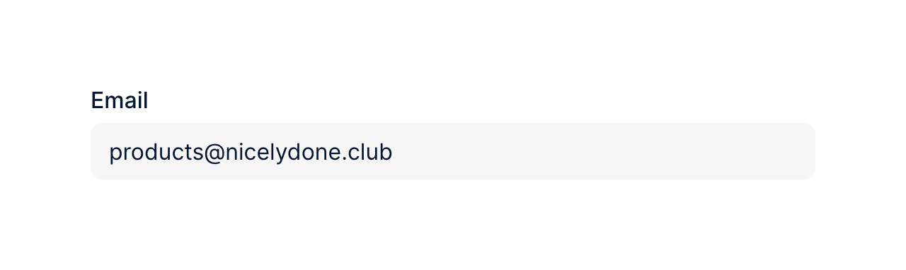
Email input field

Dopt — Alert component
Dopt logo
Dopt

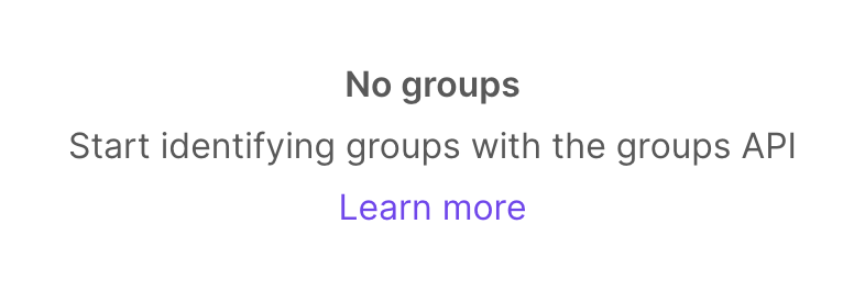
Empty state for groups

Browse the full component library

Browse the full UI component library.

Trusted by the best teams