Current UI components examples
Browse Current UI component design examples. Preview individual interface elements and explore related component categories. All your team’s work in one place
Explore the examples

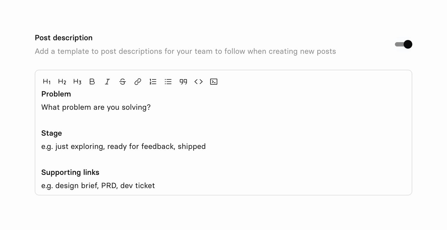

A rich text editor field used to configure a default template, featuring a formatting toolbar and pre-filled placeholder text.
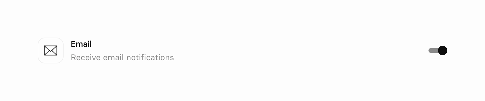
A list item containing an icon, a title, a description, and a toggle switch to enable or disable email notifications.
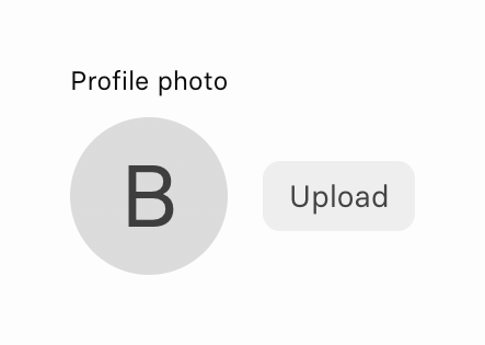
A profile photo upload component featuring a circular avatar placeholder with an initial and an 'Upload' button.

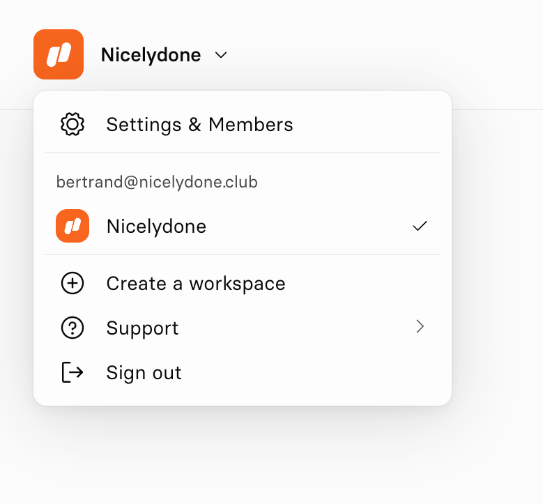
A dropdown menu for switching workspaces, managing settings, and signing out. It includes the current user's email and an active workspace indicator.
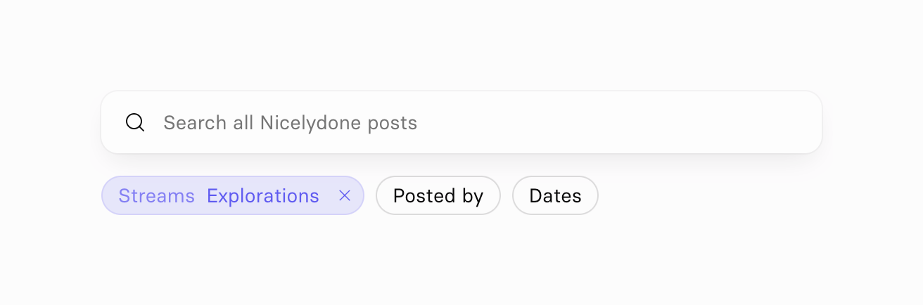
A search input field accompanied by a row of filter chips below it. One filter chip is active and shows a selected value with a clear icon.
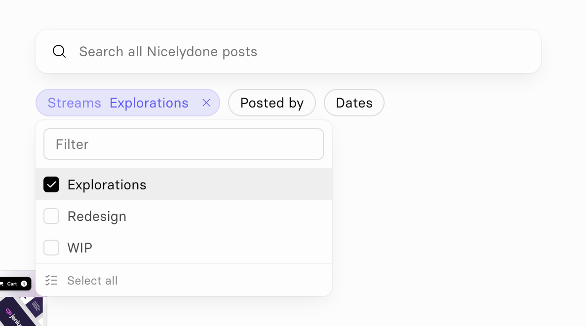
A search input field above a row of filter chips. The 'Streams' chip is active and displays a popover menu with a list of selectable options.
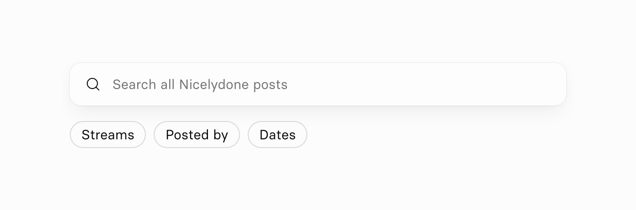
A search input field with a magnifying glass icon and placeholder text, followed by a row of three pill-shaped filter buttons.

A dark-themed toast notification confirming a successful sign-in and instructing the user to return to Figma.
Browse the full component library
Browse the full UI component library.
Trusted by the best teams







