Skip to content

Cron UI components examples

Browse Cron UI component design examples. Preview individual interface elements and explore related component categories. Next-generation calendar for professionals and teams

Explore the examples
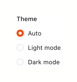
Cron — Theme settings component
Cron logo
Cron

A radio group for selecting the application theme, with options for Auto, Light mode, and Dark mode.
Cron — Button component
Cron logo
Cron

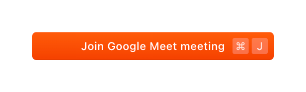
A prominent orange button to join a Google Meet meeting, featuring a keyboard shortcut hint.

Cron — Toggle/Switch component
Cron logo
Cron

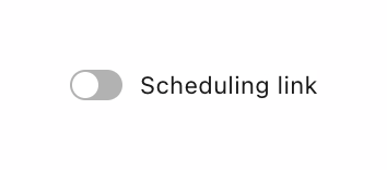
A toggle switch in an off state, labeled 'Scheduling link'.

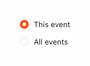
Cron — Checkbox & radio component
Cron logo
Cron

A vertical radio group allowing the user to choose whether an action applies only to the current instance or all future instances of a recurring event.
Cron — Button component
Cron logo
Cron

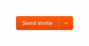
A split button with a primary action to 'Send invite' and a dropdown arrow for additional options.

Cron — Notification Toast component
Cron logo
Cron

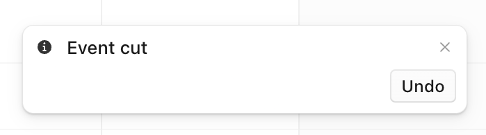
A toast notification confirming an action with an option to undo it.

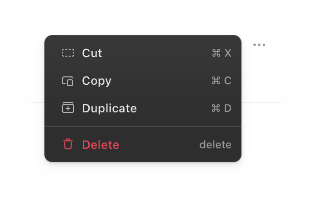
Cron — Dropdown menu component
Cron logo
Cron

A dark-themed dropdown menu providing standard clipboard actions and a delete option, each accompanied by an icon and a keyboard shortcut.
Cron — Datepicker component
Cron logo
Cron

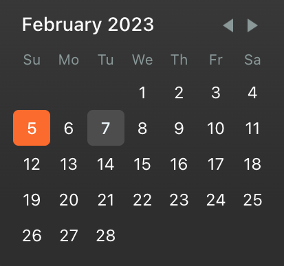
A dark-themed monthly date picker showing February 2023. The 5th is highlighted as the current or selected date with an orange background, and the 7th has a subtle gray background indicating a secondary state or hover.
Cron — Tooltip component
Cron logo
Cron

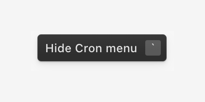
A dark tooltip displaying the text 'Hide Cron menu' alongside a keyboard shortcut indicator.

Cron — Button component
Cron logo
Cron

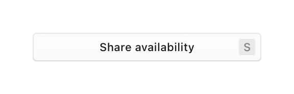
A wide, outlined button labeled 'Share availability' with a keyboard shortcut indicator 'S' aligned to the right.

Browse the full component library

Browse the full UI component library.

Trusted by the best teams