Skip to content

Cosmos UI components examples

Browse Cosmos UI component design examples. Preview individual interface elements and explore related component categories. A Pinterest alternative for creatives

Explore the examples
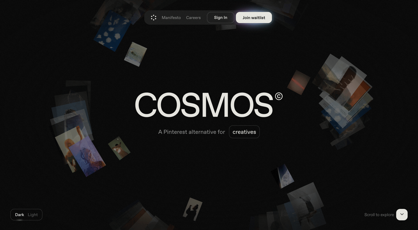
Cosmos — Hero section component
Cosmos logo
Cosmos

A dark-themed hero section featuring a large central logo, a subtitle with a highlighted keyword, and scattered image thumbnails floating in the background. It includes a top navigation bar with a waitlist CTA, a theme toggle in the bottom left, and a scroll indicator in the…
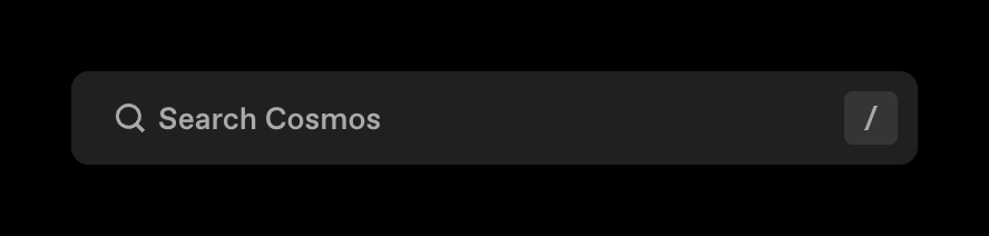
Cosmos — Input search component
Cosmos logo
Cosmos

A dark-themed search input field featuring a magnifying glass icon, placeholder text, and a keyboard shortcut indicator.
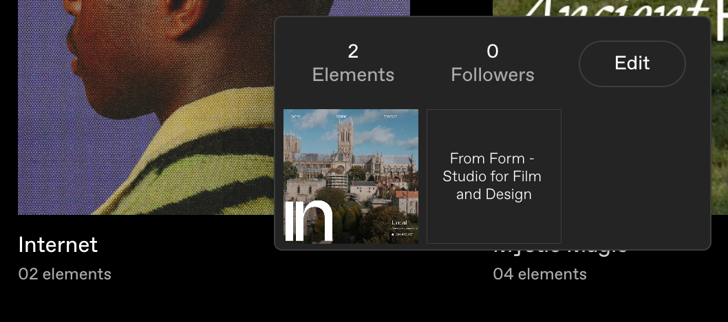
Cosmos — Tooltip component
Cosmos logo
Cosmos

A dark-themed popover displaying cluster statistics (Elements and Followers), an Edit button, and a grid of thumbnails representing the cluster's content.

Cosmos — Avatar component
Cosmos logo
Cosmos

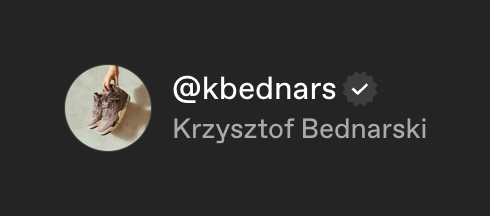
A list item showing a user's avatar, handle with a verified badge, and full name.

Cosmos — Notification Toast component
Cosmos logo
Cosmos

A dark-themed toast notification displaying an error message about a failed payment.
Cosmos — Checkbox & radio component
Cosmos logo
Cosmos

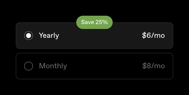
A radio group for selecting a billing cycle, featuring a selected 'Yearly' option with a 'Save 25%' badge and an unselected 'Monthly' option.
Cosmos — Avatar component
Cosmos logo
Cosmos

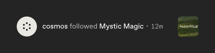
A single row in an activity feed showing a user action. It includes an avatar, a text description of the action with a relative timestamp, and a thumbnail image related to the action.

Cosmos — Sorting & filtering component
Cosmos logo
Cosmos

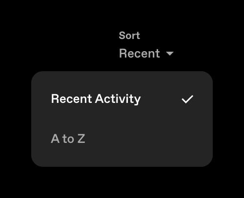
An open dropdown menu for sorting content, showing 'Recent Activity' as the selected option and 'A to Z' as an alternative.
Cosmos — Tooltip component
Cosmos logo
Cosmos

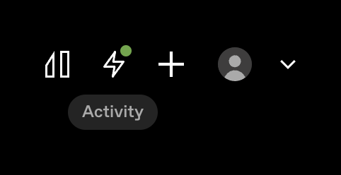
A row of utility icons including a sidebar toggle, an activity feed icon with an unread badge, an add button, and a user profile avatar with a dropdown arrow. A tooltip labeled 'Activity' appears below the activity icon.

Cosmos — Input search component
Cosmos logo
Cosmos

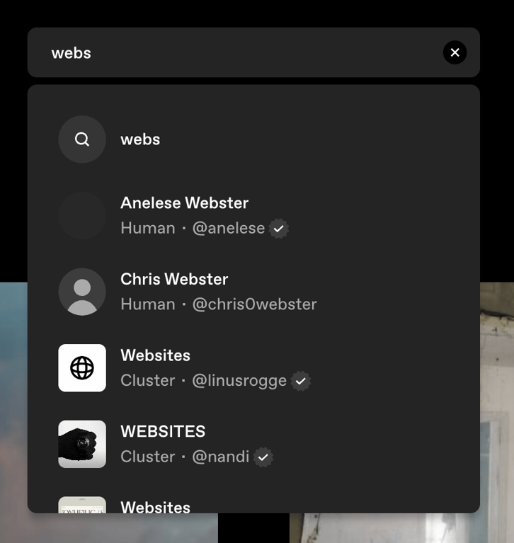
A dark-themed search input with a dropdown menu showing search results for users and clusters.
Cosmos — Toggle/Switch component
Cosmos logo
Cosmos

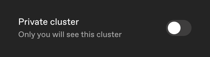
A toggle switch with a label and helper text to set a cluster's privacy status.

Cosmos — Avatar component
Cosmos logo
Cosmos

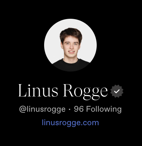
A user profile header displaying an avatar, name with a verified badge, username, following count, and a personal website link.

Browse the full component library

Browse the full UI component library.

Trusted by the best teams