Column UI components examples
Browse Column UI component design examples. Preview individual interface elements and explore related component categories. The developer infrastructure bank
Explore the examples
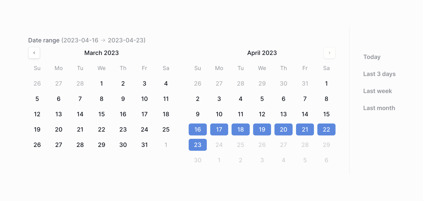

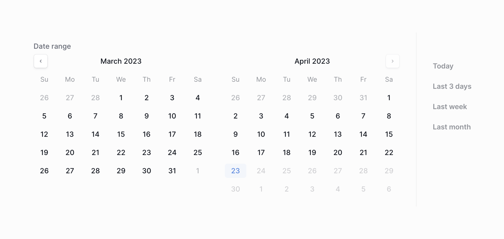
A dual-pane calendar component for selecting a date range, featuring quick selection presets on the right.

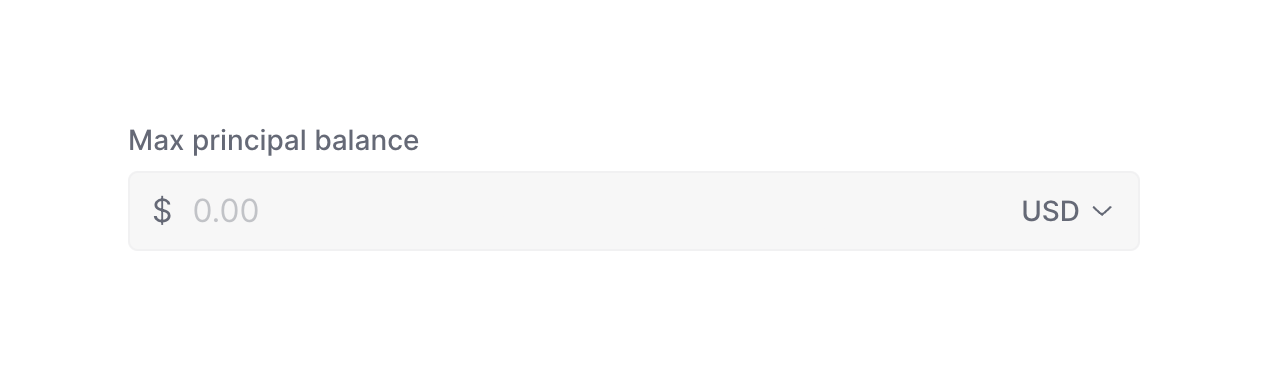
A form field for entering a maximum principal balance, featuring a dollar sign prefix, a placeholder for the amount, and a currency selector dropdown.
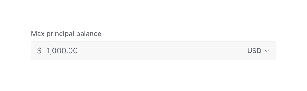
A form input field for entering a monetary amount, featuring a currency symbol prefix and a currency selector dropdown.
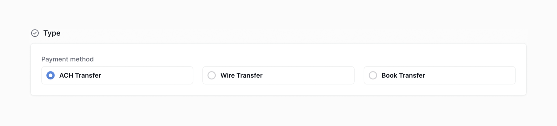
A radio group component for selecting a payment method. It features a section title with a checkmark icon, a label, and three horizontal radio button options styled as cards.
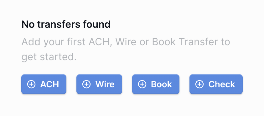
An empty state message indicating no transfers were found, accompanied by a row of four primary action buttons to create different types of transfers.
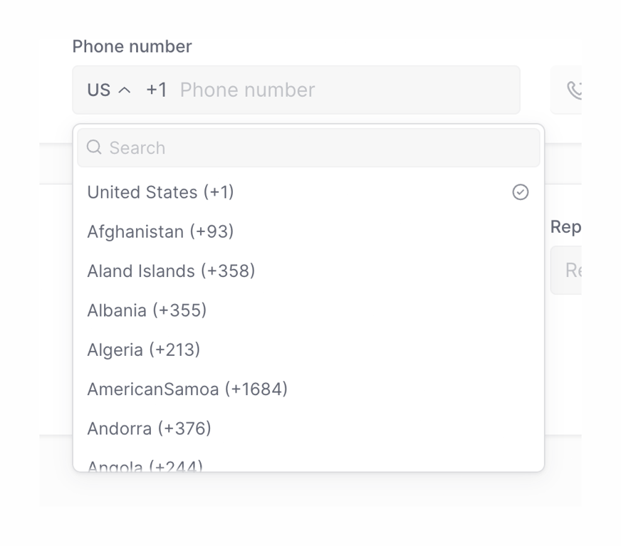
A phone number input field with an expanded dropdown menu for selecting the country code. The dropdown includes a search bar and a list of countries with their respective dialing codes.
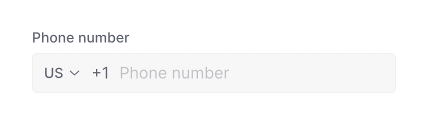
A form field for entering a phone number, featuring a country code selector and placeholder text.
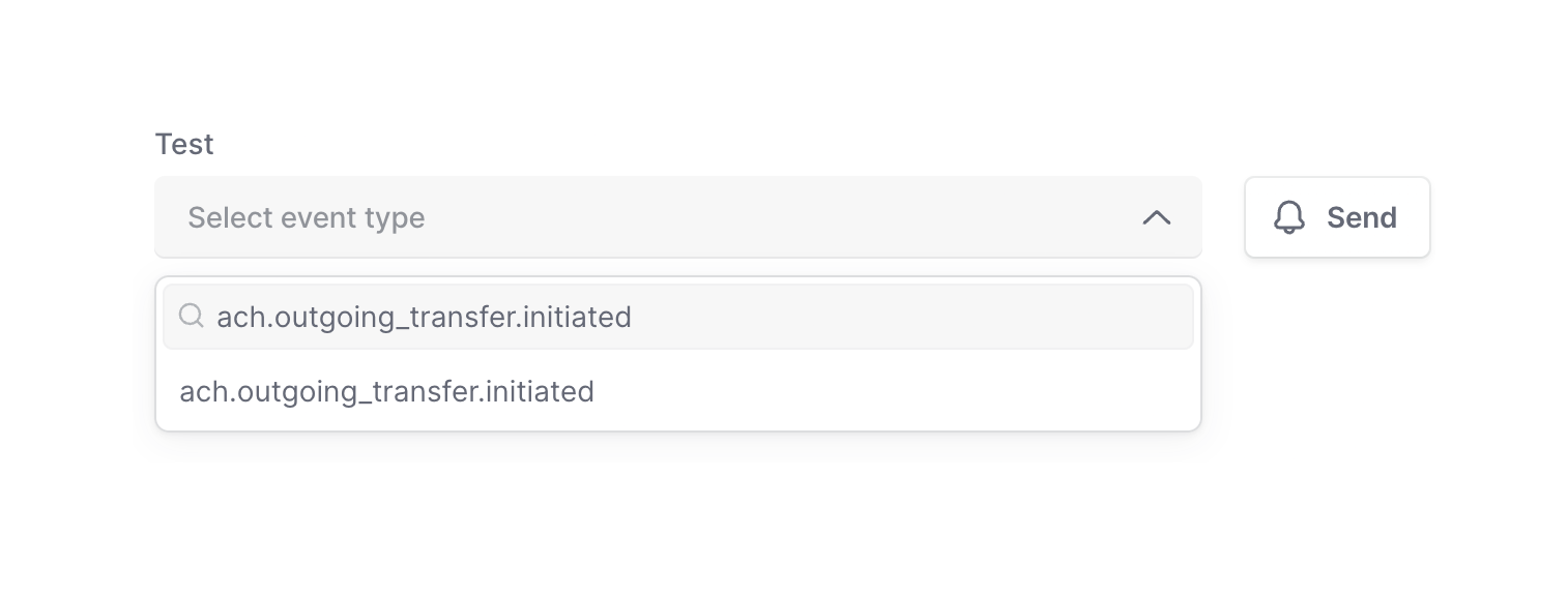
A combobox input for selecting an event type, shown in an expanded state with a search filter and one matching result. A 'Send' button is positioned alongside it.

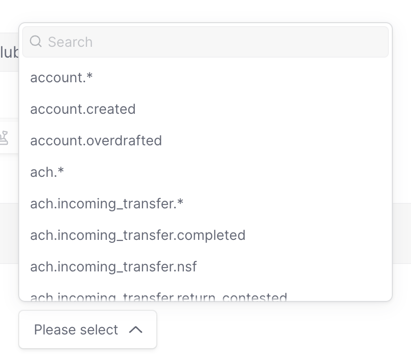
An open combobox dropdown menu featuring a search input at the top and a list of selectable event types below.
Browse the full component library
Browse the full UI component library.
Trusted by the best teams







