Ballpark UI components examples
Browse Ballpark UI component design examples. Preview individual interface elements and explore related component categories. Product research so simple, you’ll never skip it again.
Explore the examples
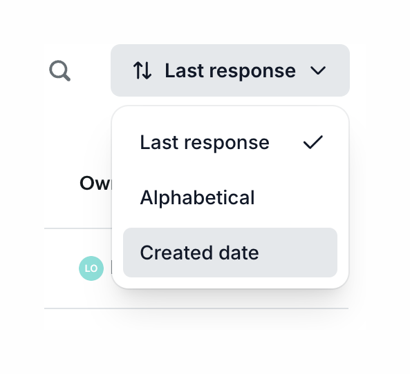

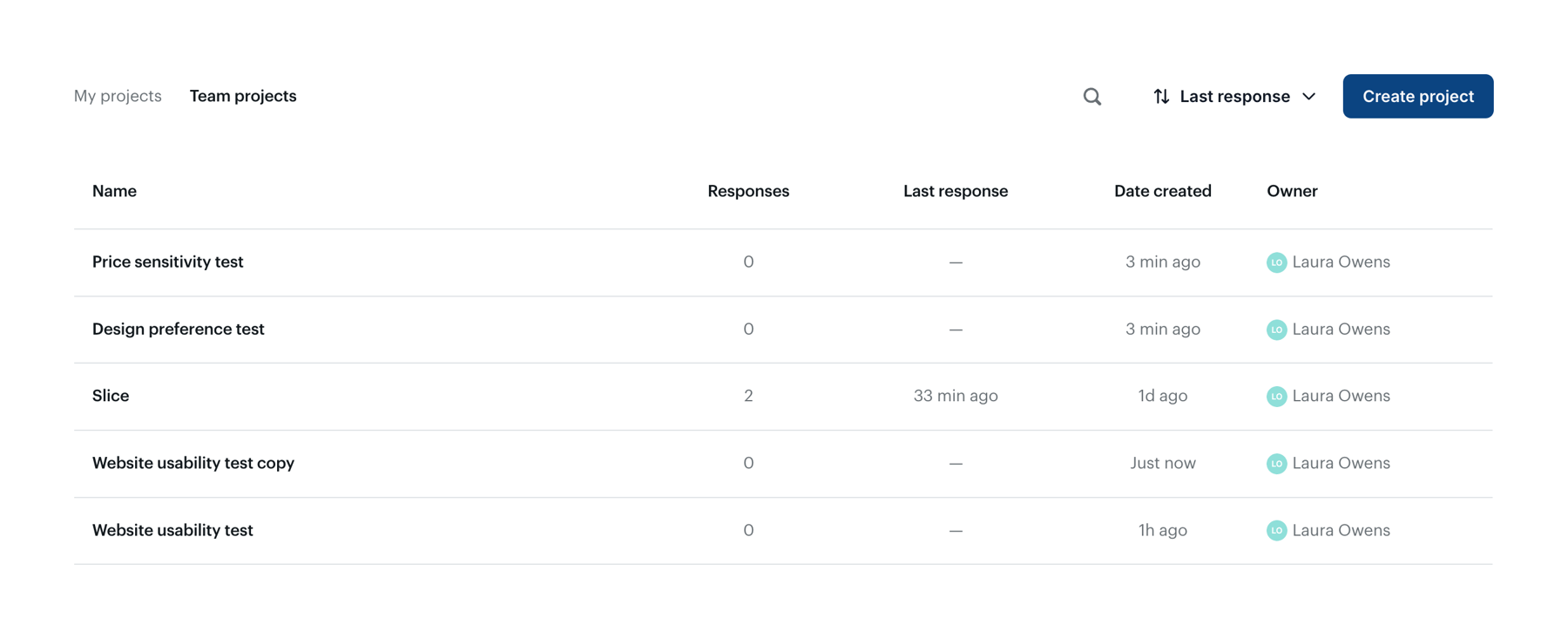
An open dropdown menu for sorting a list. The trigger button shows the current sort option, and the menu lists available sort criteria.
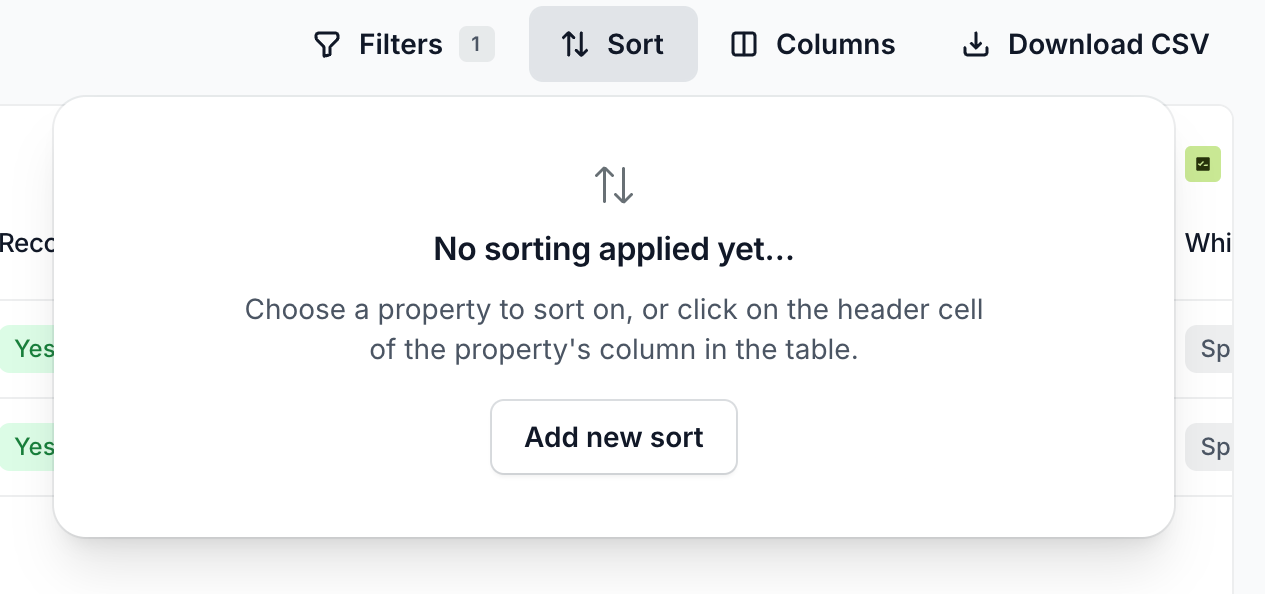
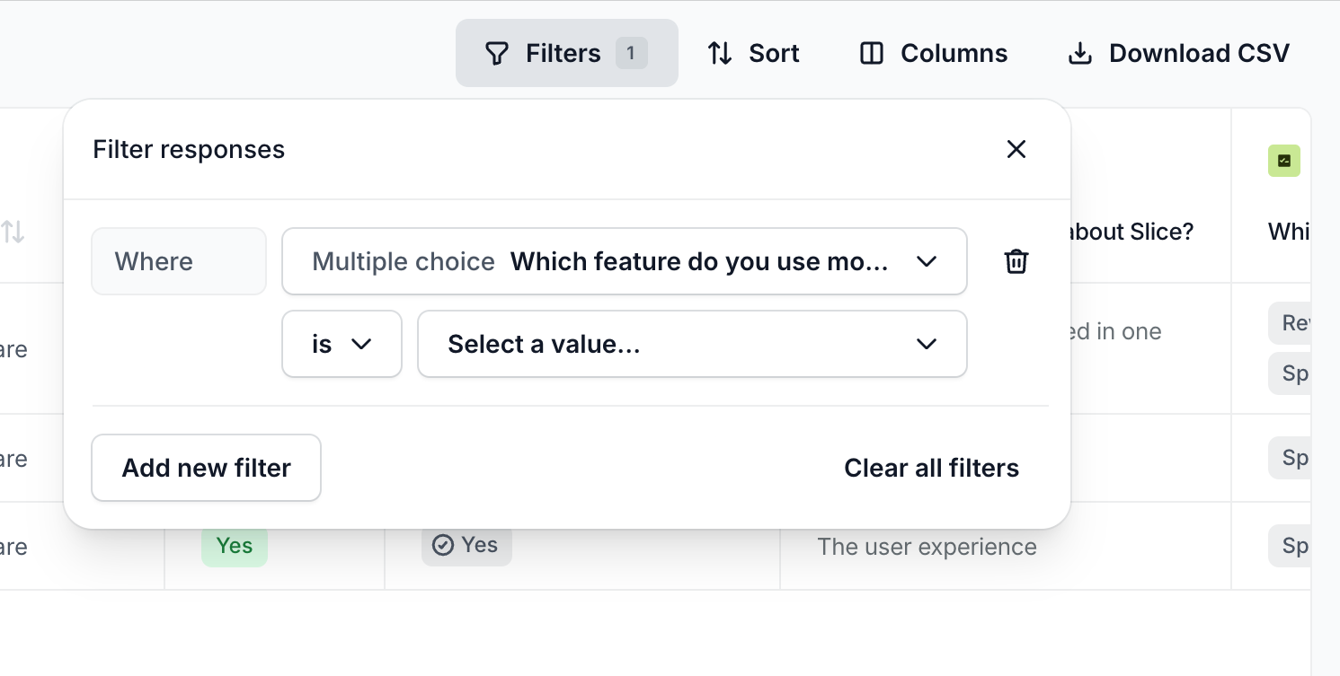
A popover overlay containing a filter builder interface. It allows users to construct a filter rule by selecting a field, an operator, and a value. It includes options to add new filters or clear all existing ones.
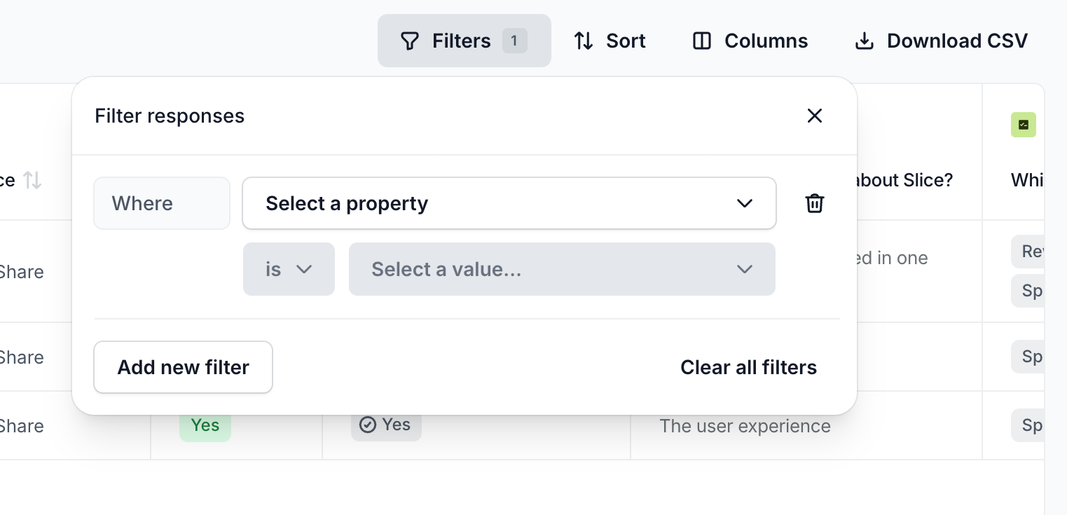
A popover menu for building complex filters, featuring property and value selection dropdowns, an add filter button, and a clear all option.
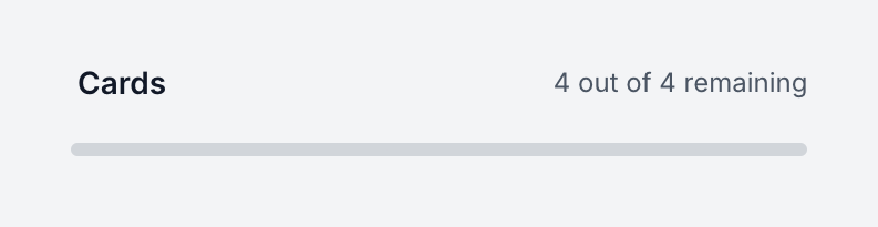
A progress bar showing the status of remaining cards. It includes a title, a text label indicating the count, and a horizontal bar.
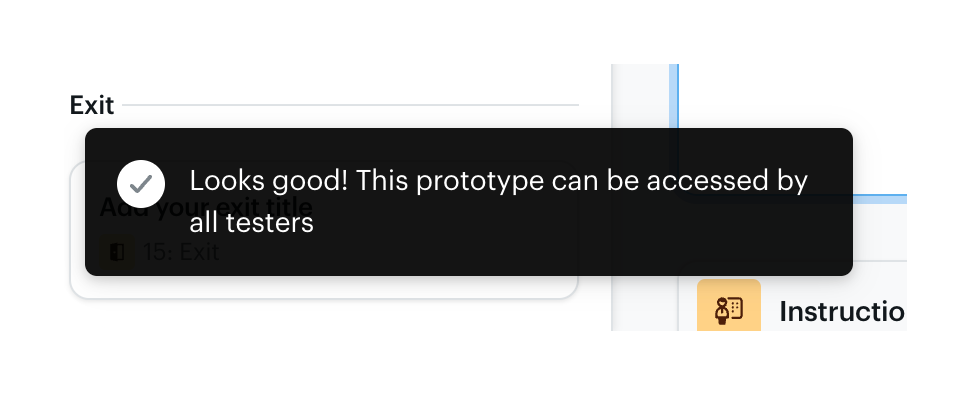
A dark-themed toast notification displaying a success message with a checkmark icon.
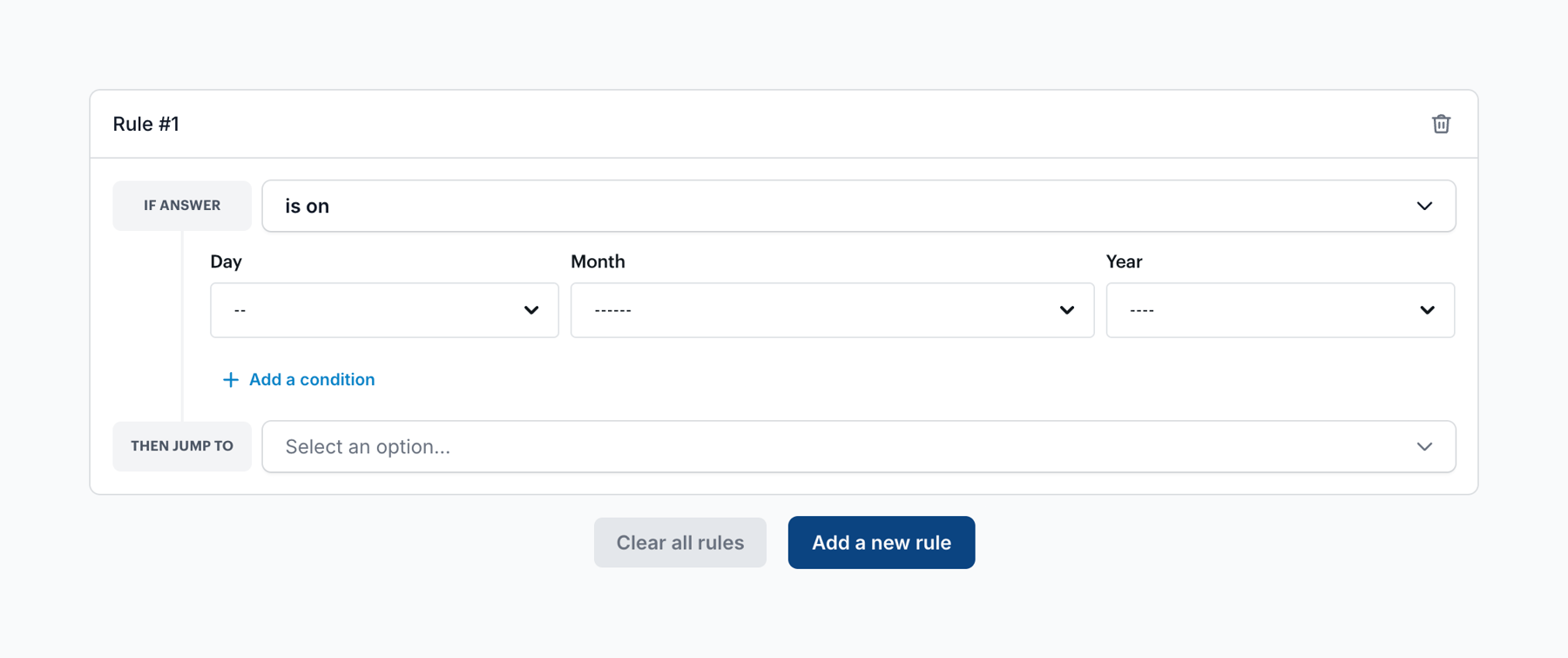
A form for creating conditional logic rules. It includes dropdowns for selecting conditions based on dates and actions to take when conditions are met.
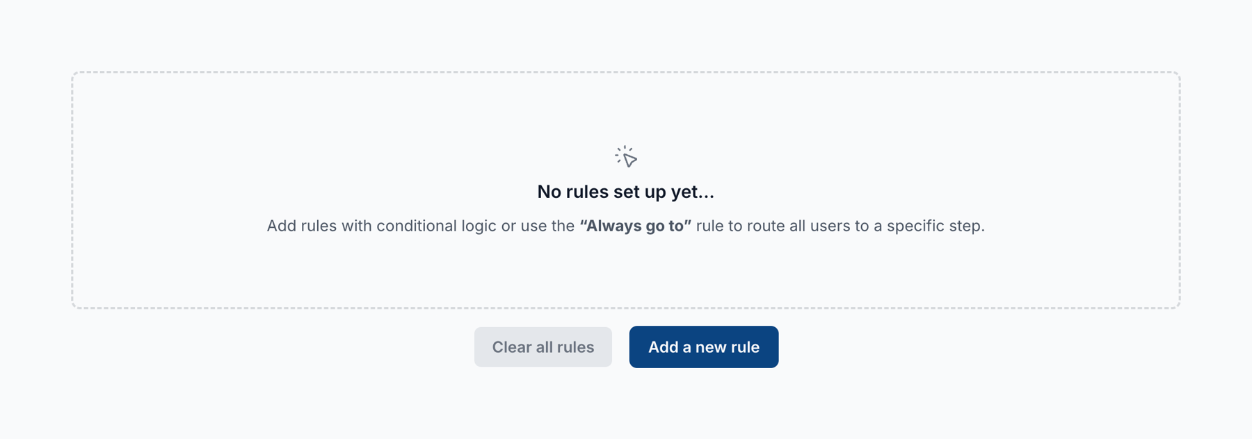
An empty state message indicating no rules have been set up, enclosed in a dashed border. Below the message are two buttons to clear or add rules.
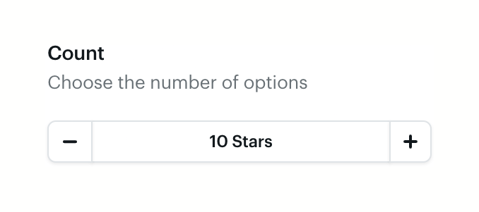
A numeric input field with a label, helper text, and inline minus/plus stepper buttons to adjust the value.
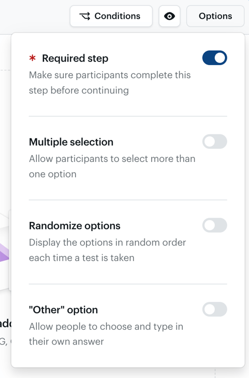
A popover menu containing a list of configuration options, each with a title, description, and a toggle switch.
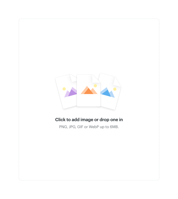
A drag-and-drop file upload area for images, featuring an illustration of image files, a primary instruction, and supported file types and size limits.
Browse the full component library
Browse the full UI component library.
Trusted by the best teams







