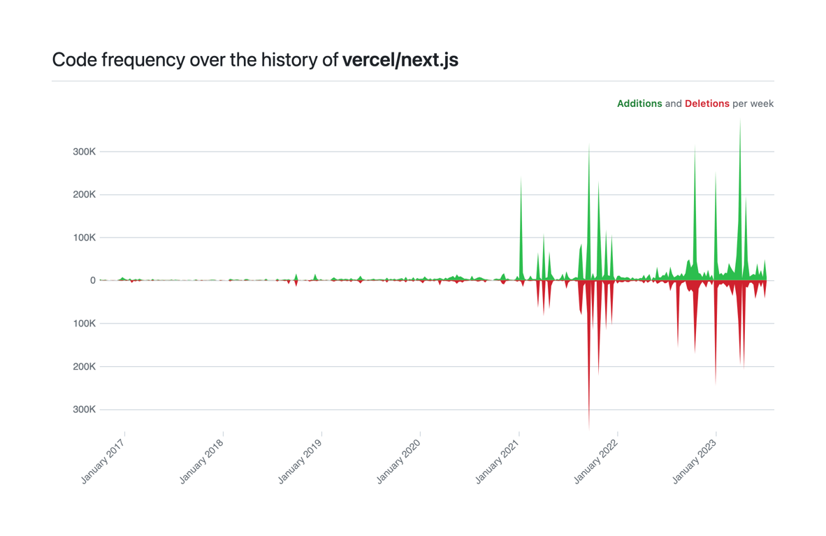
Code frequency chart
A mirrored area chart showing code additions and deletions over time. Additions are plotted above the zero line in green, and deletions are plotted below the zero line in red.
Explore the examples

Browse the full component library
Browse the full UI component library.
Trusted by the best teams