Threads UI components examples
Browse Threads UI component design examples. Preview individual interface elements and explore related component categories. Say more with Threads
Explore the examples
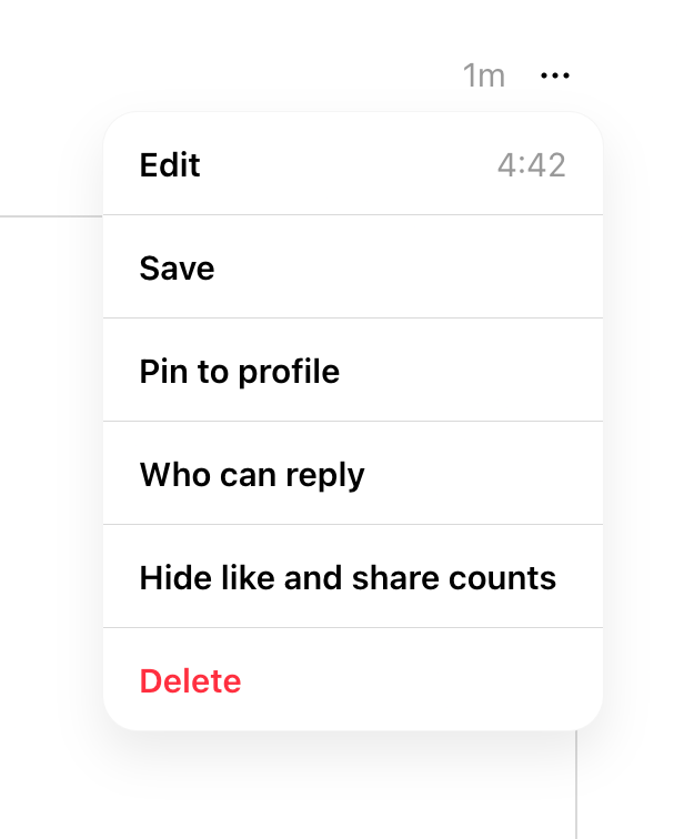

A dropdown menu showing options for a social media post, including edit, save, pin, reply settings, hide counts, and delete.
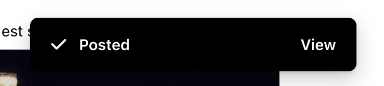
A dark-themed toast notification confirming a successful post, featuring a checkmark icon and an action link to view the post.
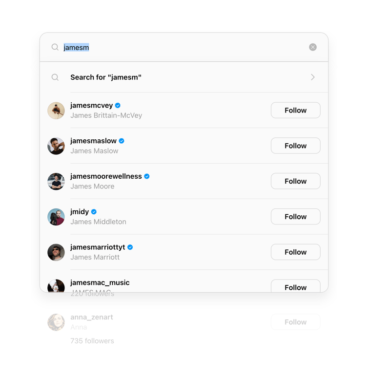
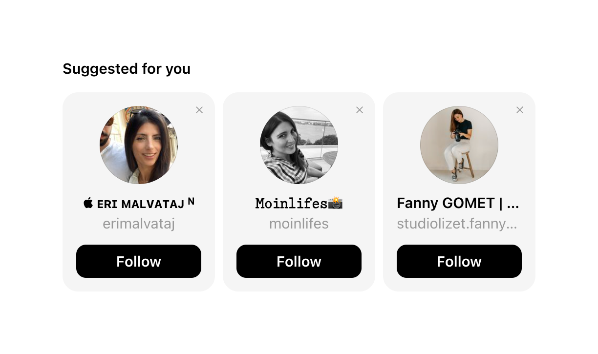
A search input field showing real-time user profile suggestions based on the typed query. Each suggestion includes an avatar, username, full name, verification badge (if applicable), and a Follow button.
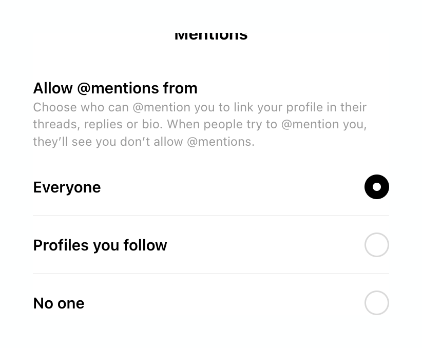
A radio group for selecting who can mention the user, with options for Everyone, Profiles you follow, and No one.

A list item containing a lock icon, the text 'Private profile', and a toggle switch in the off position.

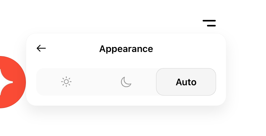
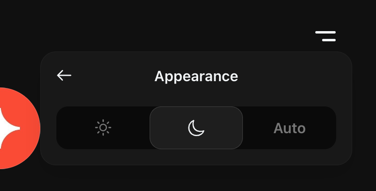
A popover menu for selecting the app's appearance theme, offering light, dark, and auto options.


A minimalist top navigation bar featuring a logo on the left, a centered group of five navigation icons, and a hamburger menu icon on the right.
Browse the full component library
Browse the full UI component library.
Trusted by the best teams







