Playbook UI components examples
Browse Playbook UI component design examples. Preview individual interface elements and explore related component categories. Make your creative work beauuutiful
Explore the examples


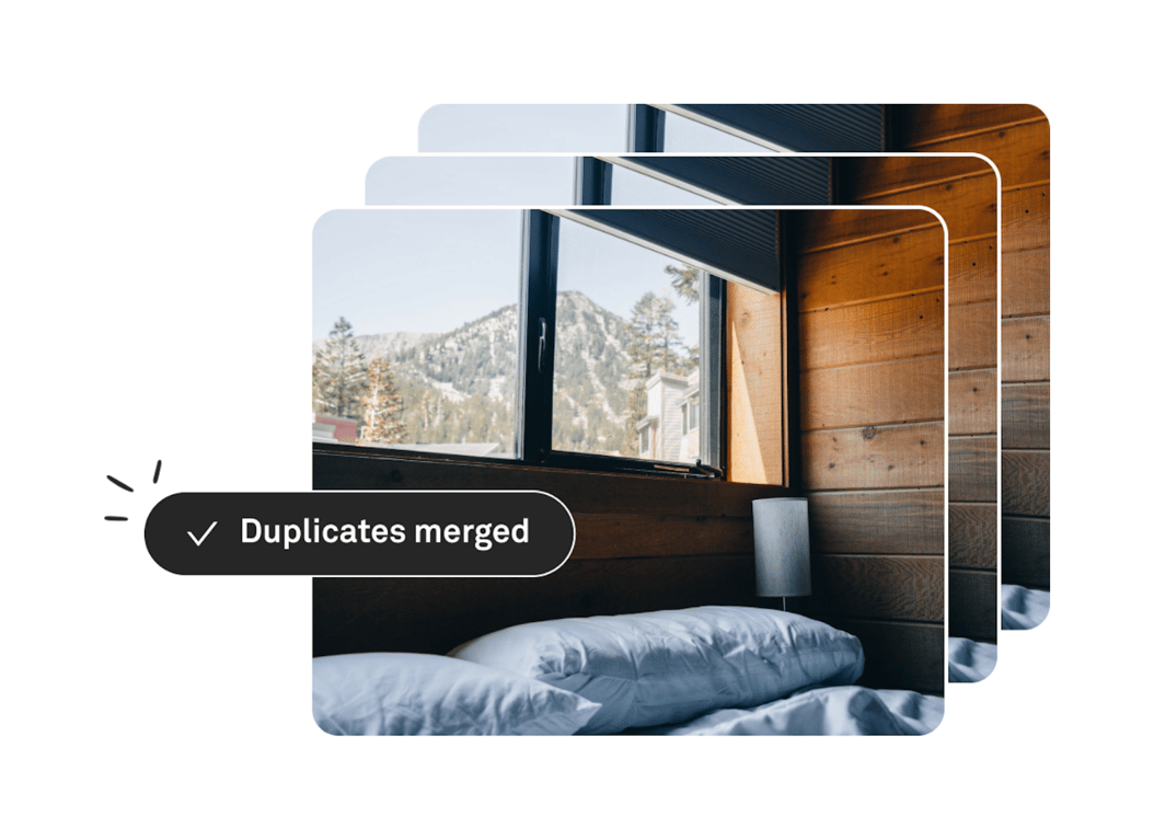

An illustration showing a stack of identical images with a success toast indicating that duplicates have been merged.
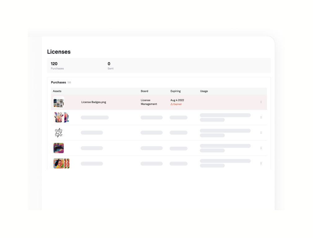
A view displaying license management details, including a summary of purchases and sent licenses, followed by a detailed table of purchased assets. The table includes columns for Assets, Board, Expiring, and Usage, with the first row showing an expired license and subsequent…

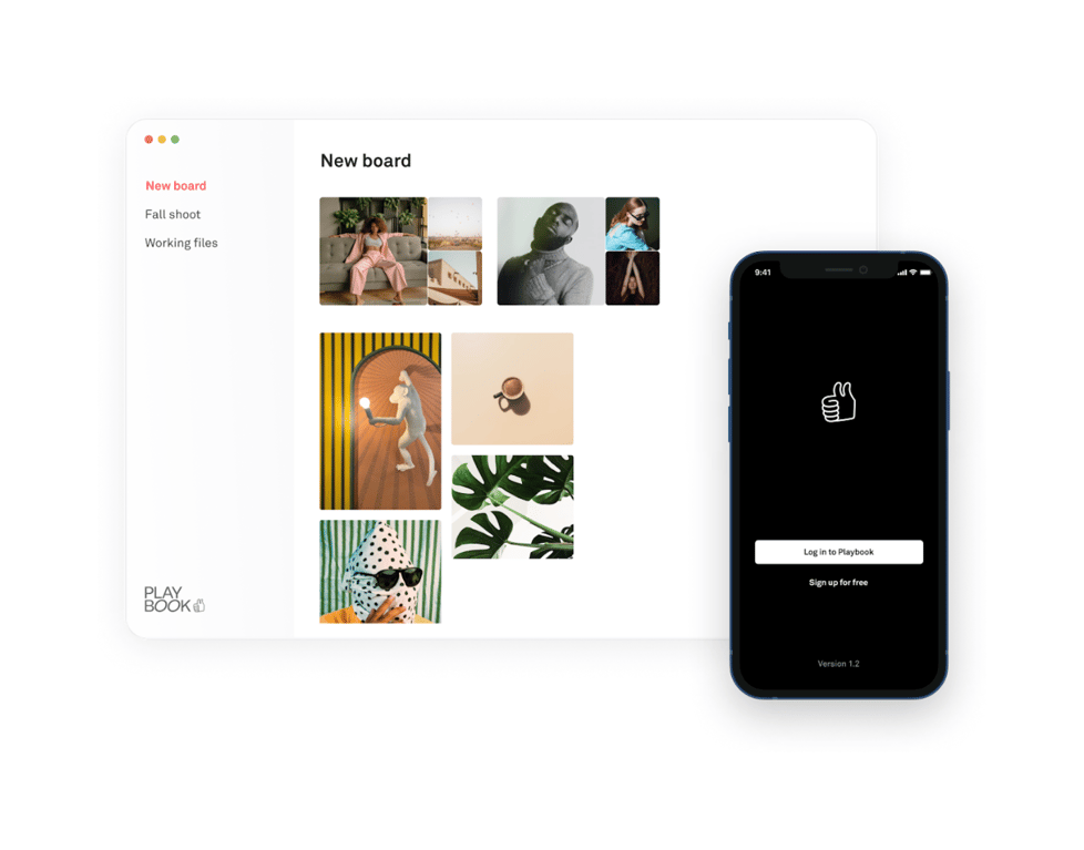
A stylized illustration showing a desktop web interface and a mobile app interface side-by-side. The desktop view shows a sidebar with navigation and a main area with a masonry grid of images. The mobile view shows a dark login screen with a thumbs-up icon and authentication…
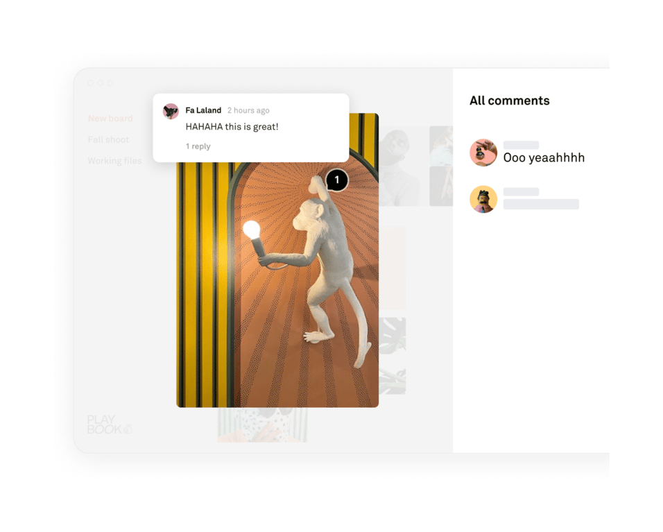
An illustration showing a stylized UI mockup of a commenting feature. It features a central image with a comment pin, a floating comment card, and a sidebar listing comments.
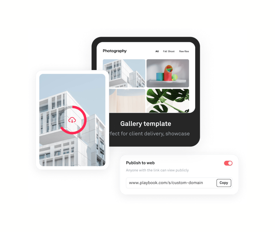
A stylized illustration showing overlapping UI elements: an image upload progress indicator, a gallery template preview, and a publish settings card.
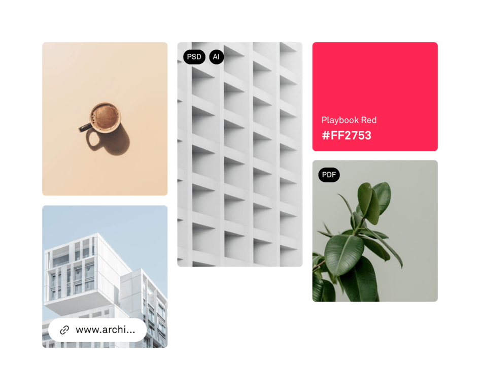
A masonry-style grid displaying various file types including images, a color swatch, and a link, with file format badges overlaid.
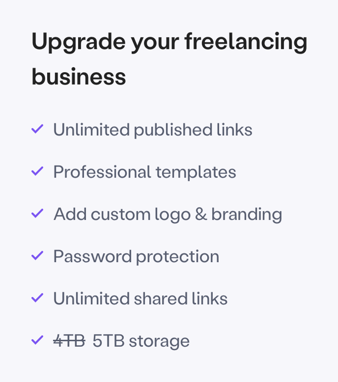
A list of features or benefits presented with checkmark icons, typically used to highlight the value of a product or plan.
Browse the full component library
Browse the full UI component library.
Trusted by the best teams







