Skip to content

Link UI components examples

Browse Link UI component design examples. Preview individual interface elements and explore related component categories. Simple, secure one-click payments

Explore the examples
Link — Illustration component
Link logo
Link

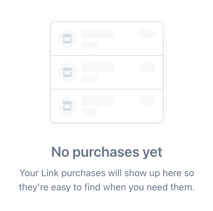
An empty state illustration showing a stylized, faded list of purchases, accompanied by a title and explanatory text indicating no purchases have been made yet.

Link — Notification Toast component
Link logo
Link

A pill-shaped success toast notification confirming a card was added.

Link — Toggle/Switch component
Link logo
Link

A toggle switch for marketing emails.

Link — Toggle/Switch component
Link logo
Link

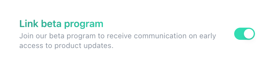
A toggle switch with a title and description, allowing users to opt into a beta program.
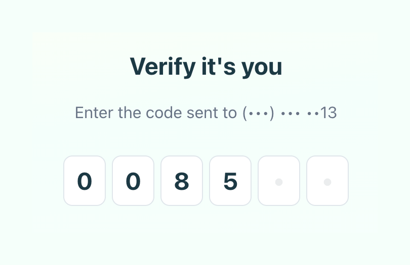
Link — Input code component
Link logo
Link

A partially filled 6-digit one-time password input field with a title and instructional text.
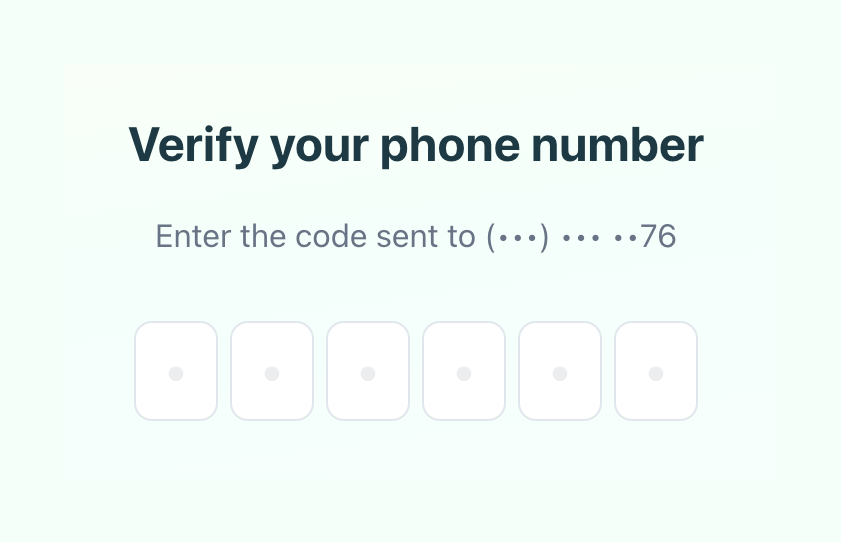
Link — Input code component
Link logo
Link

A form prompting the user to enter a 6-digit verification code sent to their phone number.
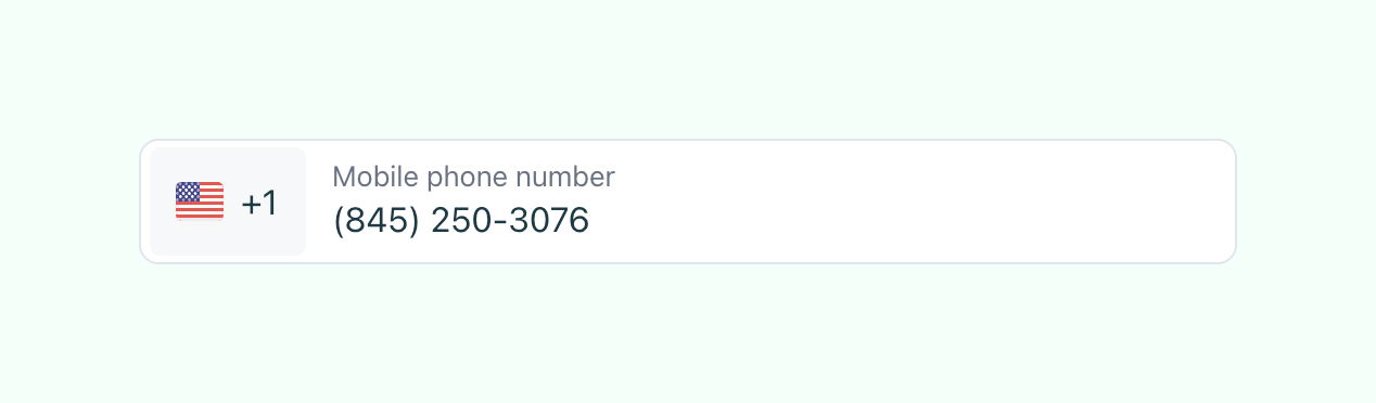
Link — Input phone number component
Link logo
Link

A phone number input field with a country code selector and a pre-filled US number.
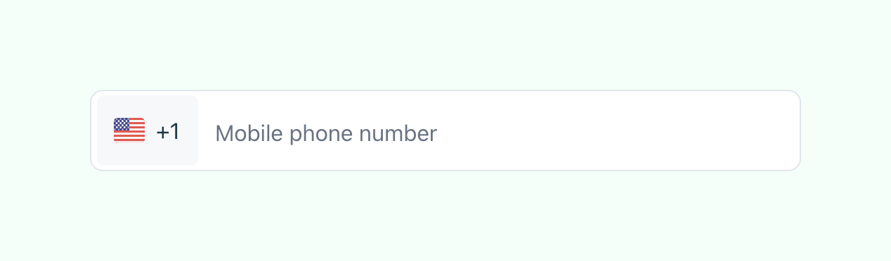
Link — Input phone number component
Link logo
Link

A text input field for entering a mobile phone number, featuring a country code selector with a flag icon.
Link — Input text component
Link logo
Link

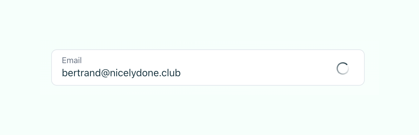
An email input field showing a loading spinner after the user has entered their email address.
Link — Footer component
Link logo
Link

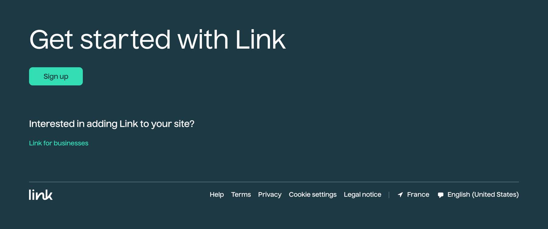
A dark-themed footer section featuring a prominent 'Get started' call to action, a secondary link for businesses, and standard footer navigation links including region and language selectors.

Link — Header component
Link logo
Link

A minimal website header featuring a logo on the left and a single 'Sign up' link on the right, set against a light green gradient background.

Link — FAQ component
Link logo
Link

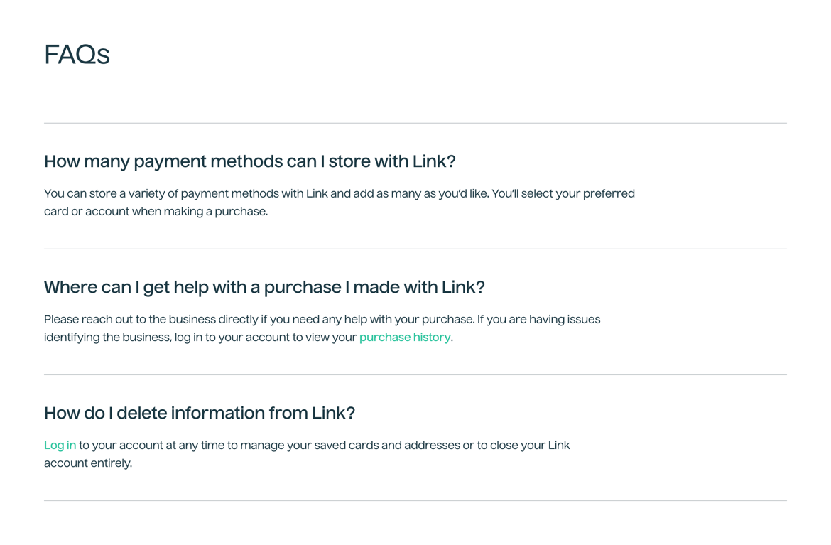
A frequently asked questions section displaying a list of questions and their corresponding answers, separated by horizontal dividers.

Browse the full component library

Browse the full UI component library.

Trusted by the best teams