Skip to content

Height UI components examples

Browse Height UI component design examples. Preview individual interface elements and explore related component categories. Manage projects across engineering, product, design, and other teams

Explore the examples
Height — Dropdown menu component
Height logo
Height

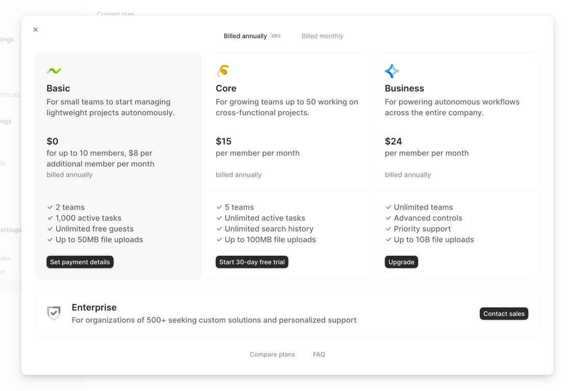
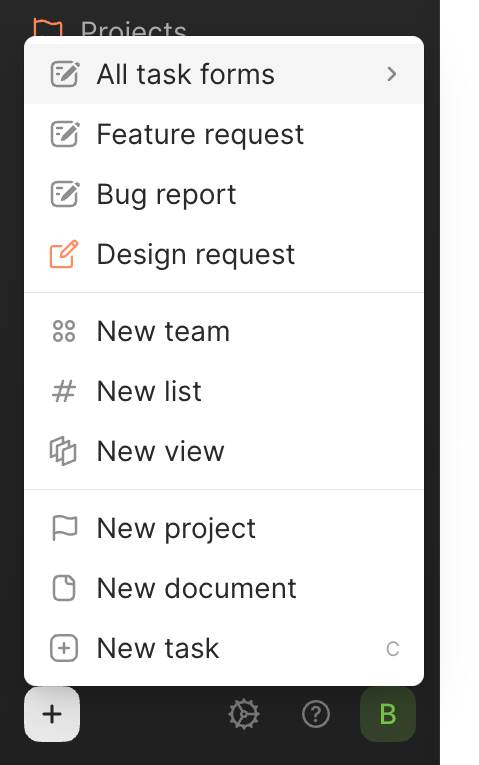
This is a modal menu with a list of options.

Height — Dropdown menu component
Height logo
Height

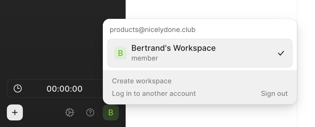
A user profile dropdown menu

Height — Click to copy component
Height logo
Height

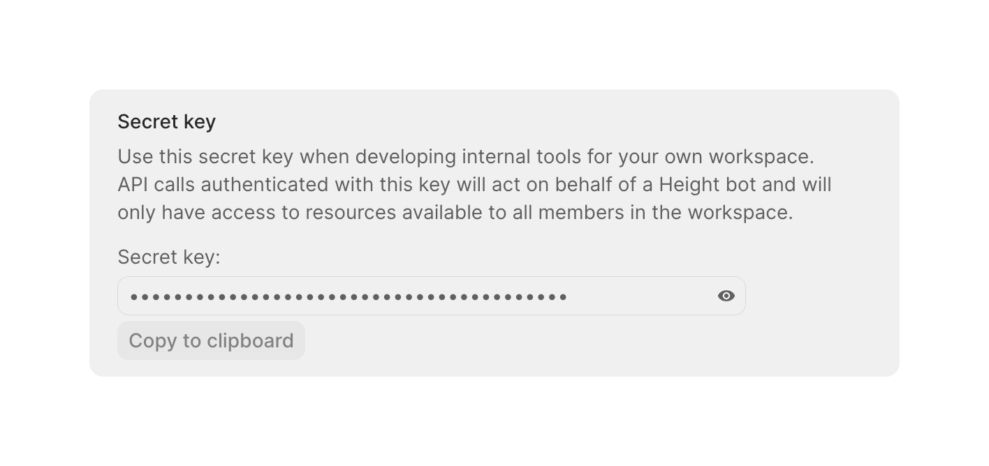
A card component displaying a masked secret key with options to reveal and copy it. Includes explanatory text about the key's usage and permissions.
Height — Modal component
Height logo
Height

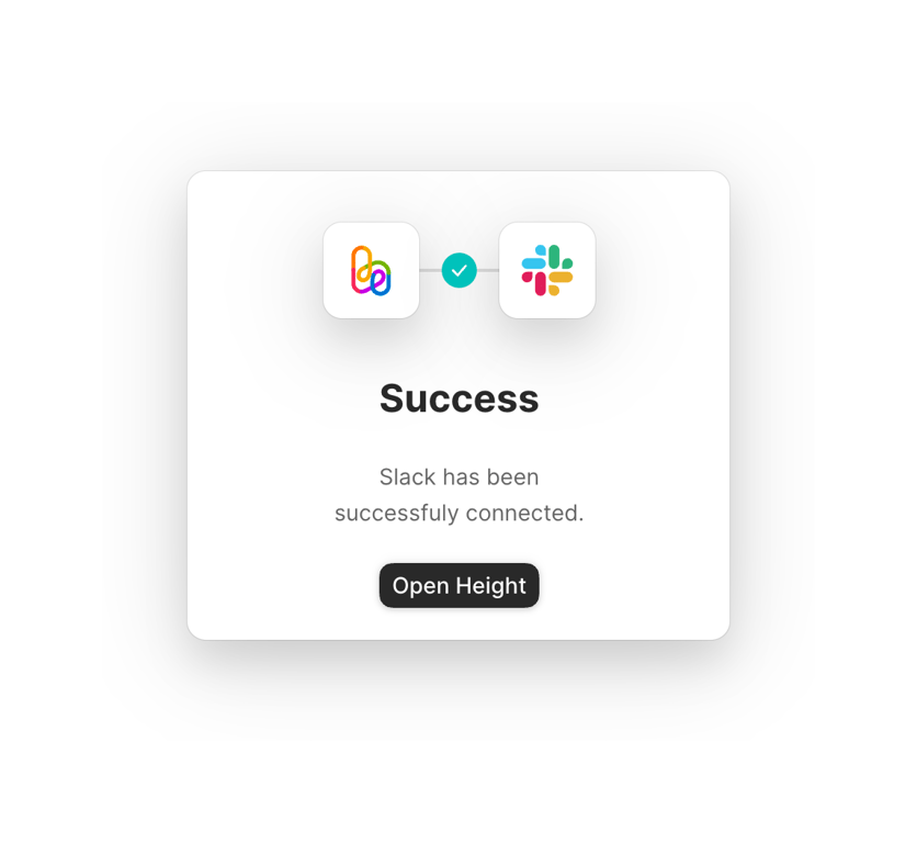
A success modal for a Slack integration.

Height — Modal component
Height logo
Height

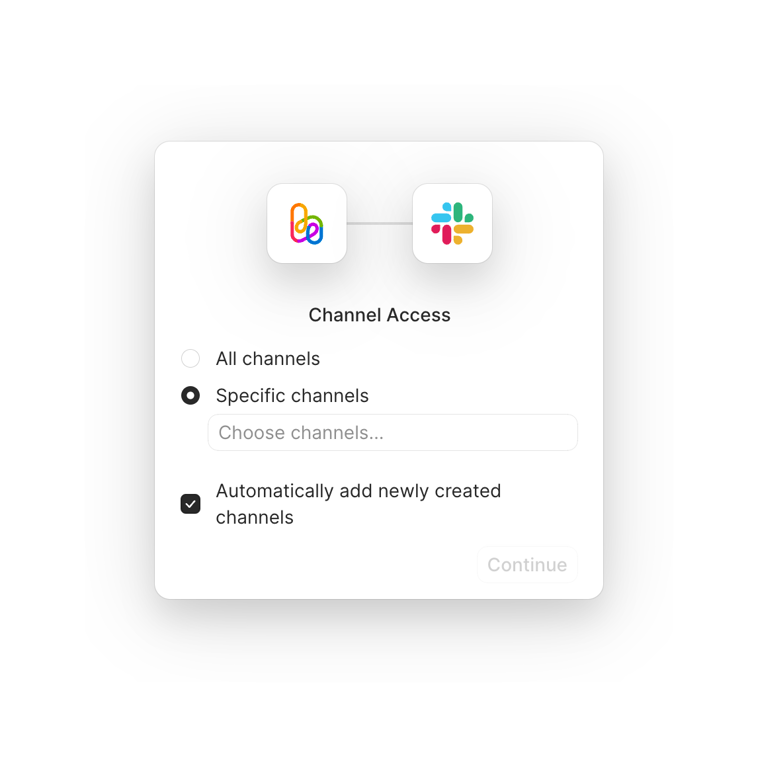
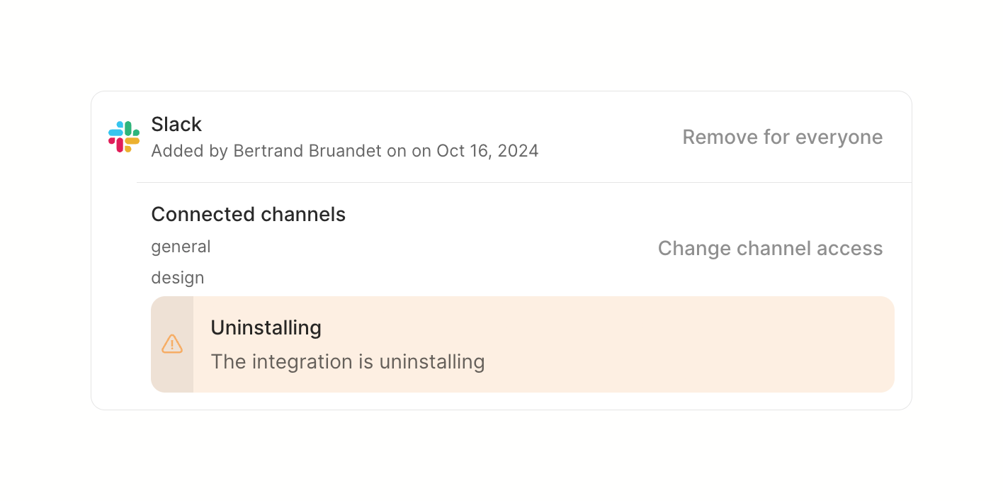
A modal for channel access settings.

Height — Input tag component
Height logo
Height

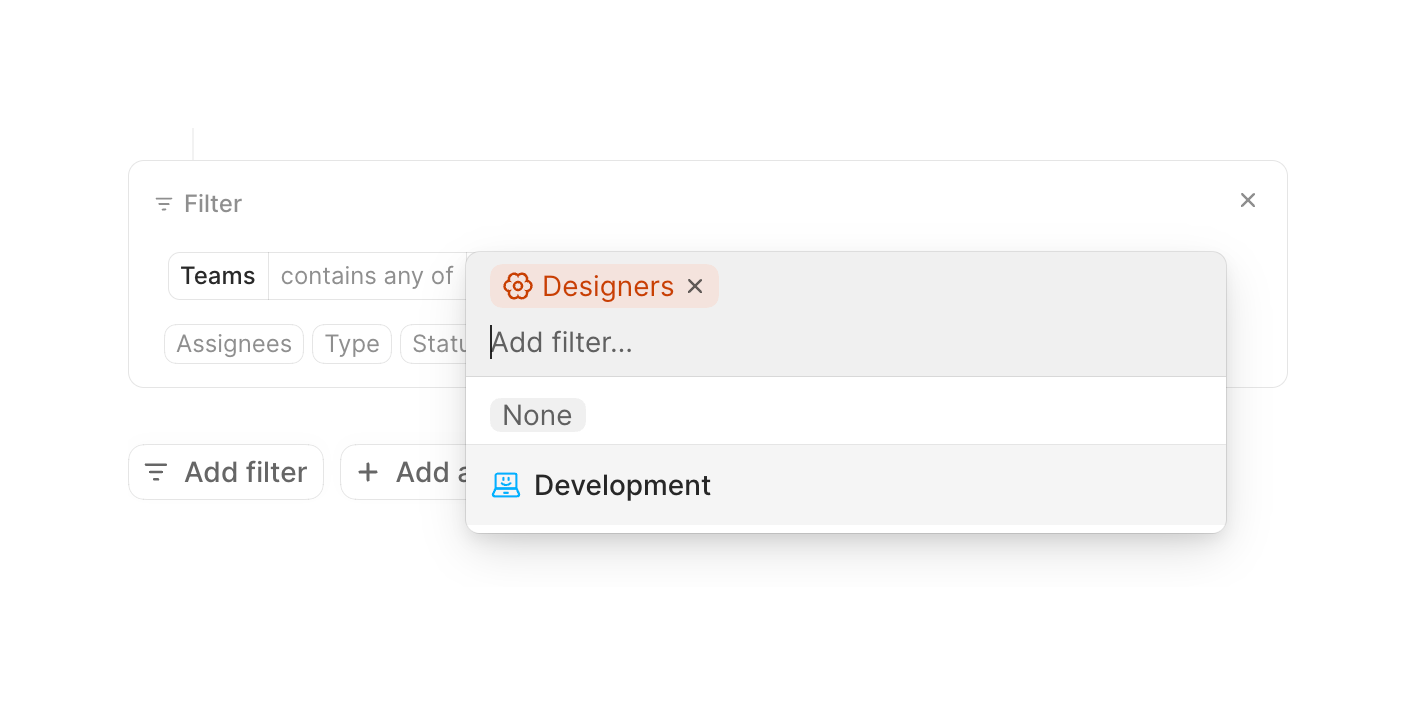
A filter configuration block showing a selected 'Teams' attribute and a combobox dropdown open to select specific team values. The dropdown displays a selected 'Designers' tag and options for 'None' and 'Development'.

Height — Autocomplete component
Height logo
Height

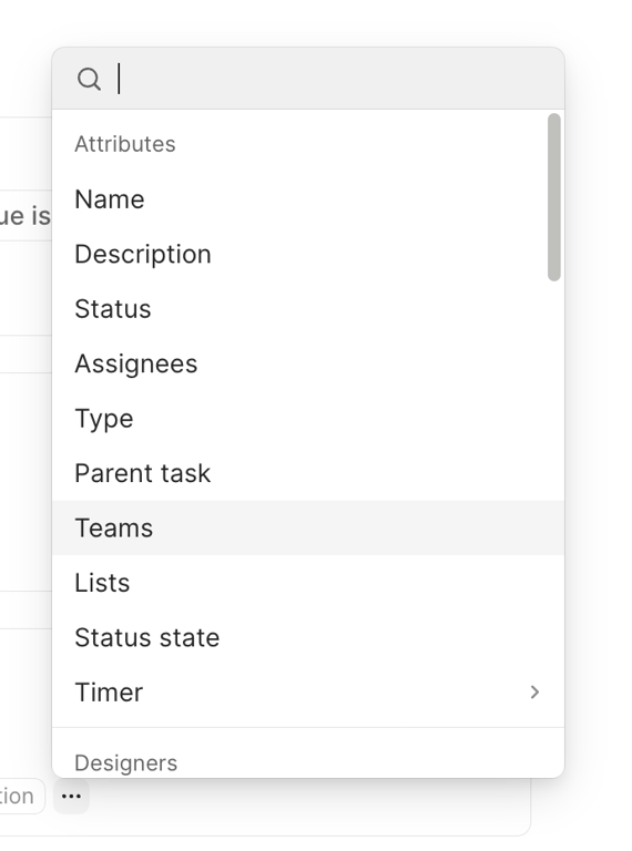
This is a modal with a list of attributes and options.

Height — Modal component
Height logo
Height

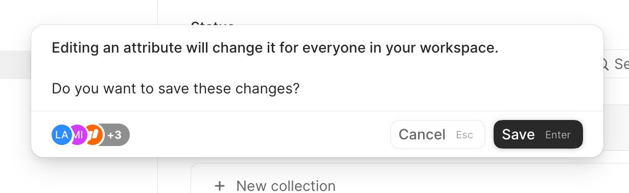
A modal dialog asking the user to confirm saving changes to an attribute, warning that it will affect everyone in the workspace. It includes an avatar group showing affected users and action buttons with keyboard shortcuts.

Height — Checkbox & radio component
Height logo
Height

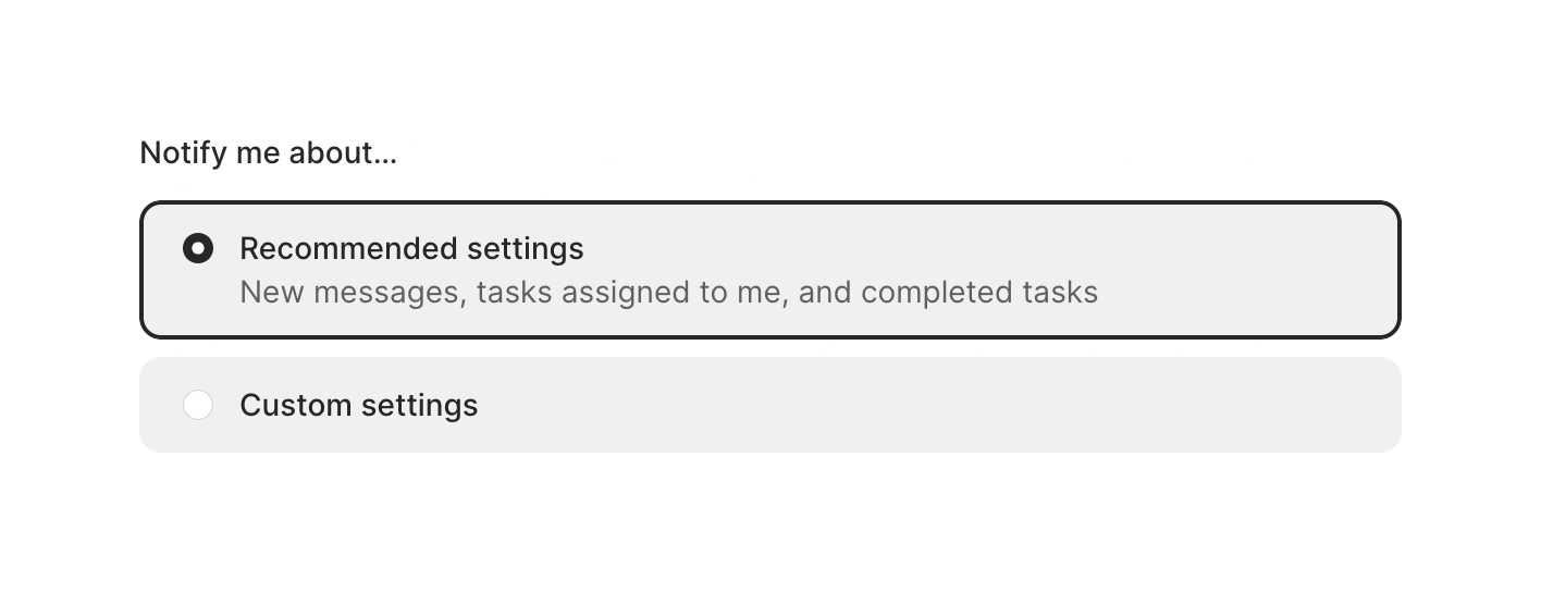
A radio group allowing users to choose between recommended and custom notification settings. The selected option is highlighted with a border and background color.

Browse the full component library

Browse the full UI component library.

Trusted by the best teams