Skip to content

Formcarry UI components examples

Browse Formcarry UI component design examples. Preview individual interface elements and explore related component categories. Best form endpoint - form backend

Explore the examples
Formcarry — Table component
Formcarry logo
Formcarry

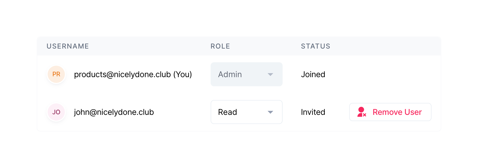
A table displaying team members, their roles, and statuses. It includes dropdowns to change roles and a button to remove users.

Formcarry — Click to copy component
Formcarry logo
Formcarry

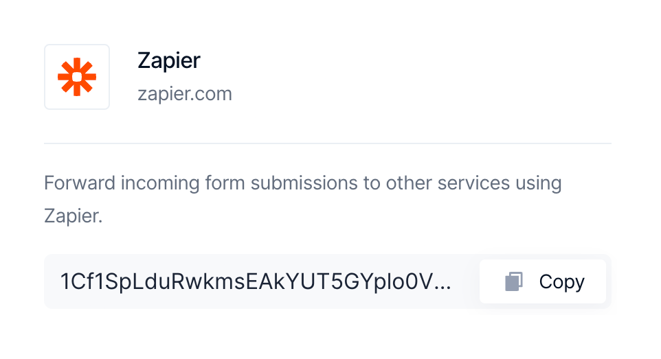
A card displaying an integration with Zapier, including its logo, name, website, a brief description, and a copyable API key or token.

Formcarry — Charts component
Formcarry logo
Formcarry

A KPI tile displaying a total submissions count alongside a line chart showing submissions over time. The chart currently shows zero submissions across all dates.

Formcarry — Charts component
Formcarry logo
Formcarry

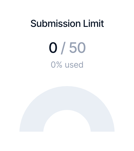
A gauge chart displaying the current usage against a submission limit. It shows 0 out of 50 used, with a 0% used label and an empty semi-circular gauge.

Formcarry — Avatar component
Formcarry logo
Formcarry

A welcome header featuring an overlapping avatar group and a personalized greeting with a subtitle.

Formcarry — File upload input component
Formcarry logo
Formcarry

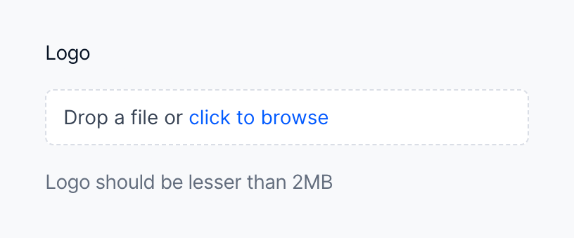
A drag-and-drop file upload area with a dashed border, label, and helper text.

Formcarry — Toggle/Switch component
Formcarry logo
Formcarry

A settings row with an icon, title, description, a 'PRO' badge, a toggle switch, and an edit button.
Formcarry — Toggle/Switch component
Formcarry logo
Formcarry

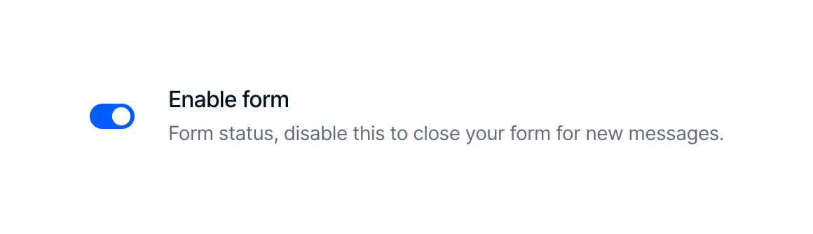
A toggle switch component used to enable or disable a form, accompanied by a label and a descriptive helper text.
Formcarry — Badge component
Formcarry logo
Formcarry

A small pill-shaped badge indicating a 'PRO' status or feature.

Formcarry — Code block component
Formcarry logo
Formcarry

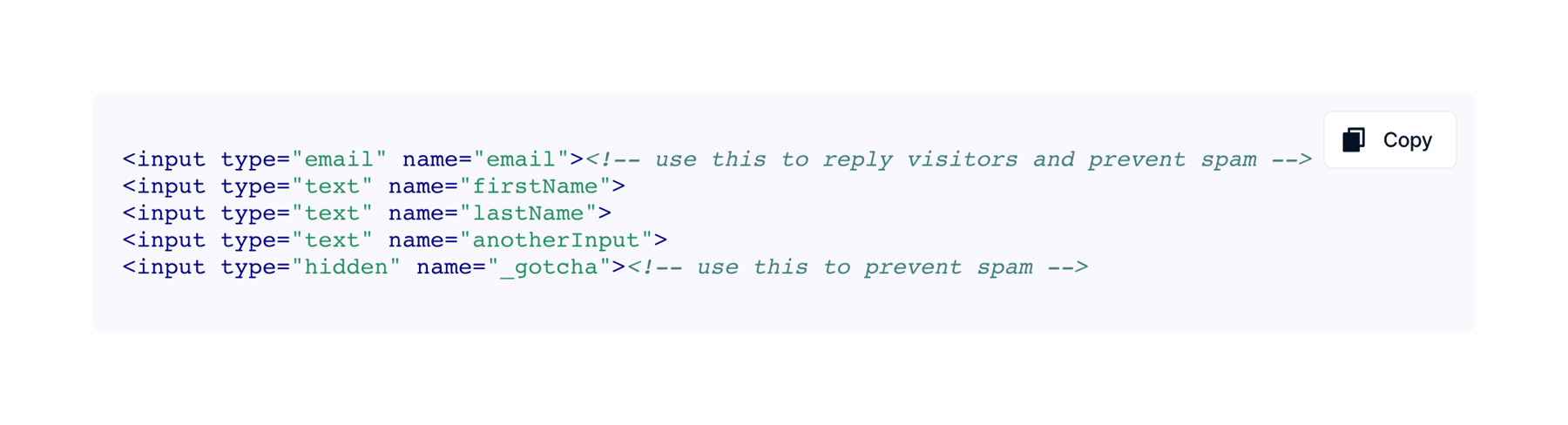
A code block displaying HTML input fields with syntax highlighting and a copy button.
Formcarry — Stepper component
Formcarry logo
Formcarry

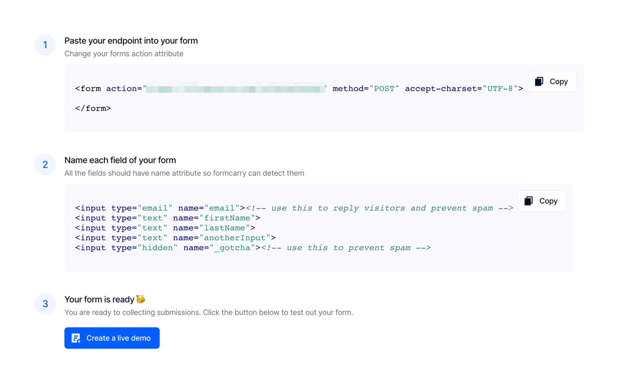
A vertical stepper providing three steps to set up a form endpoint. Steps 1 and 2 include code snippets with copy buttons. Step 3 includes a primary action button to create a live demo.

Formcarry — Tabs component
Formcarry logo
Formcarry

A horizontal tab navigation bar with four options. The first option is currently selected, indicated by a white background and blue text.

Browse the full component library

Browse the full UI component library.

Trusted by the best teams