(Basic) Bookmarks UI components examples
Browse (Basic) Bookmarks UI component design examples. Preview individual interface elements and explore related component categories. A home for your internet discoveries
Explore the examples
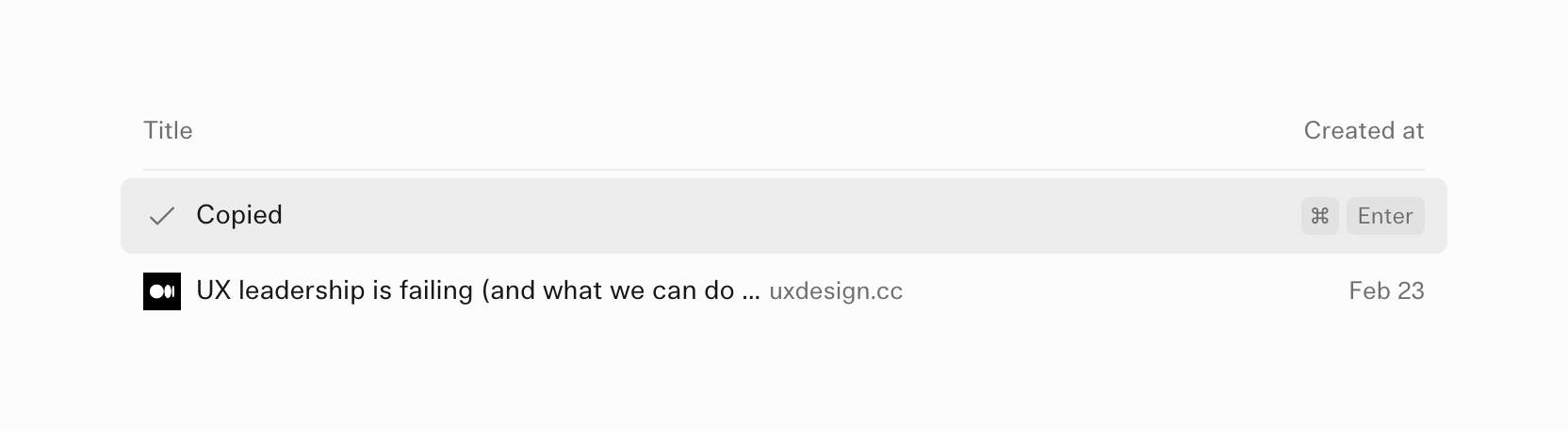
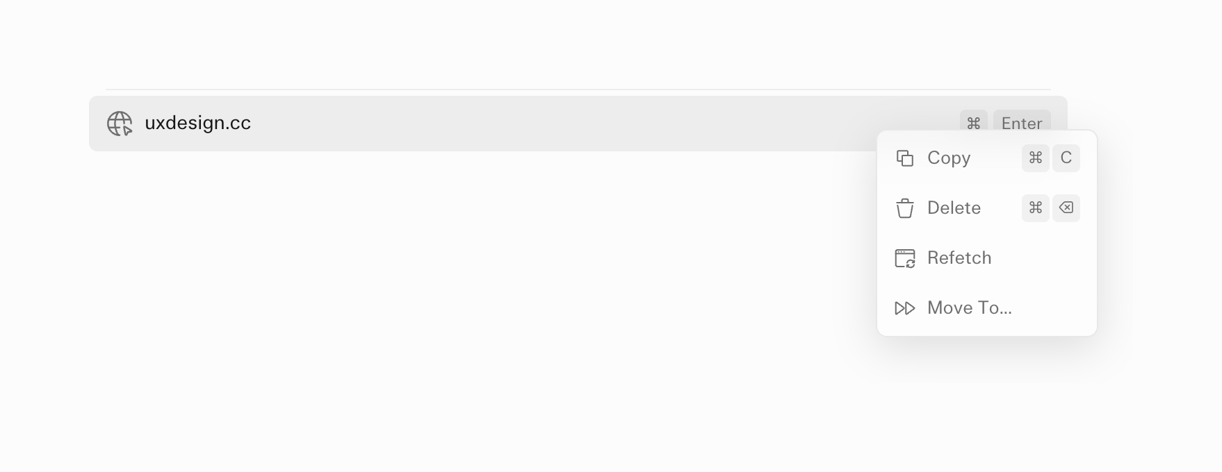

A selected list item showing a URL, with an open context menu displaying actions like Copy, Delete, Refetch, and Move To, along with keyboard shortcuts.
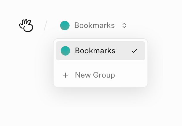
A dropdown menu for selecting or creating bookmark groups, shown in an open state with the current group selected.
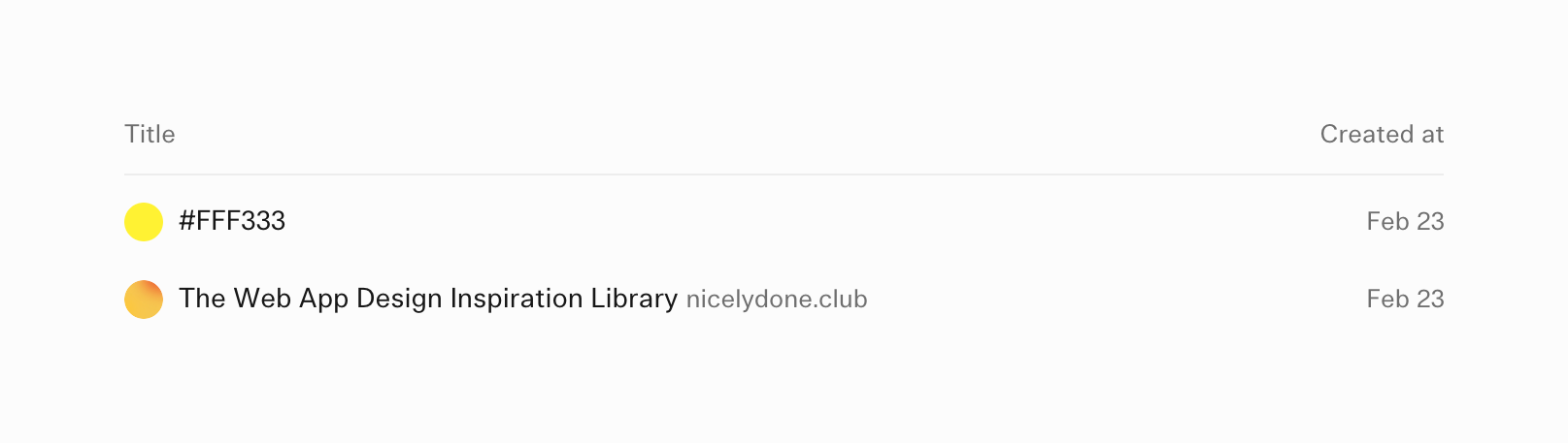
A simple list displaying saved bookmarks with a color swatch or icon, title, optional domain, and creation date.
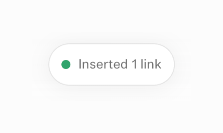
A pill-shaped toast notification indicating a successful action, featuring a green dot and a short text message.

A user profile dropdown trigger showing a circular red avatar, the username 'bertrand', and an up/down chevron icon.

A minimal top navigation bar featuring a logo, a breadcrumb-style workspace selector, and a user profile dropdown.
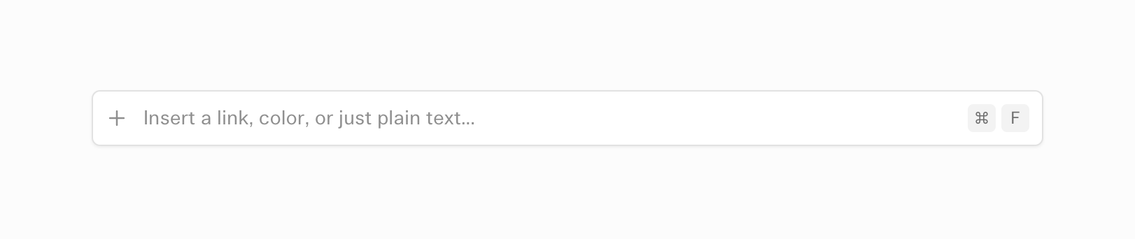
A wide input field with a plus icon on the left, placeholder text, and a keyboard shortcut indicator on the right.
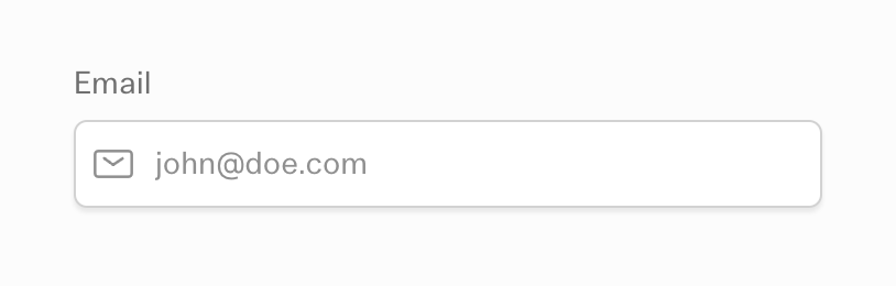
A standard text input field for an email address, featuring a top label, a left-aligned envelope icon, and placeholder text.
Browse the full component library
Browse the full UI component library.
Trusted by the best teams







