V7 UI components examples
Browse V7 UI component design examples. Preview individual interface elements and explore related component categories. Workflows for data labeling and document automation
Explore the examples
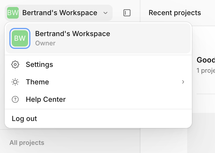

A dropdown menu for switching workspaces and accessing account settings. It displays the current workspace with an avatar and role, followed by options for settings, theme, help, and logging out.
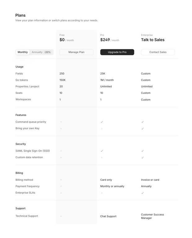
A detailed pricing comparison table showing three tiers: Free, Pro, and Enterprise. It includes a toggle for monthly/annual billing and breaks down features across categories like Usage, Features, Security, Billing, and Support.
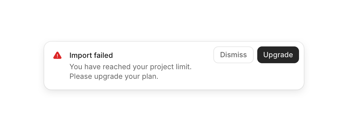
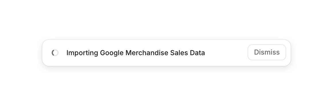
A toast notification indicating an ongoing background process, featuring a loading spinner, a status message, and a dismiss button.
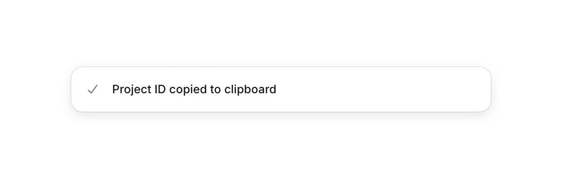
A confirmation message indicating that a project ID has been copied to the clipboard.
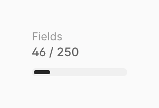
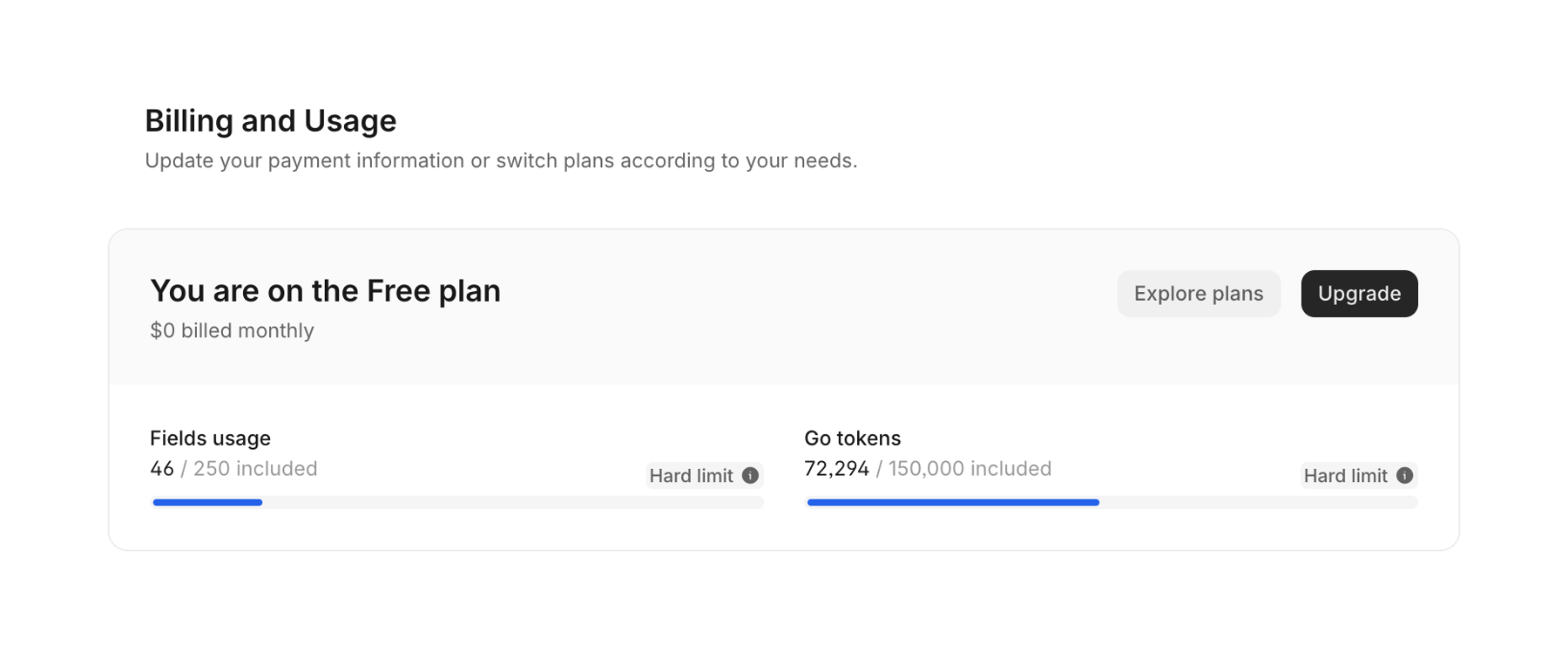
A progress bar component displaying usage limits. It shows a label, a numeric fraction representing current usage versus the total limit, and a visual progress bar.

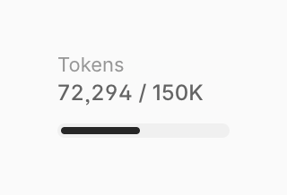
A progress bar component displaying current token usage against a maximum limit. It includes a label, numeric values, and a visual progress indicator.
Browse the full component library
Browse the full UI component library.
Trusted by the best teams







