Skip to content

Modal UI components examples

Browse Modal UI component design examples. Preview individual interface elements and explore related component categories. Cloud functions reimagined

Explore the examples

Modal — Charts component
Modal logo
Modal

A minimal bar chart sparkline showing a single recent activity event against a baseline of inactivity.

Modal — Progress indicator component
Modal logo
Modal

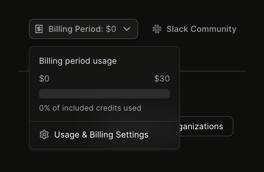
A billing usage modal

Modal — Dropdown menu component
Modal logo
Modal

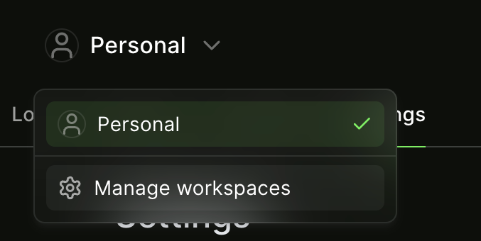
An open dropdown menu showing the currently selected workspace and an option to manage workspaces.
Modal — Progress indicator component
Modal logo
Modal

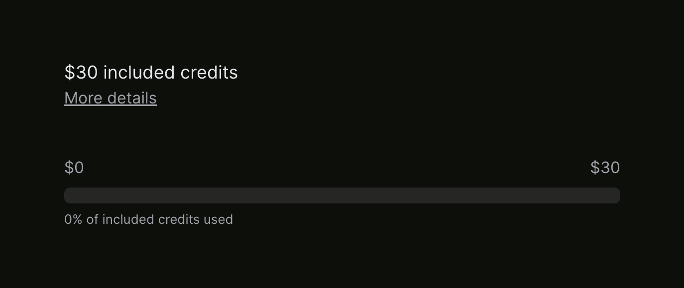
A progress bar showing the amount of included credits used, currently at 0%. It includes a title, a link for more details, and min/max labels on the bar.

Modal — Toggle/Switch component
Modal logo
Modal

A settings row with a title, description, and an active toggle switch to enable email notifications for deployed function failures.

Modal — Table component
Modal logo
Modal

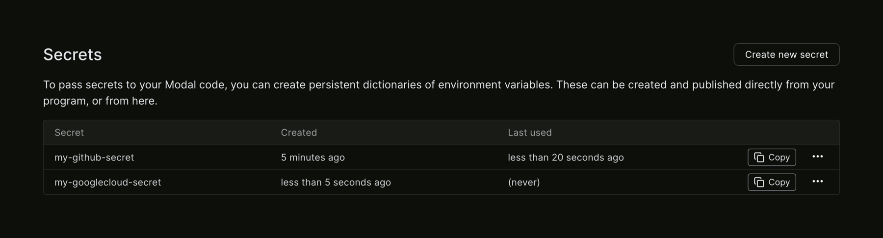
A table of secrets with creation and last used information.

Modal — Horizontal navigation component
Modal logo
Modal

A dark-themed application header featuring a logo, workspace selector, billing status, community links, user avatar, and a secondary navigation bar with tabs.
Modal — Accordion component
Modal logo
Modal

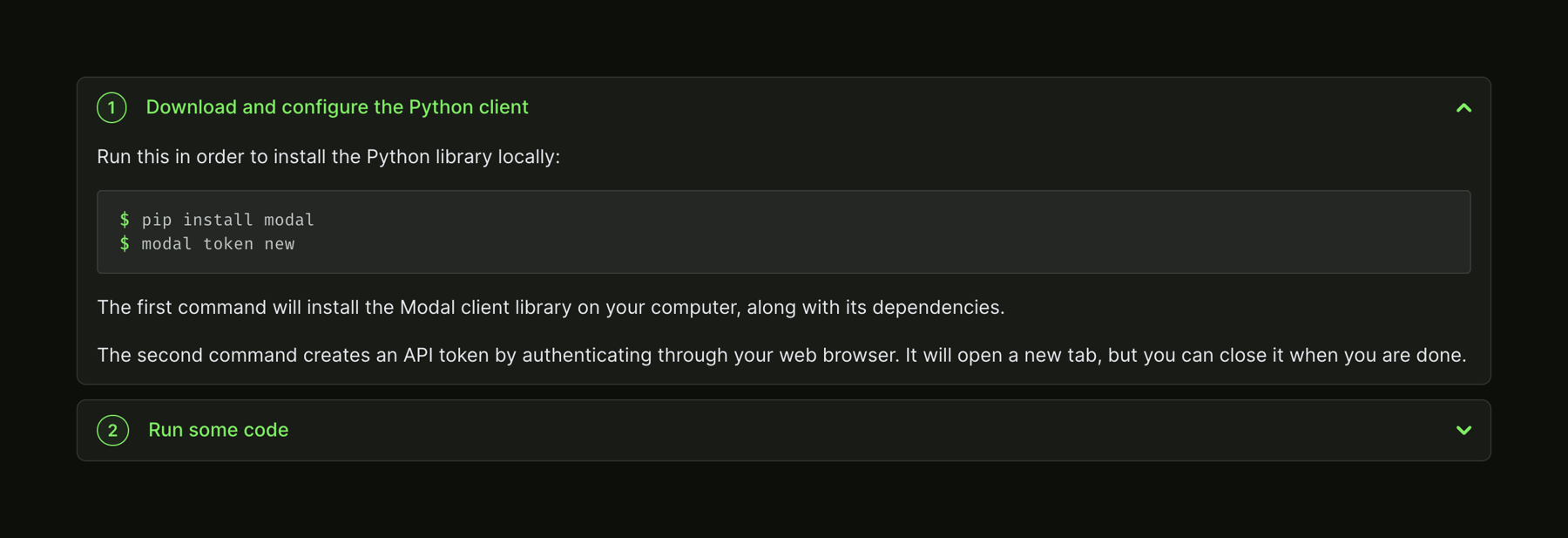
A two-step accordion guiding users through downloading and configuring a Python client, and running code. The first step is expanded, showing instructions and a code block.

Modal — Stepper component
Modal logo
Modal

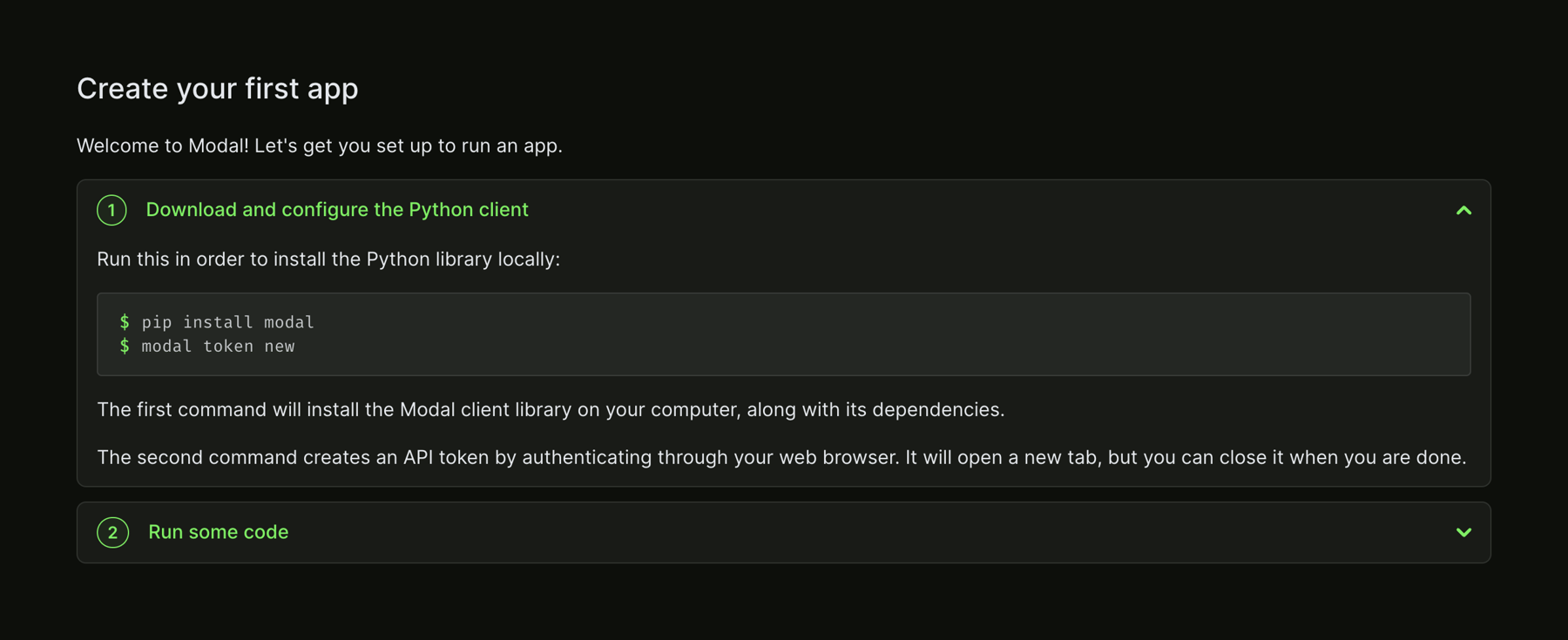
A vertical accordion acting as a stepper for onboarding. The first step is expanded, showing instructions and a code block for installing a Python client. The second step is collapsed.

Modal — Code block component
Modal logo
Modal

A dark-themed code block displaying two terminal commands for installing a package and generating a token.
Modal — FAQ component
Modal logo
Modal

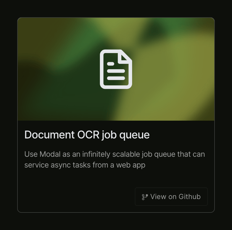
A card displaying a code example with a title, description, and a button to view the source on GitHub. The top half features a blurred green background with a document icon.

Modal — FAQ component
Modal logo
Modal

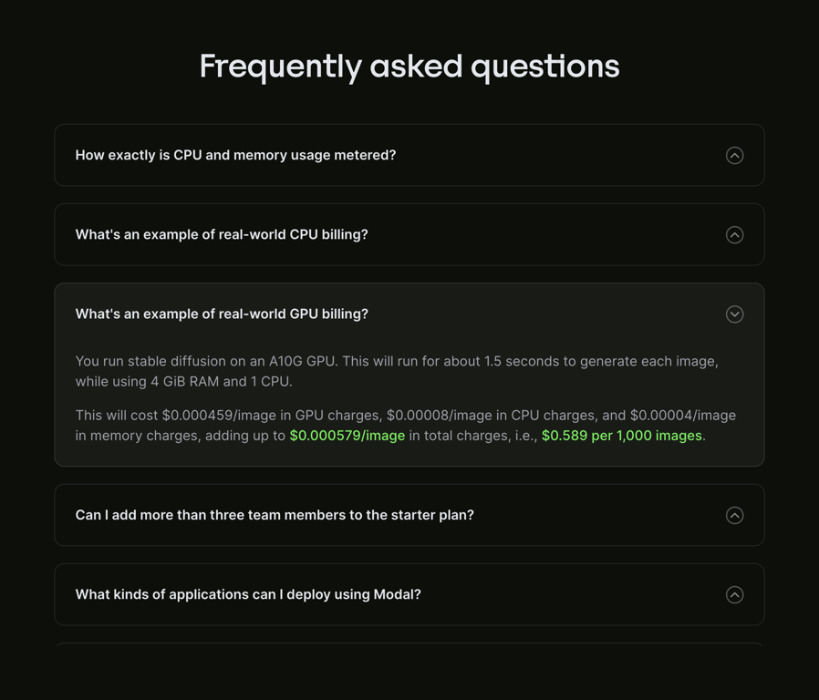
A dark-themed FAQ section using an accordion layout. It displays a list of questions within bordered cards. One card is expanded to reveal a detailed answer containing text and highlighted pricing figures.

Browse the full component library

Browse the full UI component library.

Trusted by the best teams