What is a delete account flow
The process of allowing a user to delete their account from a website or application is known as a delete account flow. It is an important flow because it ensures that users have control over their personal data and can opt out of a product or service if they so desire.
Typically, the delete account flow begins with the user going to their account settings or profile section and finding the delete account option. They will be asked to confirm that they want to delete their account and may be asked to provide a reason. The user will then be informed of the consequences of deleting their account, including the loss of all data. They may also be offered alternatives to deleting their account, such as downgrading or temporarily disabling it, if appropriate.
How do you create delete account flow
A delete account flow should be included in the application's or website's account settings or profile section. It should be easily accessible to the user, ideally in a visible location such as the user profile or account settings.
Browse hundreds of delete account ux inspiration here.
Delete account design tips
Here’s a list of tips that you can apply when designing your delete account flows. Some of them may not be applicable to your situation.
- Make it easy & efficient
It should be simple to find the path to delete my account Don't require the user to complete a complicated process to delete their account - Make it clear
Communicate cleary the impact of the action by providing them with clear information about the consequences of doing so, such as data loss, cancellation of subscriptions, and the inability to recover their account. - Make sure there's nothing preventing the deletion
Run all the necessary check before deleting the account to make sure that there won't be any conflict after (That their subscription is cancelled for example) - Ask for feedback
Allow the user to provide a reason for deleting their account. This feedback can help you improve your product or service and understand why users are leaving but keep it optional. - Remove user data
Once the account is deleted from the user perspective, make sure that all their data is removed from your system. This includes any personal information, activity logs, and stored data. - Offer alternatives
If appropriate, offer alternatives, such as downgrading their account, taking a break, or temporarily disabling their account.
Delete account design examples & inspiration
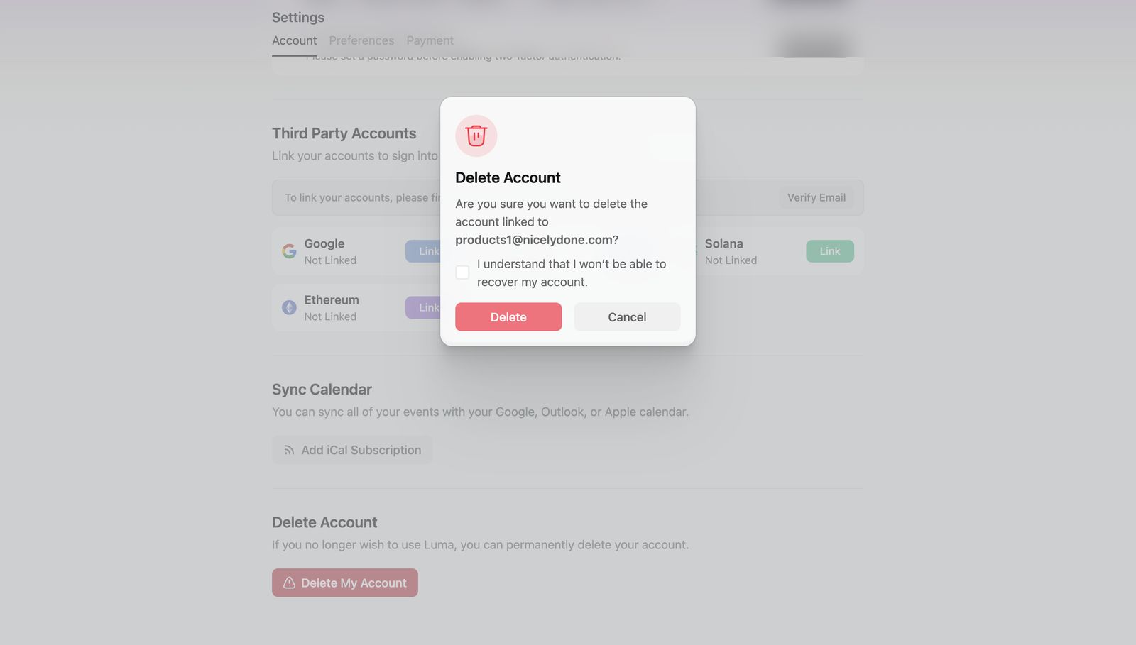 Delete account example from Luma
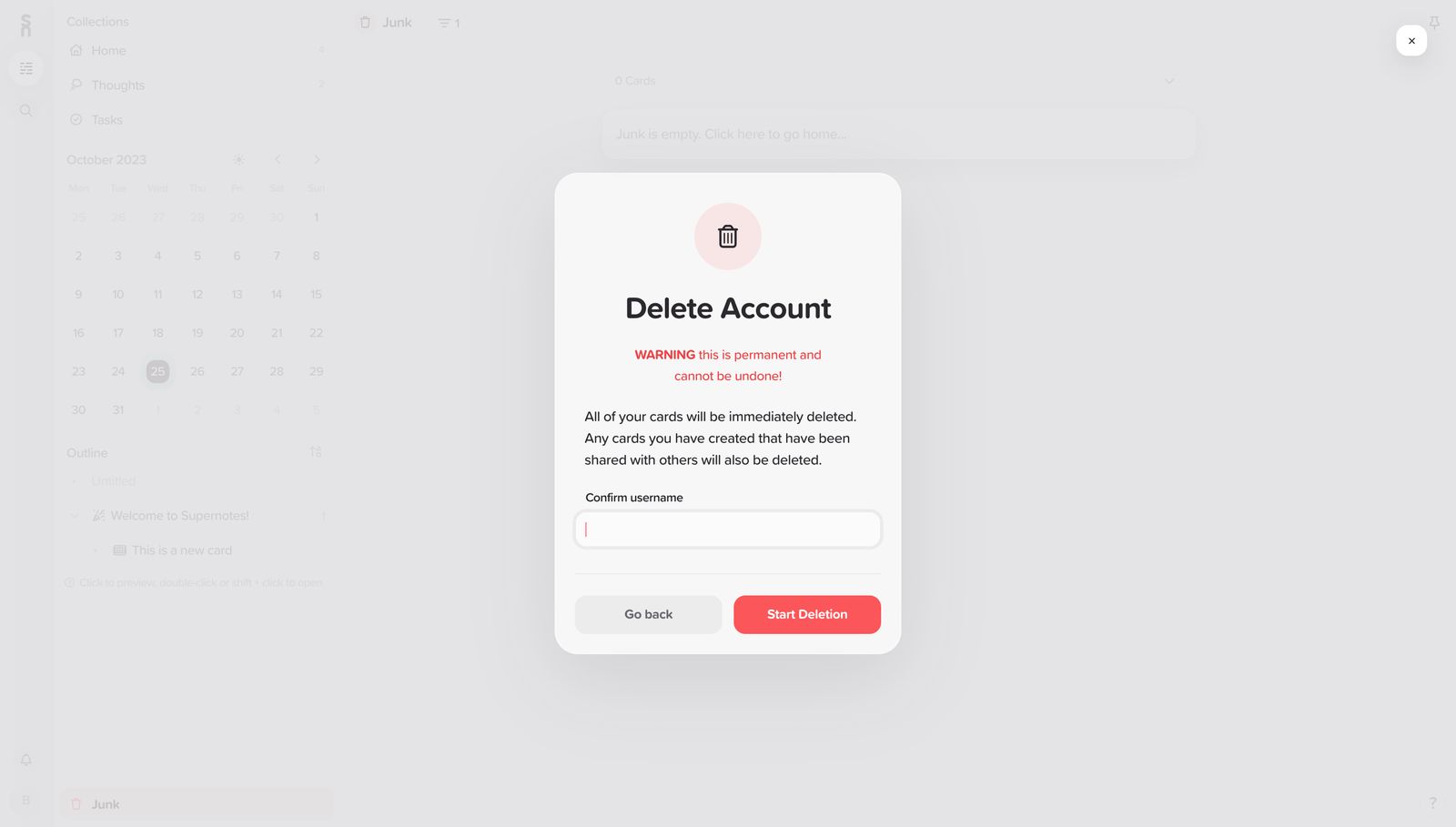 Delete account example from Supernotes
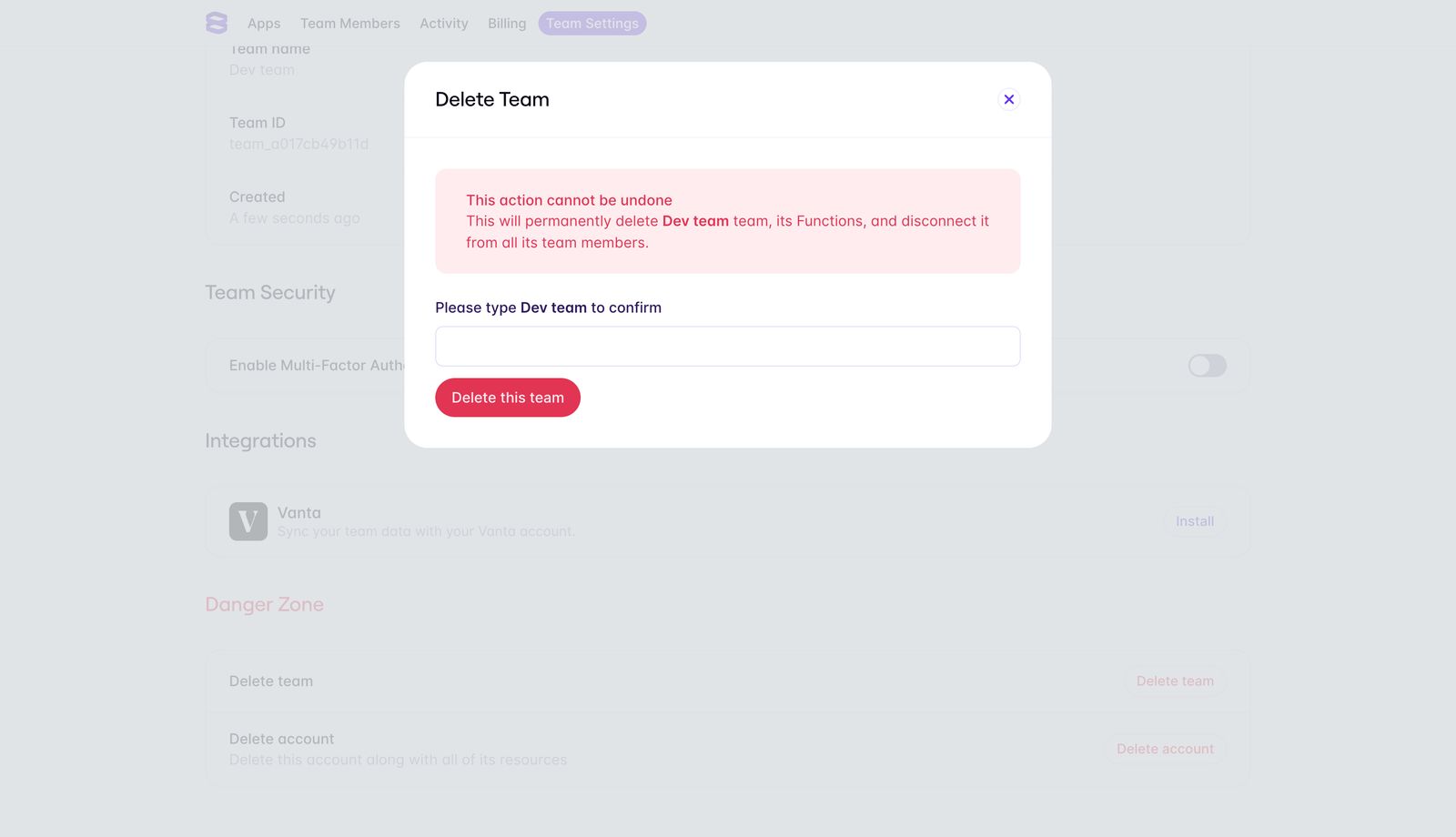 Delete account example from Evervault
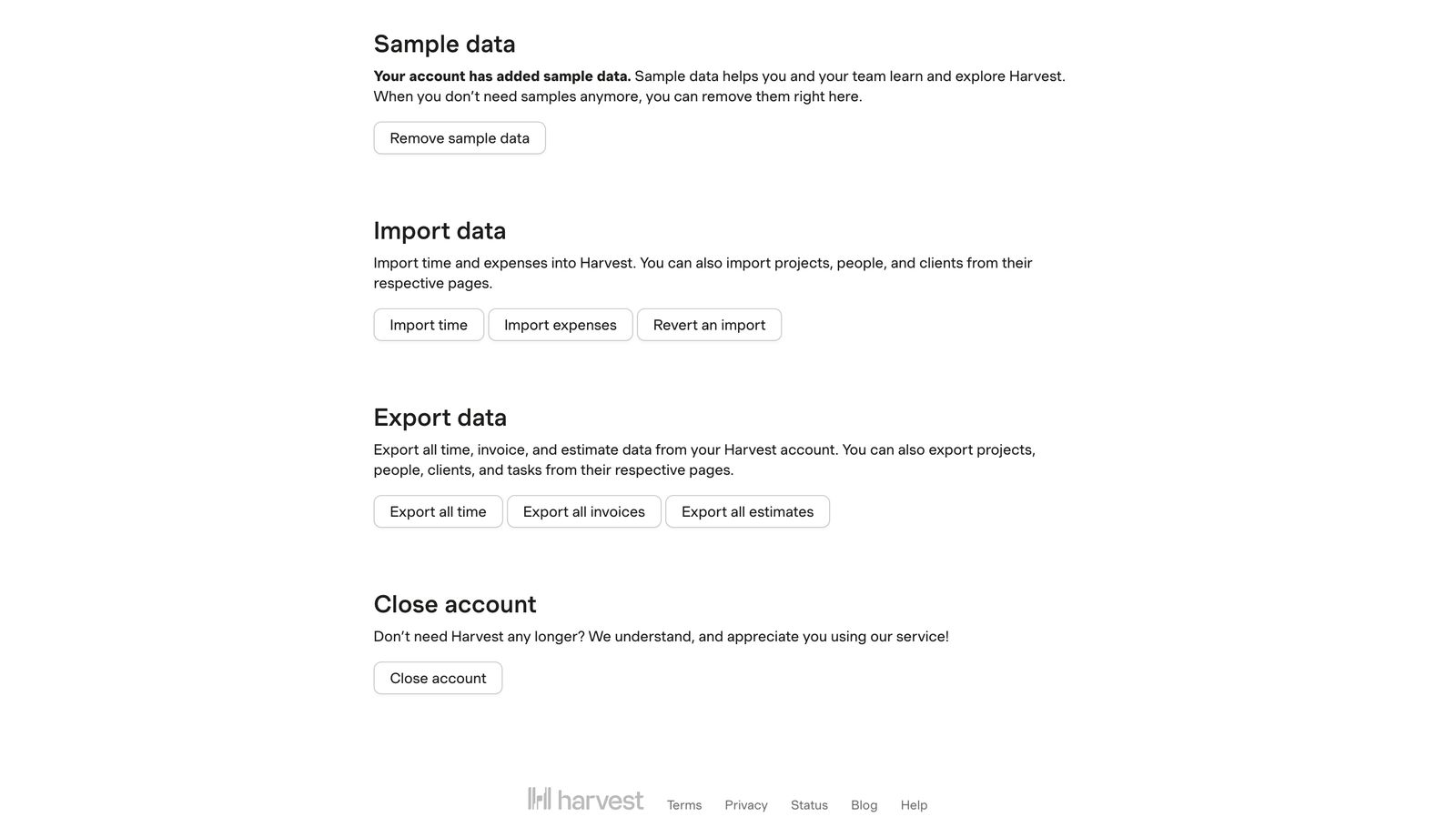 Delete account example from Harvest
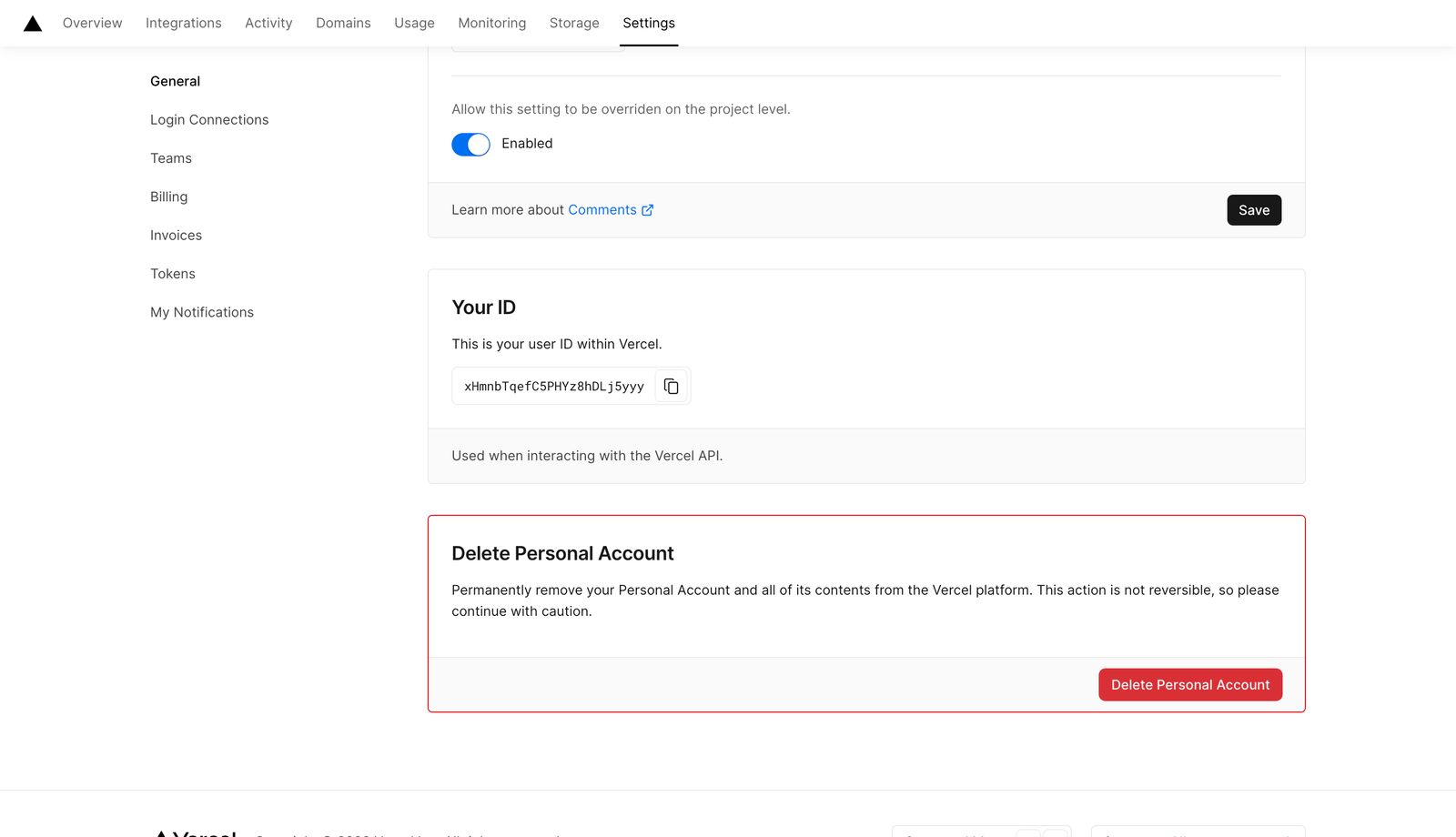 Delete account example from Vercel
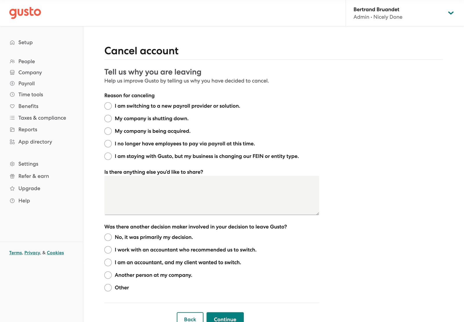 Delete account example from Gusto
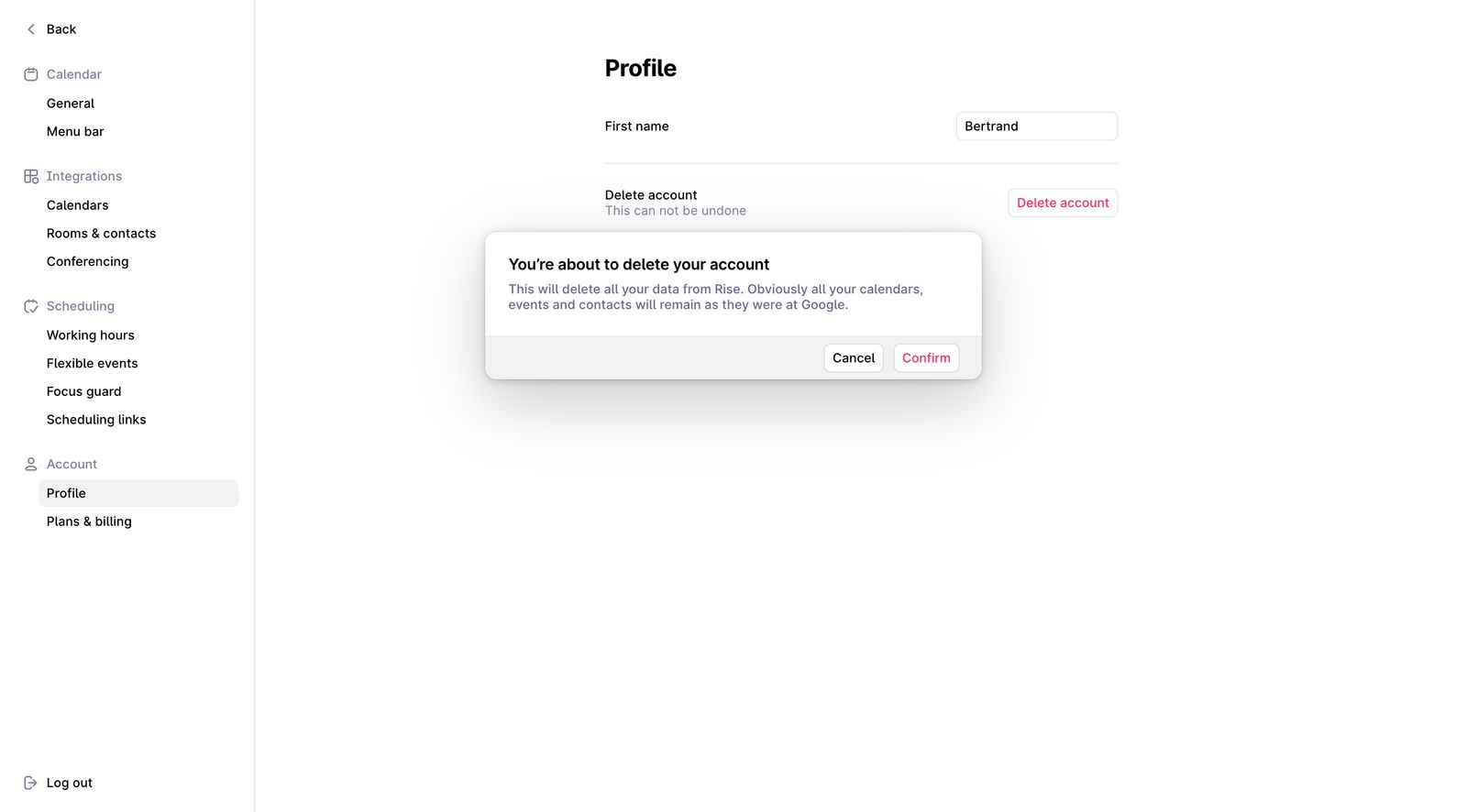 Delete account example from Rise
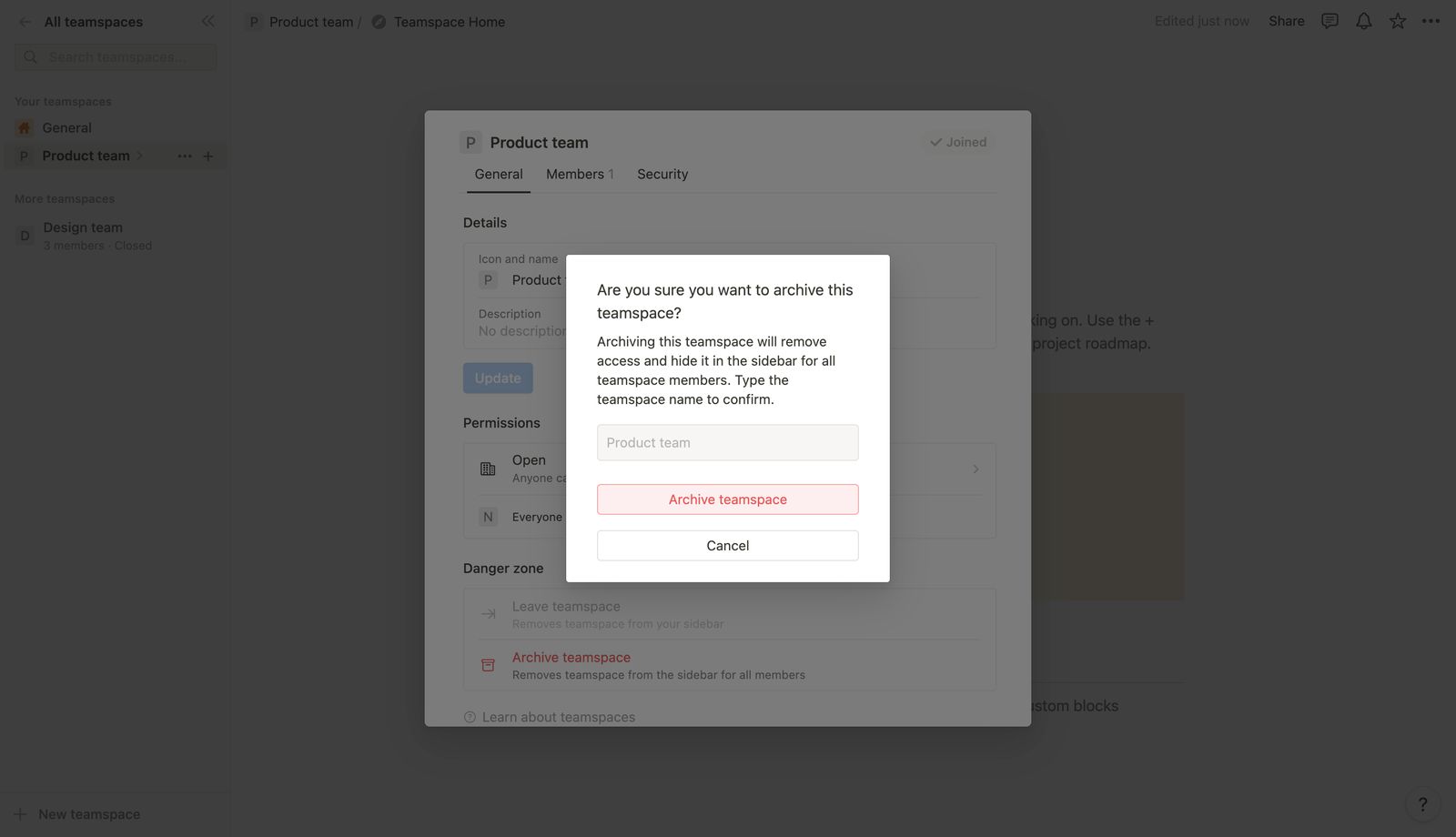 Delete account example from Notion
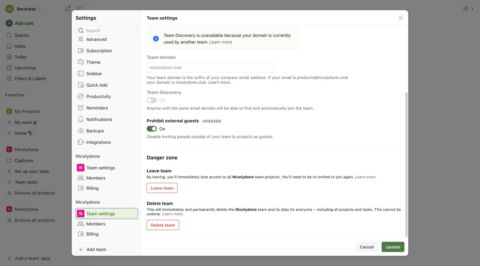 Delete account example from Todoist
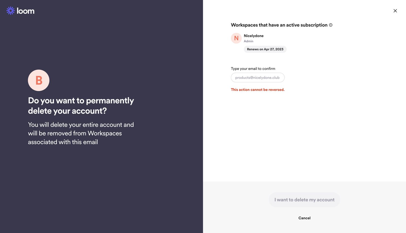 Delete account example from Loom
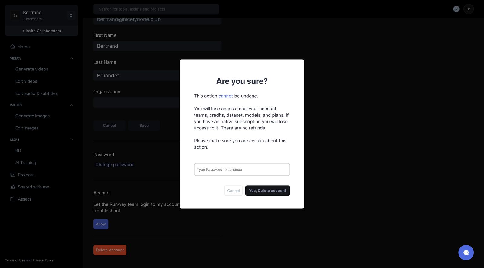 Delete account example from Runway
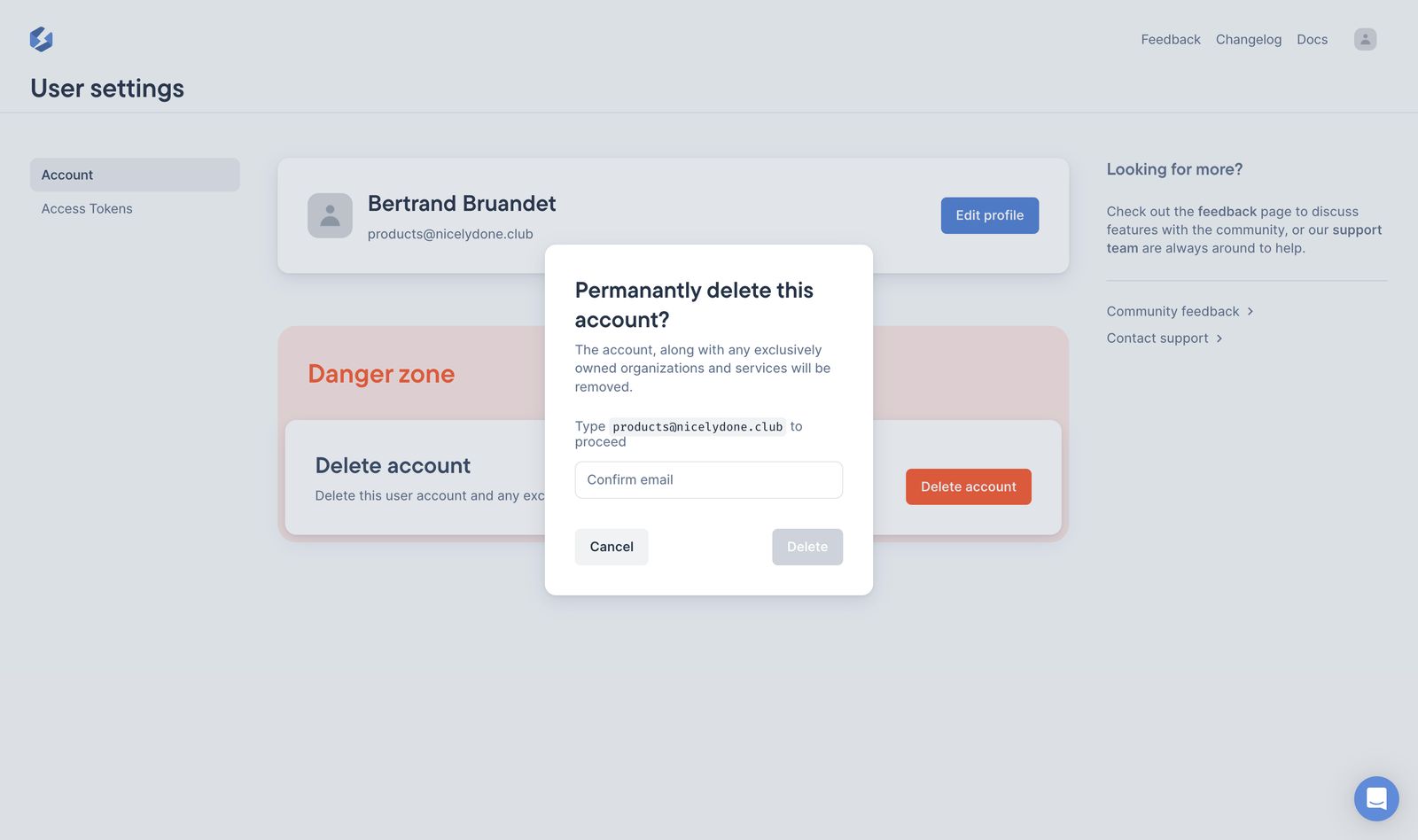 Delete account example from Stellate
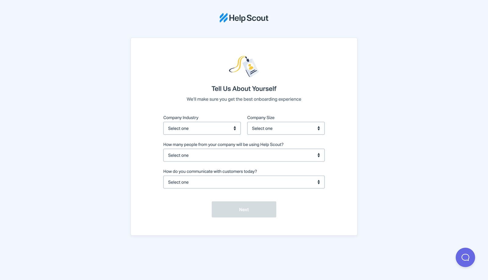 Delete account example from Help Scout
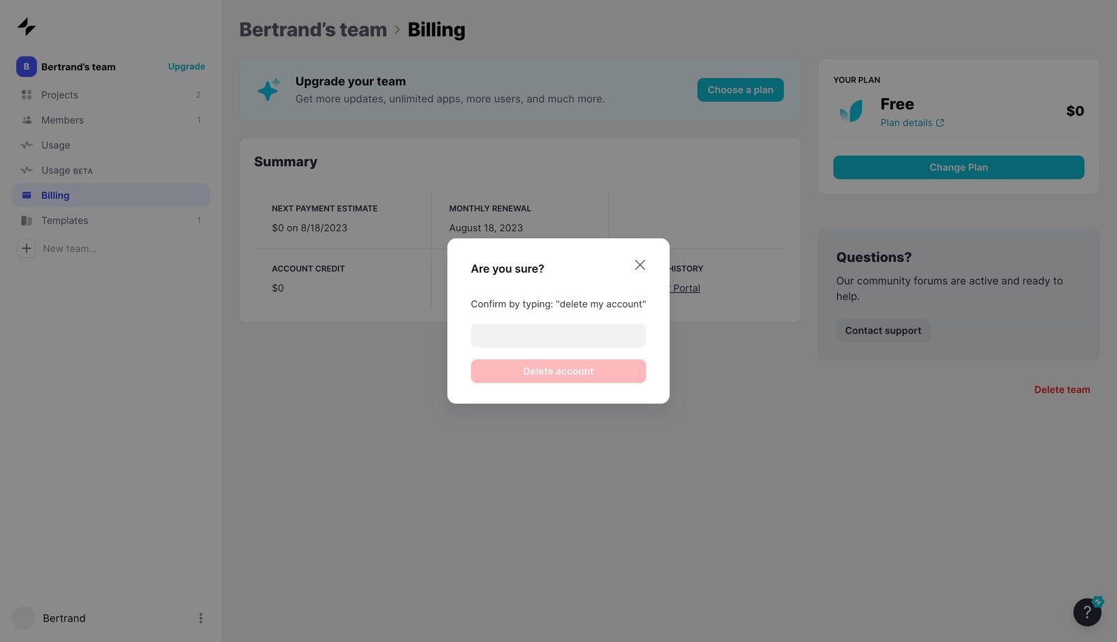 Delete account example from Glide
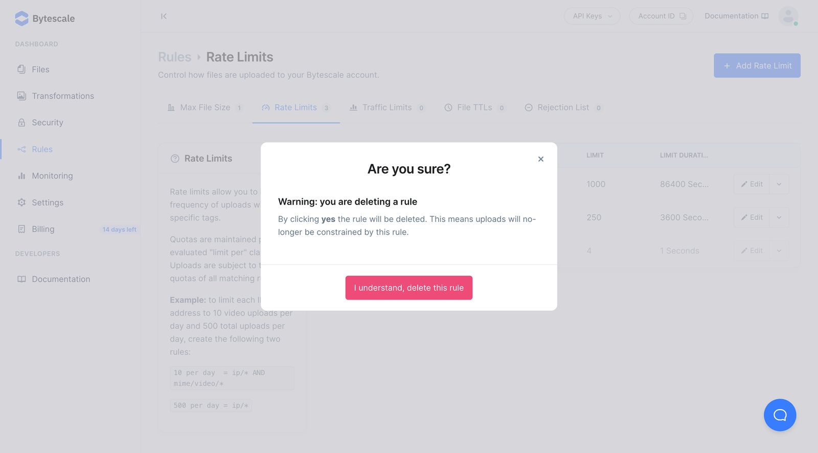 Delete account example from Bytescale
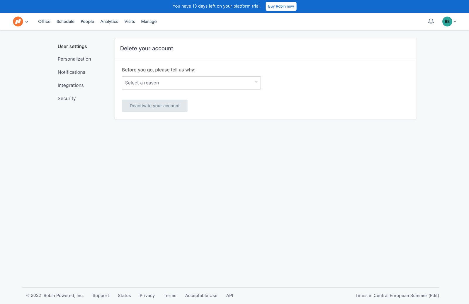 Delete account example from Robin
Want to see more? Go over nicelydone to find more Delete account pages inspiration
Let me know what you think via twitter (@nicelydoneclub).
Cheers,
Bertrand